For me to move forward to this final assignment, I am going to explore the past 4 assignments first. I need to look back and decide on what worked well and what didn't. I will look at techniques used, which I enjoyed and pick out the best paintings I feel I have done so far through out the course Painting 1.
I hope that this will help to build myself a good background of my style and reflection, so that I can input things I have learnt into Assignment 5. I want to create important pieces of work that will show technique, personal development from this course to enter it in for assessment in July.
Painting 1- Assignment 1
This actually seems ages ago when I started this course. I remember not knowing much about painting apart from doing little bits of it in my spare time. Since then I can see how much I have learnt and gained from this course.
I realised in Painting 1 that it's not just a case of putting a brush on to paper, its a lot more technical and there are so may ways that I could apply paint. I experimented with different tools and created a sketch book full of the techniques I used.
I learnt how to do washes on paper and blending two or three colours together in the washes in both transparent and opaque tones.
This was my my first attempt at proper painting:
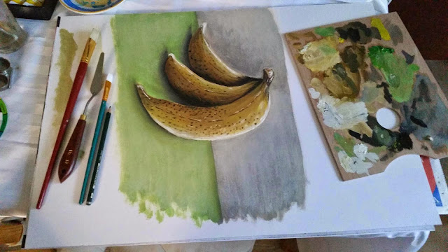
A simple image of some bananas. I have just picked it out to have a look at this painting and it looks rather flat on the page. The dark tone works well, but the white where I was trying to show reflective light, just looks as though I have placed it there and I did not really understand how to blend it in to the yellow.
I remember being eager and just wanting to paint rather then practising brush techniques and I was very impatient. Since doing this course I have learnt to be more patient which is another good thing this course has given me.
I learnt how to paint on dark and light backgrounds:
Assignment 2
When I did assignment 1 I thought I would just go through the course just painting away but how wrong was I. In this Assignment 2 I learnt that knowing colours and contrast were as just important as the technique of painting to bring out the best in my work. I found it very interesting I still now keep going back and referring to my colours info as there is so much to learn and technical ways of mixing paint and deciding on what best tones of colours to use.
Once I had looked at colours I had to produce three still life paintings:
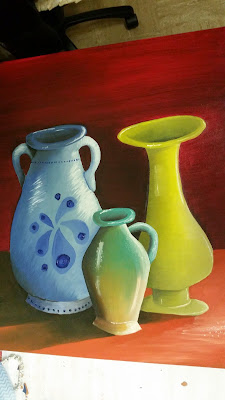
Jugs
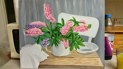
Flowers
Fruit
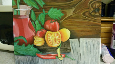
Looking at them now, I can see that here is when I began to start merging colours better, especially on the flowers and the food painting. The jug painting still has areas of me not merging the tones correctly especially on the green jug, however I do feel that I managed to get the shapes better drawn then in my final for Assignment 1.
Out of these three my favourite has to be the flowers. I love the colours and I had fun painting the flowers. I can see now looking at this painting that this is what my tutor mentions in assignment 4 feedback regard to when I use subtle colours, Just like here. I am going to keep this out for reference for this assignment 5.
I then learnt about colour contrasts and how to use complimentary colours together:
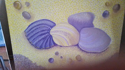
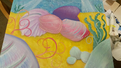
At the time, because I enjoyed painting the shells previously, I wanted to do them again. I had to create a painting to show evoking a mood. Looking back at this, I feel I didn't really grasp the idea of the task. Yes the colours are to evoke a kind of girl mermaid mood with treasures under the sea but I should of done different objects, maybe such as ice and used blues to create a mood of coldness or red on a painting of a cup of tea to show warmth. If I could go back I would of attempted this again and I feel I would of done a better job for the task.
Painting of a room was my next task. I thought I did well on this until my tutor pointed out my lines are not straight and my perspective view is not correct. I like the colours used but my angles were incorrect. I did afterwards re look at perspective and tried to get in right in my landscape paintings further on.

My final paintings for assignment 2 was a paintings of baubles. I enjoyed painting this paintings due to now starting to create different techniques with my paint brushes. My tutor said that this piece was not a good idea, as it just looked like a Christmas painting advertising baubles instead of an actual artists painting.
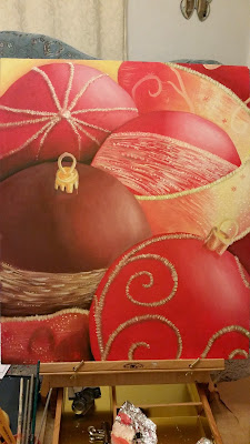
I can see now looking back at the work looked at so far, that my work was a bit cheesy and I was painting normal things instead of looking at objects and putting my own spin on them and being brave. My style looked bland with sometimes just one painting technique running through the whole painting. Also I think at this point, I decided I was not inputting enough in to my blog to help develop my paintings. I decided to add more info to my blog, such as step by steps and more of my thoughts to help my self create better paintings and let the tutor understand my ideas more.
Assignment 3
.
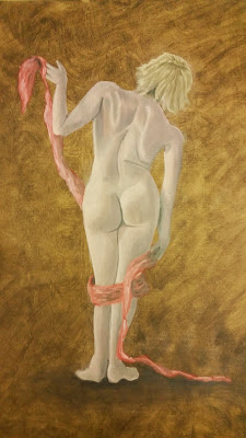
This painting above was done for an exercise, to look at the humans body shape. I think I did well with this. I looked at all the muscles and bones to create my figures body, to make her look like she had weight to her. I think it was a best shot for my first attempt.
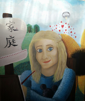
Next up was my self portrait. I had already done a self portrait in Drawing 1, so for this one I decided to do it a little more differently. I decided to paint myself with objects around me to show what things create me being me. I think the overall painting works out well. What I am beginning to notice is that I am lacking texture and a variety of different paint techniques in my work. This is what I need to improve on.
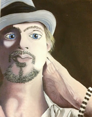
I did a portrait of my friend. I have to say his neck area and hand areas was what I was most pleased with in this paintings. His face does not seen so correctly proportioned. For example his eyes are not the same size. It also looks a bit illustrative. I really need to break out of it at look at figures more naturally.
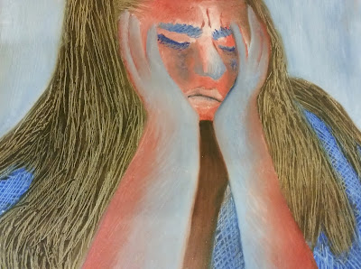
This painting I created, was to show a mood in a painting. I tried to capture the essence of sadness. I think with the colours I used worked well: blues for being upset and reds for being angry, the typical emotions we go through when we are upset. I tried different techniques, I used my finger nails to scratch in to the paint for her hair. I think this technique added to the paintings, the scratches create a sense of being really irritated with something.
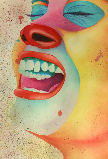
This mood painting I wanted to show laughter. I think I did a good job here. My tutor never commented on this piece, but I think it was a good idea to paint her face in a clown style whilst she was laughing. I also splattered bright colours of paint on to the painting to create a sense of fun.
In this painting it was to show perspective in my work. I did my research as I got it wrong in my last assignment and I think this time I did it much better. I didn't do much with my painting technique and my tutor did comment on that but for me, I just wanted to concentrate on the perspective to make sure I got it right this time round and I did.
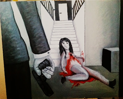
For this painting I had to tell a story and I think my painting is clearly understood of a murder scene. I think its an interesting piece as I think not seeing the murder questions the viewer to who is he? and what is the purpose of killing the woman. Just because the murderer is in a suit, does not mean that is is a man either. I do think I made a good paintings telling a story and I like it as it makes the viewer question what has happened. I needed to add more detail to the person in the suit though as it looks a little flat and should of had more detail as they are in the foreground.

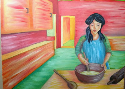
For my final painting I called it 'A good gossip' It is a painting of my nan chatting away and I wanted to capture her personality. I think I did this well. I really enjoyed painting this and had fun with capturing her hands with the cup. My tutor pointed out its too illustrative. I know it is and I have been a illustrator for years and I know I am struggling to break through that barrier of old habits to create natural paintings, which I hope I will do one day in the future. Overall, I think it worked well and I like how I added the cup in the foreground so the viewer looks like they are having a conversation with my nan too.
In this assignment, I can see that I also did lots more research and more in my sketch book, so I do feel like I am improving.
Assignment 4 landscapes
This I feel had to be one of my favourite assignments. I was really worried about landscapes as I struggled with them in my Drawing 1 course. I actually found it better to capture my landscapes with using paint. I loved the textures I created and depth with techniques I used in to my paintings.
After having my feedback got my tutor I decided I would try to do more different techniques and ideas with my paintings. My tutor said my work was naive and it could go one way or another. I was quite confused with what he was saying, so I researched on the Internet. I discovered that a lot of naive art was quite illustrative and a type of art using bright colours. For this course I have tried to break my illustrative style and tried to paint more observantly.
Painting a view through a window was my first painting.
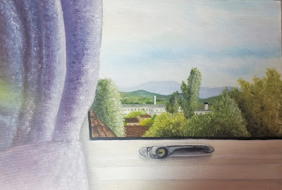
This is a painting of the view out of my window. I did this painting carefully observing the view and I think it came out well. My tutor really like this one and pointed out to me that it is one of the better ones in this assignment due to the subtle colours, impasto and that I have not tried too hard to capture the view.
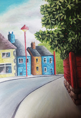
In this painting I decided to look at naive paintings, as my tutor mentioned my art work is heading that way and to be careful with it. I researched in to naive art and noticed they used bright contrasting colours, so that is what I decided to do here. I love my bush techniques with the added depth with putting layers of leaves. The houses are wonky and are not straight. My tutor said I am trying too hard and I need to just paint with subtle colours and textures, just like the view from a window. I think I was trying to hard just to find my own voice, but maybe I have it already I just need to paint and forget the rules of paintings and loosen up a little.
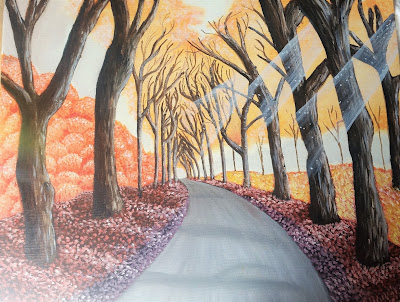
This painting I painted a road that I travel on to work and back. I love the autumn season with all the different colours of the trees and wanted to show the beautiful scene. I think I created the perspective well and the textures I am forming on the ground and on the bark are adding depth to my painting. I think at this stage I am now use to paint and am starting to look at better ways of applying it in different ways, instead of just painting in one technique all the way through a painting, which makes them look boring.
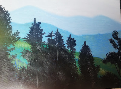
This was a view from the lake district I had to show the atmosphere in the sky that changes the colours of the far out landscape. I think I showed it well here. I don't think this is one of my best paintings, as I feel its lacking detail but I do think I have understood the atmosphere changes the landscapes tones.
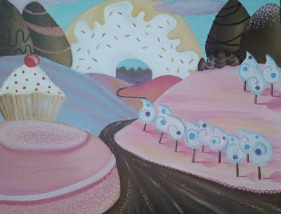
I had to create a land out of my imagination. At the time I was hungry and all I could think of was food, so I decided to create a dessert land. I think this paintings is again lacking textures and a personal voice: Yes I painted an idea, but I need to also let the viewer see my style in the painting by leaving brush strokes and different techniques, so they can sense my movement.
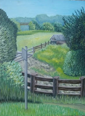
Painting out side was a fun painting and I enjoyed painting this piece. I think I captured the landscape well. I could of put more detail on the bushes either side that were framing the view as to me they look unfinished. I really like the colours and my tutor liked therm to he said to look at this painting and a view out of the window to grasp this colour collection that I am using as it works out well. I really like the layer technique I have stared to use to create the bushes, it really adds depth to my paintings.
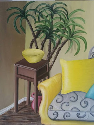
I really enjoyed this painting of my corner of my room, I have painted it well and the colours work lovely together. The pattern on the chair could of had more time spend on it, to do the detail on the material more realistic but the rest of the painting looks really good and in proportion. my tutor like this one too.
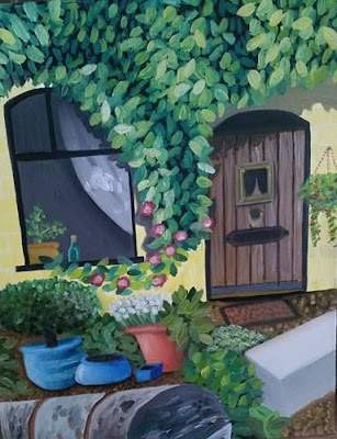
I painted this from looking at a drawing that I used a grid on, to get the proportions correctly. I don't really like this painting much as the door looks really badly painted. my bushes and stone look good but need to be textured more. I don't think I will send this on in for assessment, but I may need to practise using a grid again.
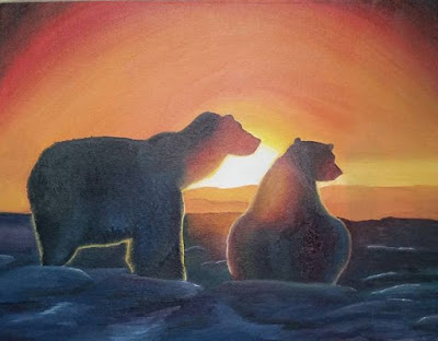
I painted this painting from a photograph and I really enjoyed painting this one. I really enjoyed merging the colours together and capture the light on the bears fur. I think I painting them well and correctly to the photograph. I think I could of added some texture in here maybe some impasto to add a good texture for the fur and snow.
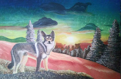
My final for assignment 4 was to create a large landscape painting. I decided to do a wolf with a sunset on a snowy landscape. My tutor gave me feed back informing me that it was an ambitious piece, but because it was so big I had needed to spend longer on it and my brush strokes got bigger and the paintings was not detailed enough. I do agree with him about this as I was questioning this my self whilst painting it. I was following the instructions in the exercise but perhaps I'm not ready yet to attempt a big painting. I did however like my texture of my trees and the fur on the wolf. Again I need to add more texture.
Overall
Looking at my paintings now, I can see what are my high and low points, what techniques work and what don't.
What worked:
What worked:
- Subtle colours - I need to look at my paintings: view from a window and my painting outside for reference.
- Adding depth to paintings - such as the bushes, which worked well.
- Impasto - techniques that add personality and interest to a painting.
What didn't work:
- Same technique of painting through a whole painting.
- Ideas of paintings - need to think of different ways of looking at things, to make them look interesting and new ideas instead of looking cheesy and old out of date work.
- Naive art - need to keep away from this work, as it does not help me when I'm trying to paint realistic and just shows my illustrative style in a painting.
- Stick to smaller paintings - which helps with smaller strokes adding better detail.
What I now need to do, to develop further:
- Create better ideas and think about what other students would never think of painting, to create interesting, individual paintings.
- Textures - practise all different ways to paint and record them, to them look at them and use in my paintings. This will help me to create more interesting art.
- Experiment with using subtle colours and understand which work well together and tones.
- Loosen up- try techniques such as holding paint brush at the top of it, to create more natural paintings.
- Look at other artists work that involves the above techniques and ideas, to develop further and inspire me to create my series of paintings in Assignment 5.
Now I know what I need to concentrate on to move forward, I am happy to begin Assignment 5 and hopefully see my self develop further.
Assignment 5
For this assignment, I need to start collecting pictures and Ideas that I like, to help me through this assignment and help me to decide on what I want to do for my final for the series of paintings. I will start to do this and put them in to my sketch book or on to a post on here of collectible art and cut outs for this assignment... colour tests etc
Claude Monet
Sunflowers
http://www.claudemonetgallery.org/Sunflowers.html

Water Lily Pond
http://www.claudemonetgallery.org/Water-Lily-Pond.html

Arm Of The Seine Near Giverny At Sunrise
http://www.claudemonetgallery.org/Arm-Of-The-Seine-Near-Giverny-At-Sunrise.html

Pathway In Monets Garden At Giverny
http://www.claudemonetgallery.org/Pathway-In-Monets-Garden-At-Giverny.html

Poppy Field Argenteuil
http://www.claudemonetgallery.org/Poppy-Field--Argenteuil.html

The Artist's Garden at Vetheuil 1880
http://www.claudemonetgallery.org/The-Artist's-Garden-at-Vetheuil--1880.html

Lady In A Garden, 1867
http://www.claudemonetgallery.org/Lady-In-A-Garden,-1867.html

Morning on the Seine IV
http://www.claudemonetgallery.org/Morning-on-the-Seine-IV.html


Pissaros way of painting is similar to Monets, they both enjoyed capturing textures. Among all the main painters of impressionism, Pissarro was the most senior, who was modest and honest in his work. he always captured his peaceful and pastoral life in his paintings.
From the paintings above I can see that Pissarro used many colour layers and learnt to control colour. I noticed that in his paintings, his strokes were larger which could fast cover the whole painting to spread out a general tone. Some of his work you can see multiple overlapping strokes and colours staggered up and down to make very rich colours and also naturally left a thick paint texture. Although Pissarro's works were mainly describing the rural scenery, his figure paintings were also very textured too.
Pissarro's palette and brushwork changed from one period of his career to another, but his general approach to his paintings was a constant factor. His philosophy of landscape painting is set out in a letter of about 1896 to a young painter:
"Look for the kind of nature that suits your temperament. The motif should be observed more for shape and colour than for drawing ... Precise drawing is dry and hampers the impression of the whole ... it is the brushstroke of the right value and colour which should produce the drawings ... Don't work bit by bit, but paint everything at once by placing tones everywhere, with brushstrokes of the right colour and value, while noticing what is alongside. Use small brushstrokes and try to put down your perceptions immediately ... Cover the canvas at the first go and then work until you see nothing more to add. Observe, the aerial perspective well, from foreground to the horizon, the reflections of sky, of foliage. Don't be afraid of putting on colour, refine the work little by little. Don't proceed according to rules and principles, but paint what you observe and feel. Paint generously and unhesitatingly, for it is best not to lose the first impression. Don't be timid in the presence of nature; one must be bold at the risk of being deceived and making mistakes. One must have only one teacher - nature; she is the one always to be consulted."
(http://www.mystudios.com/art/impress/pissarro/pissarro-style.html)
I think this letter has great truth and meaning to become a better painter I have wrote it out and actually stuck it in my art room to remind my self how to look at landscapes and be one with expressing them.
Research point
Claude Monet
Sunflowers
http://www.claudemonetgallery.org/Sunflowers.html
Water Lily Pond
http://www.claudemonetgallery.org/Water-Lily-Pond.html
Arm Of The Seine Near Giverny At Sunrise
http://www.claudemonetgallery.org/Arm-Of-The-Seine-Near-Giverny-At-Sunrise.html
Pathway In Monets Garden At Giverny
http://www.claudemonetgallery.org/Pathway-In-Monets-Garden-At-Giverny.html
Poppy Field Argenteuil
http://www.claudemonetgallery.org/Poppy-Field--Argenteuil.html
The Artist's Garden at Vetheuil 1880
http://www.claudemonetgallery.org/The-Artist's-Garden-at-Vetheuil--1880.html
Lady In A Garden, 1867
http://www.claudemonetgallery.org/Lady-In-A-Garden,-1867.html
Morning on the Seine IV
http://www.claudemonetgallery.org/Morning-on-the-Seine-IV.html
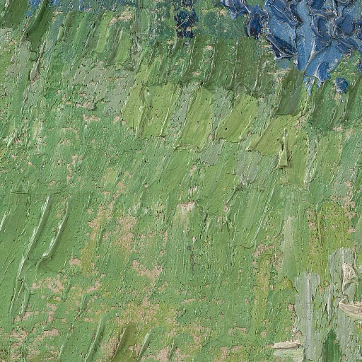
After researching on Monet paintings and to actually see one of them at Walsall art gallery (see my own research and visits post) I got to see how he paints, how he creates textures and how he sees some of the world.
His painting is not smooth it is very layered up with texture. he used more then one type of way to apply paint in all his paintings. I discovered that Monet made initial sketches in charcoal on the canvas before applying paint layers. No preparatory drawing could be identified under the paint layers of this work. Instead, the composition of the painting was marked out using paint. These initial lines of paint were applied in narrow continuous brush-strokes. The blue and green horizontal strokes across the centre of painting, were applied during this stage indicate the edge of the river and the beginning of land.
To fill in his paintings such as fields, he used pastel tones to block in large areas, applied with dry and undiluted paint. Monet’s handling of paint at this stage was loose and rapid, leaving some of the priming visible. The area below the horizon was initially left unpainted. Monet did not use the traditional technique of applying thin glazes to build up shadow and form. Instead, his most striking effects were created using a single colour, quite thickly applied using a bold, flat and even-loaded stroke. This type of brushwork is called tache. The tache was the basis of Impressionist technique. The tache technique of paint application signalled a move away from the traditional method of blending colours on the canvas.
In the foreground of Morning on the Seine IV (pictured above), ripples across water and the fall of light are articulated using even and thickly applied taches of blue, orange, and white paint.
In the painting of Sunflowers (pictured above) colours straight from the tube were applied to the canvas, not mixed beforehand on the artist’s palette. Subsequent layers of paint were applied before those beneath had dried. This method of painting I think is classed as wet-in wet.
Monets work to me was great, it is as though hes trying to capture the movement or fleeting aspects of nature he was surrounded with whilst painting. Monet in his older years became more interested in qualities of colour and form. He began to apply paint in smaller strokes, building it up in broad fields of colour. He began to explore the possibilities of paint surfaces and contrasts of colour.
As I got to see one of his paintings at Walsall gallery I got so see even deeper in to his work. I am getting more use to now looking at paintings textures and application more then the overall scene.
Pissarro
The Wheelbarrow, Orchard, c.1881
http://www.camille-pissarro.org/The-Wheelbarrow,-Orchard,-c.1881.html
Bathers II
http://www.camille-pissarro.org/Bathers-II.html
Entrance to the Village of Voisins, Yvelines, 1872
http://www.camille-pissarro.org/Entrance-to-the-Village-of-Voisins,-Yvelines,-1872.html
The Hermitage at Pontoise 1867
http://www.camille-pissarro.org/The-Hermitage-at-Pontoise-1867.html
Hyde Park, London, 1890
http://www.camille-pissarro.org/Hyde-Park,-London,-1890.html
A Cowherd on the Route de Chou, Pontoise
http://www.camille-pissarro.org/A-Cowherd-on-the-Route-de-Chou,-Pontoise.html
A Rest in the Meadow, 1878
http://www.camille-pissarro.org/A-Rest-in-the-Meadow,-1878.html
Pissaros way of painting is similar to Monets, they both enjoyed capturing textures. Among all the main painters of impressionism, Pissarro was the most senior, who was modest and honest in his work. he always captured his peaceful and pastoral life in his paintings.
From the paintings above I can see that Pissarro used many colour layers and learnt to control colour. I noticed that in his paintings, his strokes were larger which could fast cover the whole painting to spread out a general tone. Some of his work you can see multiple overlapping strokes and colours staggered up and down to make very rich colours and also naturally left a thick paint texture. Although Pissarro's works were mainly describing the rural scenery, his figure paintings were also very textured too.
Pissarro's palette and brushwork changed from one period of his career to another, but his general approach to his paintings was a constant factor. His philosophy of landscape painting is set out in a letter of about 1896 to a young painter:
"Look for the kind of nature that suits your temperament. The motif should be observed more for shape and colour than for drawing ... Precise drawing is dry and hampers the impression of the whole ... it is the brushstroke of the right value and colour which should produce the drawings ... Don't work bit by bit, but paint everything at once by placing tones everywhere, with brushstrokes of the right colour and value, while noticing what is alongside. Use small brushstrokes and try to put down your perceptions immediately ... Cover the canvas at the first go and then work until you see nothing more to add. Observe, the aerial perspective well, from foreground to the horizon, the reflections of sky, of foliage. Don't be afraid of putting on colour, refine the work little by little. Don't proceed according to rules and principles, but paint what you observe and feel. Paint generously and unhesitatingly, for it is best not to lose the first impression. Don't be timid in the presence of nature; one must be bold at the risk of being deceived and making mistakes. One must have only one teacher - nature; she is the one always to be consulted."
(http://www.mystudios.com/art/impress/pissarro/pissarro-style.html)
I think this letter has great truth and meaning to become a better painter I have wrote it out and actually stuck it in my art room to remind my self how to look at landscapes and be one with expressing them.
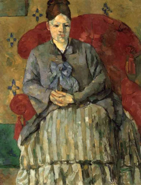
Cezanne
Madame Cézanne. 1877. Oil on Canvas 72 cm. x 56 cm.
Museum of Fine Arts, Boston.
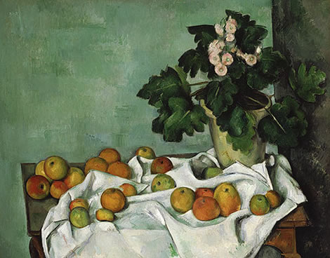
Still Life with Apples and a Pot of Primroses. 1890 Oil on Canvas. 73 cm. x 92.4 cm. Metropolitan Museum of Art
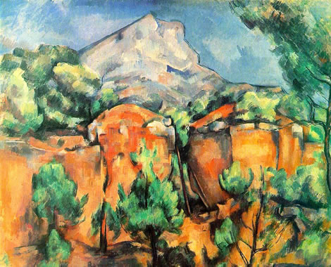
Mont Sainte Victoire Seen from the Bibémus Quarry. c. 1897. Oil on Canvas. 65.1 cm. x 80 cm. The Baltimore Museum of Art.
Small forest
http://www.paul-cezanne.org/Small-forest.html

The Lac D Annecy
http://www.paul-cezanne.org/The-Lac-D-Annecy.html

Mont Sainte Victoire (Metropolitan)
http://www.paul-cezanne.org/Mont-Sainte-Victoire-(Metropolitan).html
.jpg)
Mont Sainte Victoire (Courtauld)
http://www.paul-cezanne.org/Mont-Sainte-Victoire-(Courtauld).html
.jpg)
House Of The Hanged Man Auvers Sur Oise
http://www.paul-cezanne.org/House-Of-The-Hanged-Man--Auvers-Sur-Oise.html

Research on the Internet I found an interesting paragraph in regards to Cezanne's Art:
Cézanne was a slow worker, putting a great deal of thought into each stroke of the brush — as most painters do, but by him taken to heroic lengths. Composition, colour balance and a host of other matters that the Academy had taught painters to work out before putting brush to canvas was abandoned in favour of a direct method that would nonetheless (if only occasionally) produce a successful painting. Each brush stroke not only represented 'something 'of what he saw, but also took account of all previous brushstrokes in aiming for two things: a sense of the third dimension that did not involve perspective, and an integration of elements into the plane of the canvas. Both are difficult objectives, and Cézanne's work often shows provisional, repeated attempts to get things right.
(http://www.oil-painting-techniques.com/analysis-paul-cezanne.html)
From this and looking at his work, I get the impression that he was a painter who wanted to always create perfect art. He did paint wonderful paintings but however may of took longer on them then normal artists would. I discovered that rarely did Cezanne paint flowers, due to they would usually end up wilting because of how long it would take him to paint them.
He did however manage to paint a lot of apples. There is a still life above of apples called 'Still Life with Apples and a Pot of Primroses'. This painting to me looks quite flat. The cloth and apples are ambiguous in the third dimension: going back comfortably into the distance in the left corner of the table, but being spilled at an angle along the table edge near us. This creates the painting to become angular toward the viewer.
Madame Cézanne (above) is one of Cézanne's early paintings showing maturity. The colours hes used are in fact quite muddy. He has attempted to create 3d in his paintings by overlapping paint and by using tone.
Cézanne's art is an inspiration, but also a warning. It shows, that if your too neat and want to create 'a perfect painting' you will be spending ages to get it like a photograph image. To me he tried to hard and I can understand him.
I have in painting 1 come to realise that I try to be too perfect, when in fact I should just let the skill flow out of me and my heart, instead of thinking to hard about it.
Even though Cezanne made a profit and became famous, he is one of the few that did by painting in this way. So really it is a warning to try and steer clear of being to neat in a painting and just let it flow. In today's world, we have technology to capture real things and we don't need paintings any more to show us. What we like to see is new ideas from inside an artists head. what they see when they look at a subject, or what twist can they put on it to create some thing that the view has to think about. Art now is free flowing more then ever. I have come to realise this and want to show this in this final assignment.
Van Gogh
Starry Night France: June, 1889
http://www.vangoghgallery.com/catalog/Painting/508/Starry-Night.html

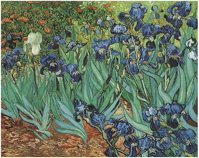
Irises 1889
http://www.vangoghgallery.com/catalog/Painting/244/Irises.html
Wheatfield with Cypresses
https://www.ibiblio.org/wm/paint/auth/gogh/fields/wheat-cypresses/gogh.wheat-cypresses.jpg

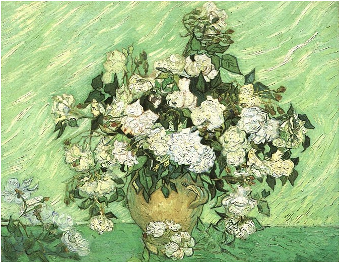
Still Life: Vase with Roses
http://www.vangoghgallery.com/catalog/Painting/593/Still-Life:-Vase-with-Roses.html
Daubigny's Garden
http://www.vangoghgallery.com/catalog/Painting/97/Daubigny_s-Garden.html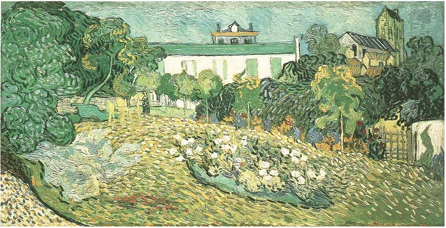
close up of Daubigny's Garden
http://www.vangoghmuseum.nl/en/collection/s0104V1962
Van Gogh to me is the be all and end all of textures in paintings. I admire his work and his ways of painting. Each painting I have see shows expressive flows of paint and you get the sense of his mood he was in whilst painting. From soft stroke to very sharp swift strokes there is a lot of texture creates. His main texture in his work is know as Impasto.
Impasto involves the thick laying down of paint on a particular segment of the canvas. This technique makes brush strokes more visible and, once the paint has dried, adds an extra element of texture. In Van Gogh’s work, the use of impasto had a huge effect on lighting, with the raised, almost three dimensional surfaces of his paintings appearing different depending on the source of light. Perhaps the most notable uses of impasto in Van Gogh’s work can be witnessed in such famous paintings as Starry Night (above) and Wheat Field With Cypresses (above), both of which would arguably not be nearly as impactful without the texture and emotion attributed to this memorable technique.
When creating Impasto the artist uses thickly textured, undiluted, paint that appears almost three-dimensional on the canvas. They can also apply the undiluted colour to the canvas, frequently with a palette knife, and mix colours on the canvas to attain the desired colour. When the painting is viewed from the side the paint is seen sticking out from the canvas in globs.
The appearance of an impasto painting is also greatly impacted by the lighting in any room. Due to the raised surface on the canvas, light is reflected and shadows are created based on the natural light in the space. Expressionists used the impasto technique for its expressive traits and to draw attention to a certain aspect of the work.
Van Gogh is said to be a pioneer in using the impasto technique. Van Gogh used impasto not just to add dimension to his paintings but to add emotion and movement.
In numerous letters, Van Gogh mentions his use of impasto. In a letter to his brother, Theo, on September 2, 1882 Van Gogh wrote:
“Sometimes the subject calls for less paint, sometimes the material, the nature of the subjects themselves demands impasto.”
(Letter Source:http://www.webexhibits.org/vangogh/letter/11/228.htm)
(Letter Source:http://www.webexhibits.org/vangogh/letter/11/228.htm)
The Expressionist Painters, 20th century Pastel Paintings
EDVARD MUNCH (1863-1944)
'The Scream', 1893 (oil, tempera and pastel on board)
This painting is a good example of showing mood and atmosphere within a painting and not just by the image. The way the medium is applied by lines of similar motion next to each other, creates a sense of panic and worry, helped by Munch with his frightful expression. The colours used, blues and reds are also to show moods of sadness and anger in a paintings. When you see this painting you automatically sense fear and to be honest it actually makes the view feel the same too.
Munch: "I was walking along the road with two friends. The sun set. I felt a tinge of melancholy. Suddenly the sky became a bloody red. I stopped, leaned against the railing, dead tired. And I looked at the flaming clouds that hung like blood and a sword over the blue-black fjord and city. My friends walked on. I stood there, trembling with fright. And I felt a loud, unending scream piercing nature." (http://www.studiointernational.com/index.php/edvard-munch-the-modern-life-of-the-soul)
Edgar Degas
The Singer in Green
http://www.metmuseum.org/toah/works-of-art/61.101.7/

Henry Tonks
Auguste Rodin 1914
http://www.tate.org.uk/art/artworks/tonks-auguste-rodin-n03017

I struggled to find many pastel art in the 20th century and the best I could find were these two others above. They show the typical texture created by oil pastels and how versitile they are for creating views of subjects. I think in past experiance of using pastels they ae rought in texture and they help you to be more of a looser artist as they are chunky mediums to use.
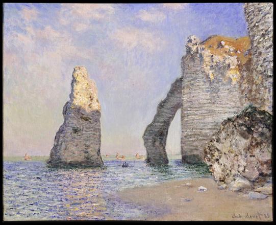
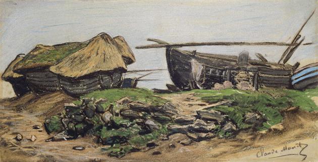
I then did a bit more research and found some Pastel paintings that Monet had done:
The Cliffs at Etretat
Monet
http://www.theguardian.com/arts/gallery/2007/mar/14/monet
Caloges and Boat at Étretat
Monet
http://www.theguardian.com/arts/gallery/2007/mar/14/monet
Fruit Trees
Monet
http://www.theguardian.com/arts/gallery/2007/mar/14/monet
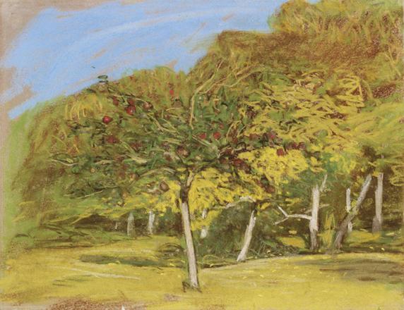
These are works of Monet before he became famous and it sheds a new different light on his talent. He was actually really good with pastels and perhaps used this medium to get use to moving on to paints. You can still grasp his way off looking at scenes and the way he has attempted to apply texture. The colours are very natural and I like the The Cliffs at Etretat (above). as the pastels create great textures for rockery.
After looking at this research I will continue to look in to other artists techniques to help inspire me in my own work. I am going to start collecting snippets of artwork and research artists to help me for my final. This will all be found in my post called ASS5 - My own research towards Assignment 5 final. Including gallery visits
No comments:
Post a Comment