Ikon Gallery OCA Visit
On 9th January I went to visit the Ikon gallery with the OCA. I had a wonderful time. It was my first time getting involved with an OCA gallery visit and I would do it again.
The tutor who toured us around was a lady called Diana. I met 6 students who were all in different courses and stages. It was a lot better visiting with other students then on my own. You get to hear what other people see in art and opinions about different subjects.
The exhibition was for an artist called Fiona Banner . Her type of work was really interesting. She enjoyed playing with words and creating pieces of art from them.
Here is some of her work that I found interesting:
The man poster collage 1997

This is a piece of work which was also used with lighting to change the colours in the poster every 2 seconds. It gave the illusion of staggered movement of the words. The way she has placed the words to create negative areas, draws you eyes to the ever changing colours of the wall. I liked this as she has played with bold contrasting colours which creates a illusion of the wall moving.
The Bastard Word 2007
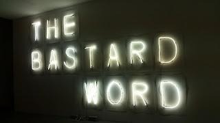
This was interesting as the artist had to bend all the light tubes. When you look close they are not perfectly shaped there are bents and bumps all over. This makes me more confident as it just goes to show, you don't have to be so neat with your art. You can loosen up and feel free to express.
Life Drawing Drawings 2007-2013


This table full of drawings books was a interesting collective collection to look at. What looks like books is actually books that are empty and blank. Fiona has created and drawn all the front covers of the books, inc some popular ones that I noticed. When I looked at them, I thought they were the real things. I was amazed to realise that she had drawn them all and put all the typography on the covers.
No name for this art but it was a painting/collage created by Fiona.

I really liked her idea here. Quite a lot of her work was to do with aircraft too, as well as words and letters. This painting collage to me looks like bomb shapes painted and there is a plane that she cut out and stuck it on to form a bomb. It creates a sense of the bombs flying, a vision that the bombs have been deployed.

The wall above has a lot of Fiona's work on. She used lots of fluorescent colours, which make a good contrast on the wall and creates a good complimentary balance of her art.
Unboxing 2012

Above photo is Diana the tutor trying on the gloves. They were very heavy. Fiona used parachute cord, installation and brass to create them. I tried them on and they are heavy. I could not find out why she had created them, maybe the weight of life that pilots carried during wars etc, but they were interesting.
My favourite art of Fiona's was:
Work 3, 2014

I really liked this idea, it was made with blowing glass, used to create a art form of scaffolding. She wanted to create this because she felt her art that she created, was helped by using her scaffolding and she wanted to show it off, as her large art would not exist without it. She wanted to show that her scaffolding was a part of her art work. She paid a company to create it instead of her self. You can also tell this by the professional neatness of the blowing glass. Even though it was created by some one else it was her idea and I feel her art exhibition would look odd with out it, there is a great meaning to it and its shows you the artists feelings towards her tools that she used to get to where she is now with them.
After the tour I managed to get Diana to sit with me and look at some of my paintings and give me some direction for assignment 5 final. Luckily she is one of the tutors that asses the students art work at assessment's, so she gave me some good tips. She told me to think out the box, to think about how to change a subject, to think about what no other student would think of. She told me to keep simple subject but think of a good idea how to show a theme through your series of 3 to 5 paintings. She said my current work was a bit cheesy as its things that people have already painted.
I really need to focus on looking at an item or scene and think how you can paint it differently ; eg vase of flowers- instead of just painting that I could wait till they are dying and try to paint them them, this creates a more interesting painting, as its not a usual idea.
She also told me to be a bit looser with my painting style and told me to go back to the beginning and try holding a paintbrush at the end of it which will create looser paint strokes.
I really enjoyed the day and talking to Diana and meeting other students listening to there struggles etc made me feel really inspired and I now feel ready to push my self and start exploring new techniques and Ideas.
Walsall Art Gallery Visit
22/1/16 Today I visited Walsall Art Gallery with some of my family. It was a lovely morning and again like the Ikon gallery, I gained more confidence for doing my Ass5 final. Here's some of the art which I saw:
Mat Colllishaw, All Things Fall, 2014, steel, aluminium, plaster, resin, LED lights, motor, 200cm x 200cm x 200cm. Courtesy of the artist and Blain l Southern


I came across various paintings which I felt really helped me to see other ways how to paint and to add texture: (I did collect quite a few, so I have just put some quick nots on for reflection.)
Sally Ryan
Potted Plant 1967 oil


I really enjoyed observing this painting. I liked the fact that it had lots of texture to it. Sally had built on layers with thick paint, which made parts of the painting stick out of the canvas. Parts in the foreground created a 3d effect. The colours used were interesting on a dark background too, which also added depth to the painting.
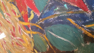
Jacop Epstien
sunflowers 1943
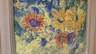
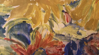
Note to self: regards ways of creating different brushstrokes going in various directions to make a painting stand out more. Can also leave parts of canvass showing in to a painting too.
Theodore Garman
Autum Stil Life 1950


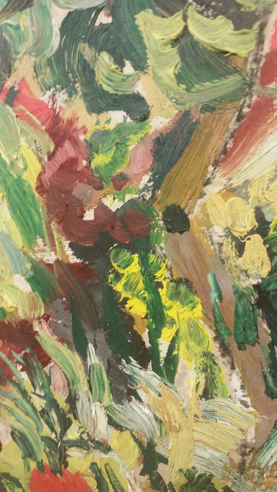
This painting was created adding texture. I tried to take a few close ups. you can especially see the texture on the white flowers head. The texture is trick and you can see where the brush strokes are which shows how the artist painted it. Again here, the artist also left areas of canvas to show through in to there finished painting.
Theodore Garman
window picture in june 1951


Theodore Garman
Arum Lillies 1949

These above are another two of Garman's painting. you can see his same style through them all. Thick paint, impasto and directions he painted in. You can see he has his own way of painting and when you look at all three, you can see the same style which shows his personal voice to the viewer.
In the style of Myles Birket Foster
Children playing in a wood 1867

I took a photo of this painting as I liked the detail, that the artist has captured in the scene. There is lots of detail in the trees. It is an outdated painting with lack of texture, but I still admired it due to thinking how long it must of took to put in all that detail. The colours are good and subtle for a natural landscape.
Paul Hogarth
Georgetown, Colardo Undated

I liked this painting/collage due to al the different textures created. You have the technical drawn buildings with the rough texture of the trees on the mountain. It creates a good balance. I also like the composition of not using all the canvas. The colours greens and browns work well too, with the red areas standing out.
Jacob Epstein
Autumn Landscape, Epping Forest 1933

I think the colours used here are really thought through and capture the essence of the Autumn season. Jacob's brushstrokes are clearly seen to create textures of leaves. You can see the leaves on the floor of the forest, as well as on the trees. I think this has captured a fleeting moment in nature well. You get the sense of the wind too, due to the swift movements and flows of the paint in the painting.
Sally Ryan
the cutting garden Connecticut1960


Michael Wishart 1963
Moths on a blue path


These two paintings above are good examples, of really thick parts of paint used for texture. They both also use muddy colours in there work and I think there techniques of each artist here, are quite similar. For each painting, you have to step back to see the over all subject, that they are trying to capture.
Theodore Garman
Summer Garden South Harting 1947


This is another painting, created by Garmen. There where quite a few paintings of his in the gallery, but not as though it was an exhibition. I think this one for me has too much detail going on, when you are looking at it from afar. It has got a lot of texture to it and the reds and greens work well together. Again he has used all different ways of applying painting to his painting which does make it interesting to look at up close.
Francis Dodd
Clouds Hills and fields 1902


Noted : for the colours, as are subtle and natural.
John Constable
Landscape with clouds 1821-22


This is a good example to show weather in a painting. the grey heavy clouds create a scene of a storm that is starting. It could also be the storm is ending and the clouds are parting, Either way it has been captured well.
Claude Monet
The Sunken Road In The Cliff at Varengeville 1882


This was a great painting to see, as I had to firstly do research on his work for the beginning of this assignment. I got to look up close and understand his way of painting better. I really like the fact he has put two simple strokes of thick white paint on the painting and when you step back away, you can see they are boats. He has painted there form so well that you understand what they are in the background out at sea. Even the people are just simple black and red marks but come back from the painting and you can see that they are silhouettes of the two people. The colours were quite dark on the cliffs I guess to capture there clay essence. His brush strokes can be seen all over his painting and not one next to the other is the same.
We then went for lunch and I discussed my final with my family and I got some really good feed back. It helped me to create some more ideas I could attempt for my final.
Overall I enjoyed the gallery and I felt that I did manage to find enough material to look at and understand techniques more. I feel now ready to explore them and see what I can create.
Research from around my day to day life.


Pastel Art

Research from Books
I have also looked in a few art books to help with my research:
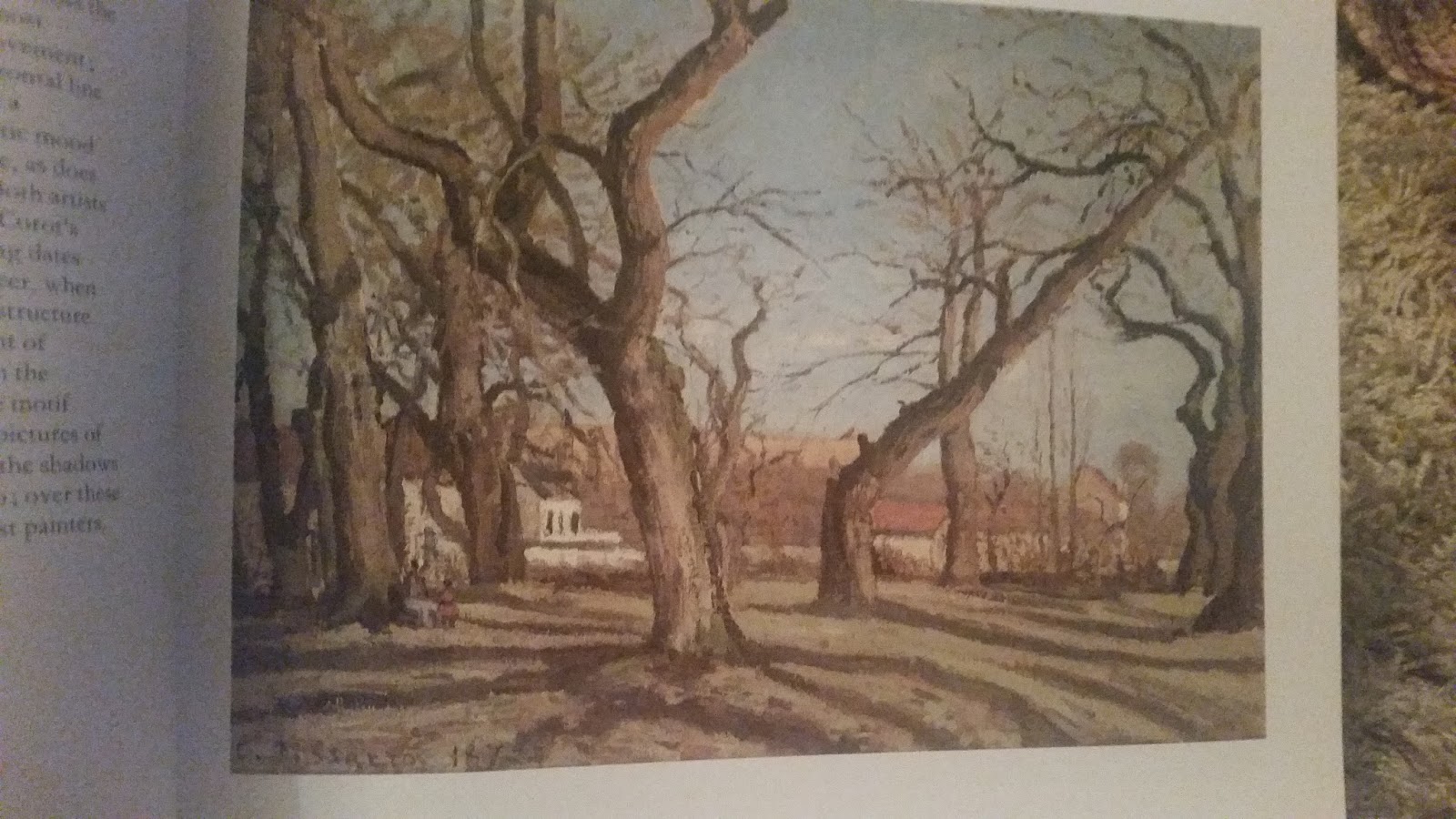
Pissarro
the outer boulevards, snow 1879
Book: Impressionist Seasons Helen Langdon 1986
Book: Impressionist Seasons Helen Langdon 1986

After looking through some books I cam across a few useful photos towards my research. The above painting is by Pissarro. It is a image of a winter landscape. I get a sense of the snow being thick and it is still snowing. I like the fact that there is a figure there and there are foot prints in the snow of where he has walked from. The colour's are quite dull but you get a sense of the artist painting this while trying to look at the landscape with the snow falling in to his face.
Pissarro
Chestnut trees Louveciennes 1872
Book: Impressionist Seasons Helen Langdon 1986
Book: Impressionist Seasons Helen Langdon 1986
I managed to find some more of Pissarro's work in this book. It gave details on what he was painting and the use of his colours and themes which captured seasons of nature well. The one above is a great one for me to look at on how he captures textures with in a landscape especially the bark on the trees. I like the use of colour's here lots of subtle tones.
Alfred Sisley
Church Tower Autumn effect 1874
Book: Impressionist Seasons - Helen Langdon 1986
Book: Impressionist Seasons - Helen Langdon 1986
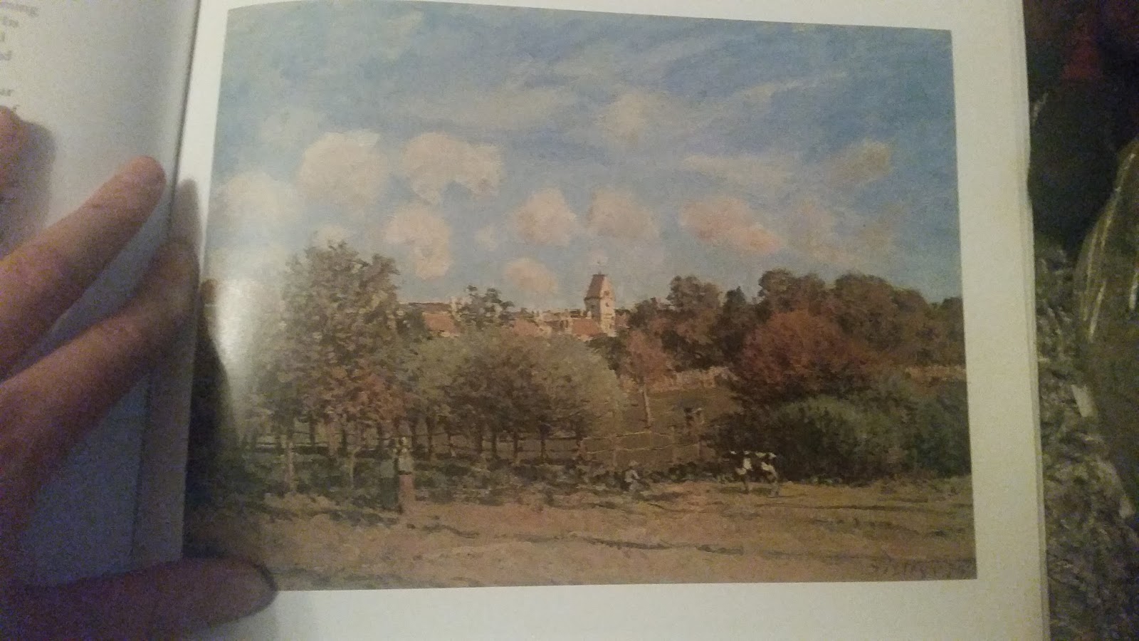
I liked looking close in this painting as there is a lot of detail to it. I like how he has create texture on the trees and the colours. It is a good realistic painting with added texture.
Samuel Palmer
In a Shoreham Garden 1803-5
Book: 100 Masterpieces of Art - Marina Vaizey 1979
Book: 100 Masterpieces of Art - Marina Vaizey 1979

I found this to be quite an different style of paintings, more illustrative in a way. I like how Palmer has captured the blossom on the trees. There is not much texture which shows me the artist was only looking at the basic shapes of the landscapes.
Auguste Renoir
The Seine at chatou 1881
Book: Impressionist Seasons - Helen Langdon 1986
Book: Impressionist Seasons - Helen Langdon 1986

This is a beautiful painting with a great amount of detail. I like the textures in this painting they work really well in the foreground. The composition on the landscape makes you want to look far out in to the distance, with the bushes framing the scene.
Paul Cezanne
La Montagne Sainte-Victoire 1886-8
Book: 100 Masterpieces of Art - Marina Vaizey 1979
Book: 100 Masterpieces of Art - Marina Vaizey 1979

Cezanne painting shows to me not much detail created but its simplicity creates and easy on the eye view. He has captured the basic element so the view can see he landscape clear. The view he was painting was of a distance so little detail is needed anyway. The only extra detail he needed is in the foreground for the tree. I included this painting just to show a simple form of a landscape, showing the basic outlines and colours.
Monet
Lavacourt, Winter
Book: Impressionist Seasons Helen Langdon 1986
Book: Impressionist Seasons Helen Langdon 1986

A winter atmosphere is created here, with tints of blues to show the coldness of the snow. It has little colour which works fine as the snow s thick and covers the land and buildings. I feel it is a good example of a snowy scene.
Shirley Trevena
Blue China

I took a photo on this abstract painting, as I really likes the use of colours and the way she has looks at the jugs and disorientate the image to create a abstract painting. The blues purples and greens work well together here.
Van Gogh
could not find info on painting
An introduction in to painting Landscapes - Ted Gould
An introduction in to painting Landscapes - Ted Gould

Here is a painting of Van Goghs that I found in the book. You can see his painting style well. His impasto marks flow differently on each object creating a interesting texture. He is some one I look up to and will be taking note of his works later on to help with my own final paintings.
Nicholas Verrall
Le Petit Dejeuner
An introduction in to painting Landscapes - Ted Gould
An introduction in to painting Landscapes - Ted Gould

I loved the colours of this painting. The trees leaves are very detailed and filled with a glorious orange tones. You can really see how they have captured the light well from the sun. the colours are very natural yet the tones help the sunny atmosphere stand out at you.
Research from Magazines
I had many magazines for art which I had collected and decided to go through those to get snippets of images I liked and useful information that would help me for this assignment. Please see pictures below to show my research which is in my sketch book.
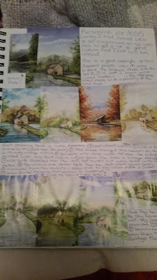


As you can see above I found quite a lot to talk about. I picked out all art that useful to me. I was looking at subtle colours, textures, interesting ideas and understanding ways of painting in an abstract way. I really enjoyed researching this and feel excited to get started my self.
Useful videos - looked at to help my research:
Impasto
https://www.youtube.com/watch?v=brY2cDAvpZ0
https://www.youtube.com/watch?v=foOGT1sITrw
https://www.youtube.com/watch?v=VQar4O7MiZM
https://www.youtube.com/watch?v=HZso660IVz0
https://www.youtube.com/watch?v=86RsoSdIN4w
Canvas Textures
https://www.youtube.com/watch?v=ClJMtXNytWs
https://www.youtube.com/watch?v=mcfQW6PysBE
https://www.youtube.com/watch?v=f-C547fgHx8
https://www.youtube.com/watch?v=_jcaXp6EHPk
Colours and tones, looking in to subtle colours
https://www.youtube.com/watch?v=uuVgF4sb5b8
https://www.youtube.com/watch?v=dhLq1M13TUE
https://www.youtube.com/watch?v=j2lRO4WcfL4
https://www.youtube.com/watch?v=fxLag-_-soY
https://www.youtube.com/watch?v=aiH3k41YY_E
https://www.youtube.com/watch?v=SYRuH13BZd4
Mediums to use in oils
https://www.youtube.com/watch?v=oWrpWzZHPzY
https://www.youtube.com/watch?v=z7DWCoS-eiE
https://www.youtube.com/watch?v=6Dt02-loNNA
https://www.youtube.com/watch?v=LfeeKpv8RQo
https://www.youtube.com/watch?v=xeZGc8CIBrc
Artists ways of paintings
https://www.youtube.com/watch?v=-Ftb1mkN30g
https://www.youtube.com/watch?v=u0TFto-uf_c
https://www.youtube.com/watch?v=5aTqs8MNVfE
https://www.youtube.com/watch?v=z7-tIW7w5GU
https://www.youtube.com/watch?v=sXgjm1WicIg
https://www.youtube.com/watch?v=YpmdlAi0IUY
https://www.youtube.com/watch?v=TNInExsXgQg&list=PLBWc0QA-23wM0d8gJmcJqsBIXRHyKDcVO
https://www.youtube.com/watch?v=xICl4l3P57k
https://www.youtube.com/watch?v=wZyJWB8TKuA
https://www.youtube.com/watch?v=CrVE-WQBcYQ
Other tools to paint with such as knives etc
https://www.youtube.com/watch?v=Z3h_sjDFdH8
https://www.youtube.com/watch?v=wFOWEFm866w
https://www.youtube.com/watch?v=RzSHhW41bVA
https://www.youtube.com/watch?v=BGke6a0oKug
https://www.youtube.com/watch?v=fGc6n3-zbKo
https://www.youtube.com/watch?v=Mni-q1Hr_So
https://www.youtube.com/watch?v=aQv_VrMYHRw
https://www.youtube.com/watch?v=RzSHhW41bVA
https://www.youtube.com/watch?v=UXhBLNUfMgE
Colour research
My best colours I enjoy to work with are subtle colours, Here I just want to look at some colours to which I find most attractive and ones hat work well together. I have had a look at some of the websites below to help me to look and understand there relationships better. https://uk.pinterest.com/spcraig/subtle-color-palettes/
On the above pinterest website the colours that this page opens up with make me see colours in a harmony sense of theme. They work well together and I think they are very beautiful colours. They make me feel calm and relaxed and pleasing to the eye. Not one stands out more then the other. The are all neutral colours next to each other.
Looking at colours around us:


As you can see all above images have subtle colours to create beautiful scenes. They are soft and have a delicate feel to them. I prefer these to bright colours, as they remind me of my own personality. They are not loud but they are there, they make you feel at ease and they are colours that make you think of nature and its natural colour.
Some paintings I came across to show use of subtle colours:
http://fineartamerica.com/featured/white-flowers-paula-day.html

http://fineartamerica.com/featured/misty-magnolias-paula-day.html

I like the use of the purples working with the turquoise colour in the background. It also is good to see the plants outline obtained by using white. This is a new idea to me and I think it creates an interesting image to look at.
http://fineartamerica.com/featured/south-africa-protea-karen-armitage.html

This final painting I am going to look at shows the colours looking like a dream, they are blurred on the paper and yet I can still grasp what the objects are in front of me. The dream essence provokes the calming feel you get when you look at a subtle painting, exaggerating the colours personality.
Research in my Sketch book:


Overall colour research is an ongoing subject to me. Along the way on this assignment 5 I have learned so much about colours and there purpose, that is either being alone in tones, or working with colours that reflect and compliment each other.
I like subtle colours and I now realise looking back before I even started this course, that I have always been using them with out even realising it. I still have a lot to learn regards understanding them more and mixing colours, but I feel this will improve overtime. I am looking forward to using them and to make viewers feel relaxed and happy when they see my work.