This technique I feel, is one of the main tools you need to become a good painter. It is a technique that helps blend colors and achieve color gradients. Its one of the main techniques that really you need to practice and Learn.
Exercise - Tone Graded Wash and Overlaying Washes:
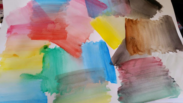
For this I used Oil paints Ultra Marine firstly. I started top of paper, just using paint and then kept applying white spirit to the paint as I went down the paper, to thin the paint. It showed the gradient of the colour and It was quite easy to do the only issue I thought is that I kept seeing the brush strokes in the paint, but as I'm quite new to painting I am not to sure if that is just normal with an oil wash?

I then put two to the side to dry. I created a purple colour and applied that to the wet blue gradients but this time starting from the bottom working up and using the same technique with the white spirit to blend the two colours together. It was easy to merge them together while the blue was wet as it blended easy.
Once the other two were dry I then applied the same purple color to them again as a gradient to mix with the blue wash. I found this quite difficult to blend as the blue was dry so instead of the paint merging the purple was goings on top on the blue. It still looked like a good gradient two colour wash, but it took me longer to blend together and didn't run on the paper as smoothly as when the blue was wet.

I feel this technique with the blue would be good to employ it as an ocean or a sky. You could use other colours such as red and yellow to create a good sunset in a background. The technique can be used to create a good background then apply detail on top.
I feel this technique with the blue would be good to employ it as an ocean or a sky. You could use other colours such as red and yellow to create a good sunset in a background. The technique can be used to create a good background then apply detail on top.
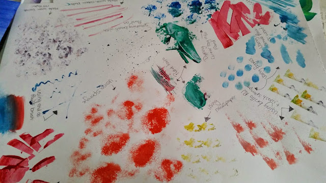
I then attempted to practice, to see what mixed colors work well and which of those didn't. This time I used acrylics. I found that they were so fast drying ,that I had to go as fast as I could to merge the colours together. I feel some of the colours that mixed well were yellow to orange to red, Blue to green, pink to red. I feel some that didn't work were red to black and blue to red. I just feel once they were dry and I looked at them, that didn't appeal to me as much as the others the colours seemed to clash a little.
Mark Rothko
I had a look at Mark Rothko artwork called: The Seagram Project on www.tate.org.uk. His use of colours is very good. You can clearly see that he knew the contrasts of colours and which colours suit best against each other.

Mark Rothko Seagram Paintings www.tate.org.uk
His work was influenced by the destruction of Pompeii. The paintings contain colours which give a sense of fire, smoke, ash and blood. All the more chilling, since not long after he donated his work to Tate Modern, He committed Suicide.
I feel now, I understand paintings like this better. It must of took him a while to paint them and to get the colours and contrast just how he wanted.
I hope to understand for myself and get a feel of knowing which colours look best and those that don't work well together to improve my own work.
Exercise - Opaque colour Mixing
For creating Opaque colour, instead of thinning the paint you can create a gradient using white paint. You start off with your colour and as you go down to make it lighter, you just keep adding a bit of white to change the tone. I found this far more better then the washes. The paint coverage was more thicker and the colours were more nicer. On the left side of the paper I tried oils and on the right side, I tried acrylic paint. Acrylic was fast drying so merging the colous together was a lot harder and didnt turn out as well as the oil paint. The oil paint worked great takes longer to dry so you have chance to get the colour just how you want it.

Overall
I feel these types of techniques are a must for every artist to learn. Transparent and Opaque will be beneficial to my work in different areas, to create different effects. Transparent washes will be great for back grounds and fill in big base areas. Opaque will be great for adding detail to your work. They are more vibrant then transparent so I would use these mainly for the objects that I an drawing, to make it stand out on the paper. Both techniques are great to use for different layers on a painting and I think using them together will create a great effect that works.
Exercise - Monochrome Studies
For this exercise I had to find a tree to sketch and then paint 2 paintings
1 - paint background and then positive shape on top
2 - paint dark base the paint in all the negative area around the tree.
so I did my sketch first...
Then I painted the first drawing. the positive out line of the tree turned out well, I didn't add all the branches in, just to keep it simple. The silhouette of the tree was easy to look at and concentrate on. Just looking at the object this way I guess is a normal way.
I then did the second painting and I felt it was really fun to to. I did find it hard to keep the smaller branches. I kept finding it hard to work fast yet keep some of the trees little details. I feel it came out with a good effect. Even though the first drawing is more clearer. I found that the second drawing gave a different look to my work it made the darker colour have depth in the painting and a bit of a retro look about it.
I think concentrating on the objects positive space, gives you more detail to it but it can deter you from looking at the shape correctly. Looking at the negative helps to get more an accurate shape to the object but does not allow you to see detail of the object. I have found by doing this exercise that you need to train your self to look at both ways to get a more realistic and accurate drawing.
I think this type of painting method could be good for a painting of a sunset and the silhouettes of the buildings/landscape in front of it. This would be a good affect for that type of view.