Introduction Research
For this research part, I am going to look and choose some landscape paintings from the 18th century up until today, that appeal to me. This will help me look closely at there techniques and the way landscape paintings have changed through out different art eras such as Impressionists, Non- Impressionists and post-Impressionists. I think this will be interesting to look at, to give me some ideas to help with my own landscape paintings and to see how other artists look at the world.
18th Century
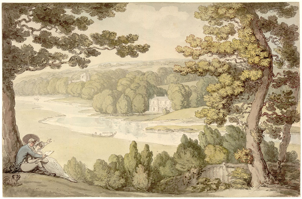
The Country House' by Thomas Rowlandson (1757-1827), about 1800, watercolour over traces of black chalk on paper. Museum no. P.117-1931, © Victoria and Albert Museum, London
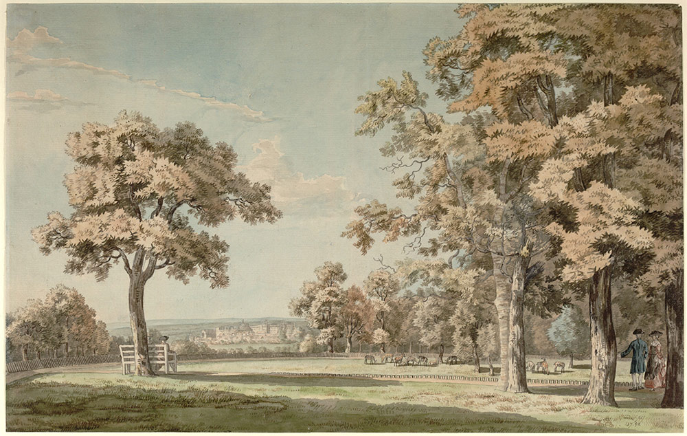
Windsor Castle from the Great Park, Near the End of The Long Walk, by Thomas Sandby (1721-1798), 18th century, watercolour on paper. Museum no. 137-1892, © Victoria and Albert Museum, London
I came across these two paintings on the Internet whilst searching for 18th Century paintings. I really enjoyed looking at these two paintings. You get a sense on the distance within each and the artists do this by making the background more fainter then the foreground. These two paintings are done by two different people yet look like they have both used the same technique. The subtle colours work well together. The soft greens and brown give a typical English landscape feel to it. This art appealed to me because of the illustrative way it has been done using outlines to make objects stand out.
Joshua Shaw (1776-1860). "Seven Hills: An American Landscape," 1818. Oil on canvas, 17 1/8 x 24 1/4 inches. Signed and dated lower right: J. Shaw / 1818
Image Courtesy of Hawthorne Fine Art
This painting really caught my eye, the small cows grazing with an amazing view of a valley behind them. The typical rules of landscaping are used again here with the background faint and the foreground darker, to create a sense of depth. He has used yellow greens in this painting which creates a good effect for the light of the sun, the atmosphere of the sun setting. It looks peaceful and I can just imagine my self sitting there having a picnic. This appealed to me as it is a little illustrative and it is the type of painting style that I am trying to create.
19th Century
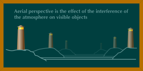
This Century was the golden age for landscape paining. It became important in the art world. Three aesthetic concepts established during this era divided the natural world into categories: the Pastoral, the Picturesque, and the Sublime. Pastoral and Picturesque represent Nature as a comforting source of physical and spiritual sustenance. The Sublime, refers to the danger and excitement of confronting untamed Nature and its overwhelming forces, such as thunderstorms and volcano's. Whereas the Pastoral and Picturesque reference mankind’s ability to control the natural world, the Sublime is a reminder that humanity is not all-powerful, nature still prevails us.
Pastoral landscapes celebrate humans power of taming nature. The scenes are peaceful, often depicting ripe harvests, lovely gardens, manicured lawns and fattened livestock. it yields the necessities we need to live, as well as beauty and safety.
The Picturesque is a category developed in the late 1700s by artist William Gilpin — refers to the charm of discovering the landscape in its natural state. Gilpin encouraged his followers to engage in “picturesque travel” – the goal of which was to discover beauty created solely by Nature. The artist and the viewer delight in unspoiled panoramas: sunsets behind majestic mountains, a quiet marsh, a deer in the woods. These scenes are uplifting, but not frightening.
I found some sketches Gilpin made, whilst out looking for a good area to create a landscape painting from:
Rev. William Gilpin 1724–1804 - date of landscape unknown - Graphite and ink on paper
http://www.tate.org.uk/art/artworks/gilpin-landscape-t09537
Rev. William GilpinLandscape date not known
http://www.tate.org.uk/art/artworks/gilpin-landscape-t09535
From these sketches, I can see that he wanted to capture quickly the essence of the view he was looking out to. These are quick sketches, yet there is enough drawn there to understand the main key elements of that landscape and enough information to understand what is in the foreground and background, with harder pencil lines being in the foreground then the back to make it create a sense of depth.
Rev. William Gilpin Landscape, a River between Hills date not known
http://www.tate.org.uk/art/artworks/gilpin-landscape-a-river-between-hills-t09534
Imitator of Rev. William Gilpin Mountains and Lakes date not known
http://www.tate.org.uk/art/artworks/gilpin-mountains-and-lakes-t09542
Now looking at some of his paintings, I can see how useful quick sketches are. The help to note the key areas and elements of your landscape you are looking at and also to create the statement you are trying to show the viewer. The paining above of mountains and lakes is one that I like the best due to how quick it looks painted, yet he has captured the light, depth and movement within that area. The colours he has used work well together and to finish it off with ink which helps to add detail and textures to the environment with in that landscape.
Sublime images, on the other hand, show Nature at its most fearsome and powerful. Humanity looks small and helpless in front of raging rivers, cliffs and canyons, ferocious animals, and violent storms. These works can be uplifting, but in a deep spiritual way. The Sublime emphasises God and nature's dominion, over humanity and considers the possible flaw in mankind’s overriding confidence.
John Constable
Wivenhoe Park, Essex, 1816
Widener Collection
1942.9.10
http://www.nga.gov/content/ngaweb/Collection/paintings/British.html
In the 19th Century the famous artist Constable took the landscape painting world by storm with his amazing paintings. There is so much detail involved and you can tell he enjoyed painting what he was observing. Some aspects of his work are illustrative but I feel this is more of a natural painting then the ones I have looked at above so far. The reflections on the river and the details to the animals finish this painting off well, creating a typical English summers day.
Richard Parkes Bonington The Grand Canal, Venice 1826
http://www.tate.org.uk/art/artworks/bonington-the-grand-canal-venice-t00965
Bonnington sketched this with pencil and used chalk for highlights, I wanted to input this in to my research as you can see how other artist observe landscapes and how they sketch it out before the painting. This sketch compared to William Gilpin's (above) sketches, shows more time was taken in to it to capture more detail. As with a building landscape there are more lines and detail then a typical countryside landscape.
Richard Parkes Bonington - A View of the Rialto Bridge, Venice Date: ca. 1826 - Watercolor on paper http://themsv.org/artwork/view-rialto-bridge-venice-0
This is one of many Bonnington painted of Venice. This type of painting does not appeal to my style. His work is very realistic to his surroundings and there is a lot of detail to create this perfect scene. I can understand the painting and what it is, but I find some areas hard to understand what is there. I also think the sky needs some more detail to fit in with the rest of the painting.
20th Century
Pilgrim Corner painted by Gordon Willbond
http://www.pilgrimcorner.co.uk/history.html

As my tutor informed me, my painting is of a type of naive art, I need to improve this to create my own style.
It was not until the 20th century, that I started to come across typical naive landscape paintings. I have had a look at some great ones and also now feel more positive. I have picked some on the best ones to look at that I spotted. The painting above of the ''Pilgrim Corner' caught my eye. You can tell with this painting that he sketched it out with paint first then painted within those lines. I think this is a charming piece of art work and he has captured a small village scene really well. His lines are not straight as can be but this also gives atmosphere to the painting, as old thatched houses tend to be a little wonky. There is more detail in the foreground then the background which gives you the sense of receding space here. He has painted lighter areas on the buildings in some areas to capture the light flowing through this village street. I can also see the reflections on the windows which is a great way to also capture the light in that area.
Landscape; Oil on Glass - Ivan Generalić
http://abookfromsnowyriver.blogspot.co.uk/2011/11/review-art-of-hlebine-school.html
This painting above created by Ivan Generalić is very simple and naive, I guess this is also due to it being painted on glass but it does create a good landscape painting. The sky is very dark but I am presuming once directed at the light this becomes lighter. I wanted to incorporate this in to my research because of its naive aspect. Looking at this, I can see that to improve my style, I need to be a bit more precise and add more detail into my paintings so there is something to look at up-close, as well as seeing the overall aspect when stepping back.
Gypsy festival - Ivan Generalic

This type of art work really excites me, I love the colours and the style is has been painted, I class this as naive art and again I can see to improve my painting style, I need to add small detail to create texture within my paintings, such as this one. You can notice the detail on the trees, with the leaves added in to create there overall texture. The grass has fine lines to create its texture. All aspects of this painting is to capture the essence of this landscape and not really the reality of it. It shows a group of people (gypsy's) peacefully living with nature, which is the statement I feel the artist is trying to employ. I really can learn a lot from this painting and will be looking at Ivan's work some more during this assignment.
Charles Wysocki - Burma Road
http://www.gingershangup.com/Charles-Wysocki.html
Nantucket Winds
http://www.gingershangup.com/Charles-Wysocki.html

I came across Charles Wysocki's art on the Internet and it really caught my eye. He has create naive landscapes, yet they are very flat paintings. There is little sense of depth in them, accept you get a feeling of this only by the painted landscape, where he has put hills and mountains behind. In the first painting 'Burma Road' there is a path which leads up to the top of the hills. You can also see he has not much depth here due to all objects throughout his paintings, are of the same size. Some are slightly smaller, but not enough so to create depth in to his work. He has taken away the typical rules of painting a landscape, yet he has created some thing new and fresh - His own style. He has used bright colours and used small areas of textures to create objects. I do like his work however, I do also like to show depth in my own style, these paintings seem to flat to me, but I do like his way of thinking and also they way he had drawn and created the objects within his paintings. Again I feel this is another artists work to look at to see what different small marks he has used to create texture and style with in his naive style.
21st Century
Paradis-tigre
http://www.catherinemusnier.com/
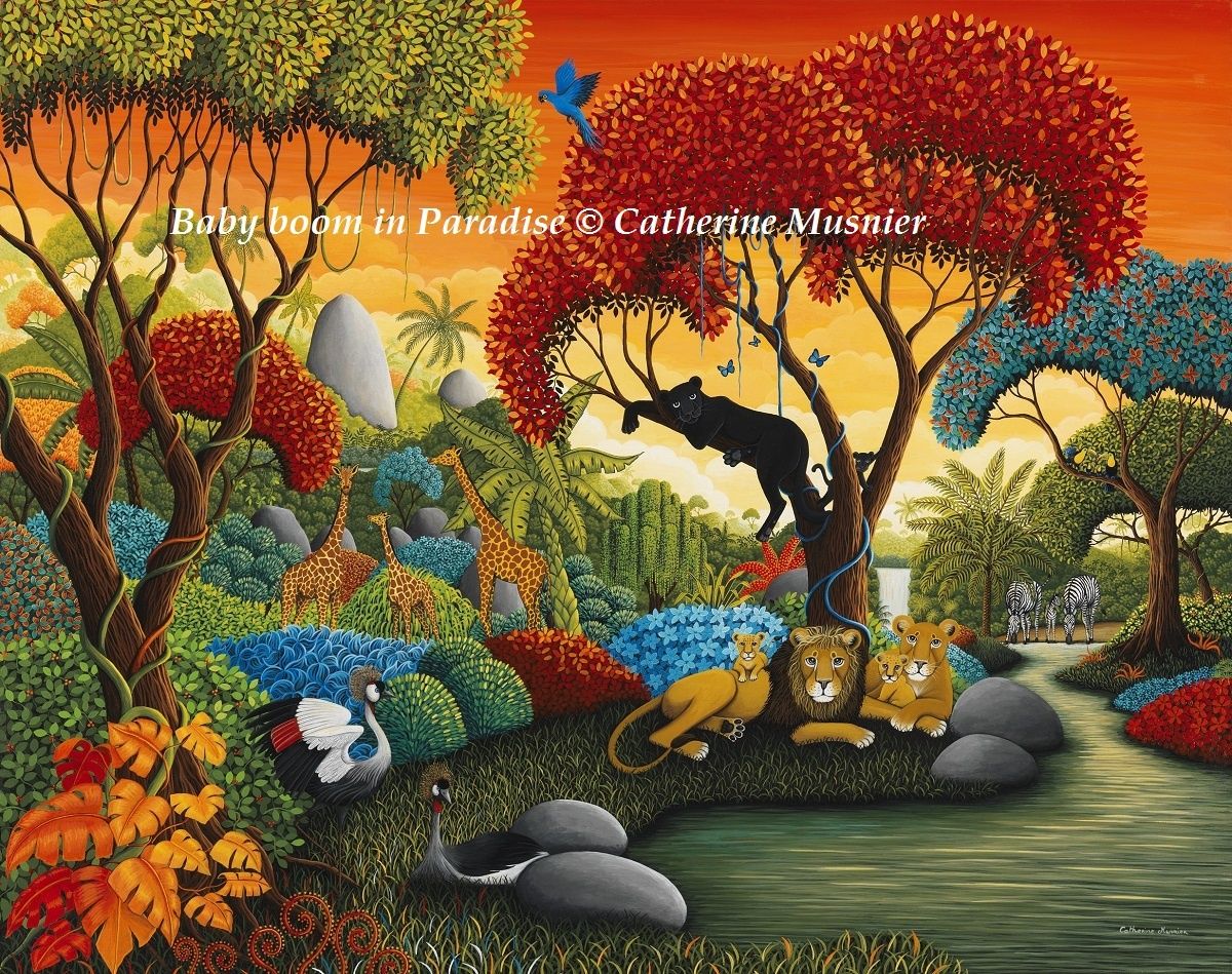
I just love Catherine Musnier art. Her painting style is similar to how I would like to paint. The are so fun to look at and the bright colours really attract you to the painting. This is a typical Naive art and I could learn a lot from her work. The small details of the bushes and trees create there texture. She has used lighter colour leaves on the tips of the foliage, to create light areas and darker areas to create shadows. With the animals she's created her view of a nature paradise, with no humans, which I also admire as I love animals too. Some of the bushes are painted blue and reds which make them stand out. Her style is again of naive art where they capture the essence of the landscape but not really the reality of what she is looking at . She uses her imagination to show her ideal paradise. I really love her work and will be definitely take note of how she creates her style.
Rolling Home - Leigh Lambert
http://www.watergatestreetgallery.co.uk/art/720283/rolling-home

I saw this painting in a Chester art gallery a few weeks back and I thought it captures a great urban scene. It is dark and dull and no aspect of nature to be seen. There is only the sky which looks gloomy over the building, which shows to me the sadness of nature, which has been tamed by humans. The artist has created quite a few of these types of paintings. The are all grey and dark. Its really eerie of how Humans are destroying the environment. There is two children in the middle of the painting which gives me an indication that this creates the hope with in this scene and that young people can learn and make a change. There is one house with there lights on which also stands out of this painting. I think this painting is really powerful statement and one which every one can learn from. It also shows statements can also be important with in a landscape painting to show environmental change and how important it is to look after nature as it gives us colour and happiness to our surroundings.
Paul Corfield - A Special Place
http://www.castlegalleries.com/art/a-special-place
This painting is very simple and again, has a naive aspect to it. Corfield has created depth by lighter tones of colour for the background of this landscape. The hills are exaggerated to emphasise the hilliness of this landscape and the tallness with the level of the hills reaching the clouds. The trees are simple shapes of triangles and circular shapes. There is a pathway that leads from the foreground to the middle-ground, to a house which is the main focal point in this painting. I do like his painting, it over excels the hills which are unrealistic, I like the scene of a dreamy landscape. However I think its too simple for what I would paint in my style.
http://www.tuttartpitturasculturapoesiamusica.com/2012/03/miguel-freitas-naive-impressions-and.html

Miguel Freitas
http://www.tuttartpitturasculturapoesiamusica.com/2012/03/miguel-freitas-naive-impressions-and.html
This is the last artist I would like to talk about for now, I just happened to find his website and I really liked his work. He is a naive artist but also a surrealist. His buildings tend to look as though there reaching up to the sky, overlooking the ground below them. In his work, you get a mixture of nature and buildings. He has used bright colours, which captures the suns presence within the painting. As he painted in Portugal, you get a sense of the heat and that typical holiday feel to them. I like the way he has added texture to his paintings and the depth he has created by using lower toned coloured buildings in the background. This is another artist where by looking at his work may help with me adding textures and detail to my own style.
Overall Conclusion From Research
I have found this research to be of great help towards my ideas and how to improve on my style of painting. Pastoral, the Picturesque, and the Sublime, these three competing ways of looking at Nature are still relevant today. In the 21st century, we still question humanity’s right to use the planet for only our own good. Global warming, mining rights, wildlife preservation and land use are all controversial issues, they play a big part in today's world. You can see as Centuries go by that there are more urban lifestyle paintings and less nature aspects within them.
Only we can change the way we think and the paintings I have looked at slowly show nature declining. Only we can make a change to save the planets nature - if not nature will take over and do its best to get rid of its parasites. I am one for being green as there are so many beautiful places in the world, so many are expressed by artists but it is in decline - if we don't change - maybe one day we will only have paintings and photos to look at what was our planet like before we changed it and overruled it completely.
Exercise: View from a window or door way
For this exercise I have got to look from a door way or window and paint the landscape I can see out side. i can have the door or window open to create a sense of depth in my painting. I am just going to look on the Internet to see how other artists paint a view from a window of door:
Research for Exercise
Magnificent Southwest - Magnificent Southwest - October 28, 2011
https://mikkisenkarik.wordpress.com/
I really enjoyed looking at this artists work. He's also good as he gives tutorials on how he produces what he creates. I think his colours are very vibrant, which I want to try to develop in to my own work. His light reflecting of his doors and various other objects is really well done and the painting does have a sense of depth to it.
Randy and Lib Travis - 2009
Wall Mural - View of the Eilean Donan Castle in the Scottish Highland
http://www.artandmurals.com/landscapes&trompeloeil.htm

This is a mural on a wall I wanted to input this as it can create depth to any room by painting an archway and a landscape through it. I think its a very good idea. It creates more space to the room its self and is a great Idea if your struggling for an actual window. It is a very relaxing painting and bringing nature indoors.
Morton Sacks - View through window of harbor
http://www.drawrm.com/sacks.htm

This is quite a naive painting. Again as I am starting to notice naive painters are bold with there use of colour and that is also something I like to look at. The red tulips compliment the ocean outside the window and it looks like a great summers day for a boat ride. I have notice some of the textures are created by direction of brush stroke such as the ocean.
Diane Romanello - Island Time Window
http://fineartamerica.com/featured/island-time-window-diane-romanello.html

The windows in this paintings are the reason I wanted to include this paintings. I just wanted to look at how they had painted there lines so straight. The windows open give a good depth to the painting and the use of colours; blues, yellows, greens and whites bring this painting all together well. I like the texture for the flowers just by dabbing a brush, it give a good effect to there appearance.
Sketching
I could not find many door and window paintings in naive art. I think these are the nearest I could find, although they do have realistic qualities to them. I have now got an idea of what I want to create.
For this first painting I just want to try and create a realistic painting before I start using my style that I want to express. I want to see if I can understand the landscapes natural form. I want to really look at the landscape and try to learn some textures from what I see. I have decided a view from a window, as I am limited to landscape views from my doorways. I am now going to do some sketches and see what landscape/view I like the best:
I have done 2 different views from different windows and I have decided I would like to paint the third sketch. I have moved home and the view from upstairs to outside is just breath taking so I am looking forward to trying to paint this whilst in my new art room.
I have now drawn it in charcoal on my board to make sure I have got the landscape composition as I see it. I am now going to begin to paint.
Painting
Firstly I have decided to experiment with colours (mainly earthy colours) and do a chart, so I can see how to make different greens and browns as below:
I feel this has really helped me and will be useful throughout this assignment to try and get the colours as I want them to be.
After my first night of painting I feel its coming on well. I have painted the sky and got some of the basic colours down for the trees, curtain and buildings.
Now its dried I am going to start looking at textures. I want to do this painting in a natural way just to grasp some of the objects I am looking at. I notice trees are dark within there bushes/leaves and you need to add small leaves on top a few different lighter greens and yellows,to capture the light. The hills in the background are of a faint blue colour and the next hills in front of that are green. As there are buildings in the background I am going to miss some out as there is a lot of tiny ones. the main building I want the viewers to look at is the Russell Hall Hospital, the white building. I think this is a key focal point in my painting.
I have now finished the landscape area and I am going to finish off the frame which is my window and curtain around the landscape. I am constantly reminding my self to add texture and small detail. I have decided to use a sponge to add detail to the curtain to see if I can grasp some of its fluffy texture.
Final Observation
I have now finished my painting. I finished it off with the window handle and did some final checks to make sure it looks correct. Its been a few days since doing it and looking at it now I feel quite happy with the landscape. I think the flaws in this painting is that the bushes in the fore ground need to stand out more, perhaps with darker colours of green? or maybe I should of done the background in lighter greens to make the foreground stand out. I also think I have too much curtain there and could of painted more of the landscape to the right. I do think the way I have added in texture (more then usual) was actually fun to do and looks a lot better now looking close. I also can see looking up close that its interesting to look at where I have place the paint and the technique I did it.
Overall I feel I looked at what was there and painted it as best as I could. Next exercise I will input my own style I want to create and see what I can come up with.
Exercise Hard or soft landscape
For this exercise I have to choose between a hard or a soft landscape. I have decided I would like to try a hard landscape, as I have just tried a soft landscape view in previous painting. I am now going to again look and see if I can find some naive types of paintings for hard landscapes to get some ideas on how to push my style I want to create:
Research for Exercise
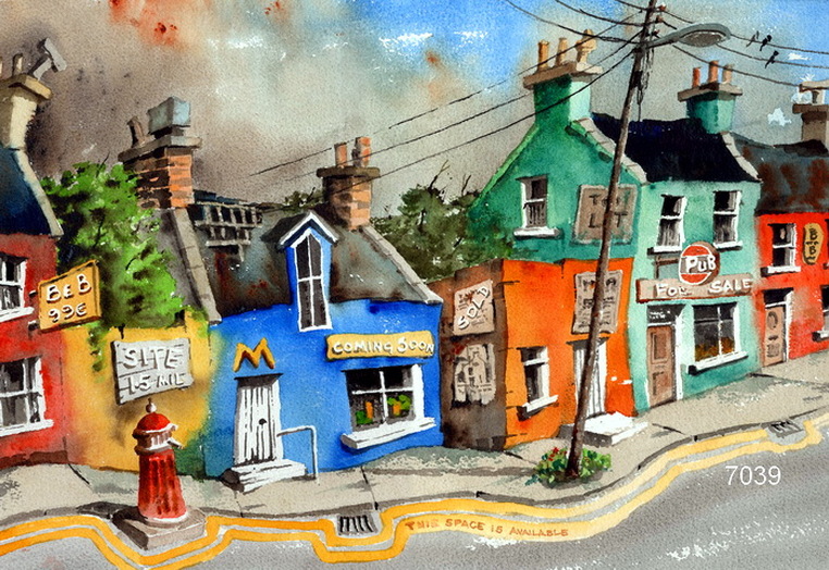
Val Bryme
http://www.irishlinksworldwide.com/7039-what-are-we-coming-to.html
https://redragnews.wordpress.com/tag/irish-artist/
I really admire Vals Hard paintings, He has captured the very atmosphere I sense when thinking of a place like this. It is dull and gloomy except, he has used bright colours for the buildings which make then stand out. With the smouldering sky behind these buildings you get a sense this is in a industrial area. The buildings are not straight neither is the path which indicates to me a cobble old road.
http://www.dailypainters.com/paintings/222682/Daily-Painting-Begbie-Street-urban-scene-painting-city/Carolee-Clark
There is a lot of basic shapes used with in this painting to for a street. There is a great deal of depth and space created by cars and a person which you can sense the size of the buildings. The colours here are bright and not much texture is used her just bold colours with highlights of different colours within them. This is to show light reflecting off the windows and building structures. The foreground is the most detailed and the background has hardly any detail at all. I do like this painting even though simple it is still quite interesting.
Michael Birawer
http://www.michaelbirawer.com/sseattle.html
Second City
http://www.michaelbirawer.com/s2nd.html

Michael Birawer creates his art using acrylic on 3d wood. I really like his surreal aspect of the sights he is looking at. It kind of looks as though he drinks when hes painting, so when he is looking out his vision is all over the place. His work is easy to understand, a style I would suggest as looking like a cartoon. I love the colours he uses and the way he expresses his own style. He has done lots of paintings and his style is found through out them.
Raphael perez painting rafi
http://dart.fine-art.com/art-172838/raphael-perez/naive-art-paintings--raphael-perez-painting-rafi
I added this painting, as a good idea for adding texture to my work. There is a lot of different textures going on which bring the painting together, to look really interesting. This is a naive painting, which is great to look at to see how I can now push my naive style and improve. I like the textures on the building walls created by using a mixture of colours, they are very colourful.
My Ideas and Sketches
Now that I have had a look at some naive artists, I feel as though I now understand what I need to do to finally move forward and produce my own style. I want to add Bright colours and create texture by adding smaller detail. The first thing I need to do is recap on my colours again and put colours next each other to create brighter colours (compliment each other) I am now going to do a test in my sketch book.
I have now refreshed on the use of colours together. It is a great page for reference for me to always go back to to look at. I am going to begin to paint my scene, I feel confident in what I am going to do.
Painting
I have firstly draw my hard landscape on my board in charcoal. I am going to paint the basic colours of my painting before I start to add the textures.
I have now painted to basic colours in for my painting as you can see above. By looking at this I have decided I am not happy with the roofs basic colour which I will change in my next layer. I would like a hit of colour as I can see moss on some of the roofs they are not completely grey. Also the bush in the foreground on the right I have painted it a green which I think is too light for the basic colour. I am going to go over it and used darkest green I can make. I want to try to layer it up with leaves getting lighter and lighter on each layer that I apply. I want to try and create a sense of depth but also highlights showing the light in the area that hits the bush.
Its been a few days now and I have finished my painting. I could not write on here due to my pc breaking but it has now been fixed. Here is the finished painting:
Firstly, I had some issues with the painting which I want to talk about. I painted the bush in the foreground with the fence and loved the way I had painted the layers, it really stands out. However when I came to painting the buildings, I wanted to try to created the same technical idea, working from a dark base colour. Whilst painting I ended up mixing a lot of different colours to get the textures. I think I got the texture well but I don't think the style fits in well with the bush in the foreground. Its as though there are two different styles in the painting. I also found the hardest part was painting in the windows and the curb on the far pavement area. They were really awkward areas to produce even with a fine brush.
I think the colours I have chosen are bright and work well together. I really like the clash of greens and reds, which really make the painting stand out. I really enjoy expressing my self with this painting technique as well as looking at my scene at the same time. It was very different for me to look at something/a area and create a unique view from it. Using my own ideas of colours and textures. It was very technical, looking and thinking how to place the colours for my painting to catch the eye.
Overall
This painting I feel is just the beginning of my personal voice, I finally feel like I am actually enjoying painting instead of following steps and being unsure of my self. I enjoyed the technical way of looking at colours and placing them next to each other to make contrasts with in my painting. I am not saying this painting is great because there are still a few parts that are not perfect, but I now feel that I understand what the technique is of my personal voice. Which is to look at contrast of colours and also build up areas like my bush from a dark base adding lighter layers. I really likes how it creates a sense of light hitting the objects and also the depth within an object. I feel this also helps me to over exaggerate my lights and darks in my painting, instead of being to careful. I am now also starting to add detail to my work so now when a view looks close they can see what I have put in to it to create the overall aspect of the scene.