Exercise: A figure in an interior
I have been looking forward to this exercise as in my Assignment two, I could not grasp the perspective of a room well, my tutor guided me and I re-did some research- making sure I use a ruler! I am going to look over that again now, to see what I discovered and then attempt this exercise.
I wanted a different look for this painting. I want to put someone in a room, that I have not painted yet. I like the idea of the kitchen. Things that are in a kitchen such as a cooker, cupboards, shelving. I feel this could be a good challenge to practise my perspective. For my figure in my kitchen, I am going to ask my friend Amy to pose for me. This will be ideal for her, as she loves cooking, so I hoping my painting will impress her.
I think the best way to show her in the kitchen is by standing at the table in my kitchen cooking/baking a cake. This will show the use of a kitchen on a general day basis.
I now have Amy with me in my kitchen and I have got her in position to try out a drawing in my sketch book.

I have now done my sketch and I am happy with it. I feel I have got the perspective correct here, which I am happy about. The hardest parts were the cupboards on the wall, to the left and the left doorway. I feel my friend Amy is positioned well in my drawing and she looks like a natural chef.

Next I thought about colours to use: I decided I wanted the colours to be food based. After thinking about which food, I decided using peppers. The colours are bright and vibrant. I think these colours will work great together and make my kitchen stand out. For Amy I decided that I will do here apron blue to make her stand out of the room.
I have started sketching it out with charcoal on my canvas using a ruler and getting the perspective proportions correct. Now that I have sketch it out, which took me a while with the charcoal, I am ready to paint.

As you can see I have started and so far I am happy with the colours, I have applied, I want my technique to be very expressive. I have decided to paint in block areas first then for the next layer show my expression.

Here above is my painting now all blocked in . I will have to wait for it to dry before I can paint it again.
My painting is now dry and I am ready to let loose on my painting.

I have spent 2 hours on this and I am so happy with the end result. This is a different type of painting, that I would not normally do. I really enjoyed just applying the paint on to the canvas and flowing it on the paper, in to the directions I see the areas going. Such as the cupboards on the left. I have applied the paint so that it aims towards the vanishing point. I think this makes the room look even more longer. I have used some white to show the light reflecting off surfaces. I feel this painting was an eye opener, not just for perspective, but also a new technique of applying paint, that I enjoyed. The colours look vibrant and bright. You can instantly see that this is a kitchen. Amy looks well in the painting too. I showed it her and she loved it. She said when I have finished with it, she would like to have it off me. Which I think was a positive comment.
Overall I feel I am getting better at perspective and adding a figure in a room is quite hard, as you need to show their volume and correct proportion. I feel I have done this here well. I think things that I could have improved on, was to add more detail on my objects in my room, but I wanted to keep it simple, so that you can see my correct angles of them. I am really happy with what I achieved here.
Interior Research:
I have to pick 2/3 paintings and give an explanation of what I think the artists intentions are and to look at the technical creative solutions that they brought to the subject:
PAUL CÉZANNE
THE CARD PLAYERS, C.1892-5
http://www.courtauld.ac.uk/gallery/collections/paintings/imppostimp/cezanne_card_players.shtml

When I was browsing for paintings on the Internet, this is the first one that stood out to me. This was due to the colours used were eye catching together and I like the rustic effect on how Cezanne applied his paint.
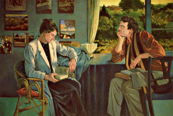
The perspective in this room is really clear by the table in the middle. Its a bold statement and the only white object in the painting which makes it stand out. The people all around the table, are all if good size to the table. I think Cezanne painted this to make the viewer feel welcome to come and play the card game. The rustic colours. create a male scene, which I sense there is betting also going on in this game too. The men are all relaxing playing a game, which I think may have been one of Cezanne's enjoyments he wished to share with us.
The perspective in this room is really clear by the table in the middle. Its a bold statement and the only white object in the painting which makes it stand out. The people all around the table, are all if good size to the table. I think Cezanne painted this to make the viewer feel welcome to come and play the card game. The rustic colours. create a male scene, which I sense there is betting also going on in this game too. The men are all relaxing playing a game, which I think may have been one of Cezanne's enjoyments he wished to share with us.
Oil on panel painting, depicting a family scene in a domestic interior. 1815-1820.
Artist unknown
Artist unknown
© Geffrye Museum, London
http://www.geffrye-museum.org.uk/collections/explore-our-collections/item-detail/?id=O22831
Looking at this grand painting, I guess who ever the artist was, he/she wanted to show the richness of this family. With a lot of gold colour on the frames and mirror in the background, you can sense their intentions were to show just this as well as the men with big well fed bellies and Costly objects surrounding them. He contrasted this by not just showing us a painting of a rich family but also by the use of royal colours to help create the scene.
The woman's dress looks like luxurious silk. The way he has shown the light on her dress is beautiful and shows to me elegance of the lady. The perspective of the room works well and the painter has created depth, by showing the corner of the room. He has used dark shadows behind the chairs to create a sense of depth to the room which works really well.
Betsy and Mark
1988
http://www.ethelfisherstudio.com/Figure_Painting_17_BetsyMark.html
Ethel is a 20th and a 21st artist as she is still around today. This painting really caught my eye. I love how you get a sense on there being a sunset outside and the sun's last rays of the day are reflecting on her figures in her room. I think her intentions were to show a couple investigating something. I can see on the back wall, there are lots of pictures, which look like they are mostly about travelling outdoors. I sense they are talking about where to go next. The man is looking really in depth into the woman as though he is interested in what she has discovered. I think she has also created a sense of wild and outdoors, by painting them with a window in the background. The outside with vibrant colours, shows bushes close to them. They are also both dressed well, so you can they could have the money for it.
The other idea I had, is that they may be artists themselves and the pictures on the wall at the back are actually paintings and they are both researching something to do with art. Ethel has got the perspective of the room well here. The focus in the painting is on the table and the two figures The background when you look at it looks blurred, this creates a focus on the foreground where the figures are. This creates depth to her painting and makes the message of the figures researching, stand of from the painting.
Now I have looked as some paintings I understand it also helps to have a story or a message to show the viewer, which makes the painting more interested and meaningful.
Exercise: Telling a story
For this painting, I have been thinking about this for a
while and because I have been watching a lot of Sherlock Holmes lately, I wanted to create a murder scene. I wanted a dramatic effect with just using whites, greys and blacks and the use of red for the blood of my victim.
I drawed four ideas in my sketch book of what I would like. I decided on the murder at the bottom on the stairs. I want my victim lying at the bottom of the stairs, with a shot wound and my murderer in the foreground, I don't want the viewer to see his face, but I want his body there with a gun in his hands. The viewer will then see a story of a murder unfolding in the painting. The murderer is there but the viewer does not know who he is, he could be her husband, burglar or someone else, but that’s what will make it more interesting for the viewer. They will have to use their own imagination of what has happened here.

I have now done a bigger drawing of the scene in my sketch book. I found the perspective of the stairs quite hard to do but I think I managed it well, I just hope I can transfer it well to the canvas in charcoal.
I have transferred it on to the canvas now. It has again took me a while to get the stairs right perhaps because I
was a bit nervous about getting them drawn correctly. They are quite a challenge to do, as you have to
think where the lines are going to be angled. I am going to begin painting now.
I drawed four ideas in my sketch book of what I would like. I decided on the murder at the bottom on the stairs. I want my victim lying at the bottom of the stairs, with a shot wound and my murderer in the foreground, I don't want the viewer to see his face, but I want his body there with a gun in his hands. The viewer will then see a story of a murder unfolding in the painting. The murderer is there but the viewer does not know who he is, he could be her husband, burglar or someone else, but that’s what will make it more interesting for the viewer. They will have to use their own imagination of what has happened here.
I have now done a bigger drawing of the scene in my sketch book. I found the perspective of the stairs quite hard to do but I think I managed it well, I just hope I can transfer it well to the canvas in charcoal.
With my painting, I now have to decide where different shades of black and white are going to go to create a dramatic effect. I want my murderer's suit to be black so that stands out with his gun shining at the viewer. I want the walls light in the room to help highlight the victim on the floor better.

I have how started painting and it is coming on well. I am
going to fill every area in firstly and leave it to dry, to see what I need to do
next. I think the use of the different shades work well. I have also used the greys to fill in my victims form.
After it dried I spent a few hours on it a few days later and this was my outcome.

I think the way it has turned out, creates an even more eire effect than I thought it would, which helps to show the story better. It has a creepy kind of look to it. For my victim I added the blood around her and used a hint of red in her limbs to create subtle shadow areas on her body. I felt there was quite a lot of blood there for one gun shot so at the end I added in another shot wound, just so that it levels it out a bit. My scene is a bit gruesome but it works well. I could of spent longer on this and added more detail, but ideally there was enough in my painting to show the story. I think the stairs look fine, some of the steps are a bit wonky but I think the perspective works well. I like the banister, at the top of the stairs which set of the stairs well. My murderer in the foreground creates a great effect on my scene. I however am not too keen on, how I have applied the paint to this painting. It seems a bit basic and I could of been a bit more expressive. I think I was concentrating too much on the story, then thinking what marks/strokes I could make to fit the murder scene. I could of done sharp scratches with paint brush strokes to show a chilling effect in my application of paint to inform the viewers more of a horror scene.
Overall I was happy with the story idea I had created. I felt I could of improved on my paint work. I am happy about the stairs as that was a bit of a challenge to take on, but I think if I spent more time on them, they would not be so wonky. This exercise has helped me to next time think more about what you are trying to portray to the viewers and how you can get them involved with your painting.
After it dried I spent a few hours on it a few days later and this was my outcome.
I think the way it has turned out, creates an even more eire effect than I thought it would, which helps to show the story better. It has a creepy kind of look to it. For my victim I added the blood around her and used a hint of red in her limbs to create subtle shadow areas on her body. I felt there was quite a lot of blood there for one gun shot so at the end I added in another shot wound, just so that it levels it out a bit. My scene is a bit gruesome but it works well. I could of spent longer on this and added more detail, but ideally there was enough in my painting to show the story. I think the stairs look fine, some of the steps are a bit wonky but I think the perspective works well. I like the banister, at the top of the stairs which set of the stairs well. My murderer in the foreground creates a great effect on my scene. I however am not too keen on, how I have applied the paint to this painting. It seems a bit basic and I could of been a bit more expressive. I think I was concentrating too much on the story, then thinking what marks/strokes I could make to fit the murder scene. I could of done sharp scratches with paint brush strokes to show a chilling effect in my application of paint to inform the viewers more of a horror scene.
Overall I was happy with the story idea I had created. I felt I could of improved on my paint work. I am happy about the stairs as that was a bit of a challenge to take on, but I think if I spent more time on them, they would not be so wonky. This exercise has helped me to next time think more about what you are trying to portray to the viewers and how you can get them involved with your painting.
No comments:
Post a Comment