Assignment 3 final
For this final assignment I have to put all the things I have learnt together to create a portrait either of myself or someone else,
To help me decide on what I want to do I am going to research other artist portraits and see what I like about them , how they have applied there paint, the colours they have used to persuade mood, atmosphere and the context of the background they have used all combined to create a good portrait.
Sir Joshua Reynolds by Sir Joshua Reynolds
oil on canvas1747-1749
http://www.npg.org.uk/collections/search/portrait/mw05282/Sir-Joshua-Reynolds

I put this painting in as I really like how the light is in the artist's eyes whilst trying to paint himself squinting to see. I think it was a really good Idea and a good outcome.


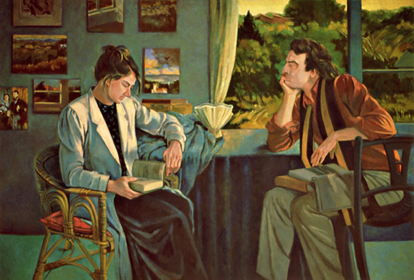
This is another painting I spotted and thought wow! How life like does the texture of the dress look. It is how I would picture it. It looks that good you could almost touch it. For this painting the background is darkened to make the painting have depth and for the figure stand out in the room.
I picked this painting as I like the tranquility feel to it. The light from the sun coming through the trees on to the woman, shows the shadows of the branches which is a pleasant touch to this delicate painting. The colours used set the painting off well and it has a relaxing sense to the painting, which suits the title.
Self-Portrait-1782
http://www.arthistoryarchive.com/arthistory/rococo/Elisabeth-Vigee-Lebrun.html
I really think painting has to be one one my favorite portrait, She looks go elegant and there so much detail involved. I know she is outside but for me this is a beautiful painting. I like the luminous effect on her clothes and skin. It sets off the portrait really well. The feather texture on her has is perfect.
Princess Albert de Broglie by Jean August Dominique Ingres 1853
http://www.jeanaugustedominiqueingres.org/
This is another painting I spotted and thought wow! How life like does the texture of the dress look. It is how I would picture it. It looks that good you could almost touch it. For this painting the background is darkened to make the painting have depth and for the figure stand out in the room.
Christiane Vleugels sleeping beauty
http://christianevleugels.com/
Alyssa Monks
http://originalpaints.com/photo-realistic-paintings-by-alyssa-monks/
.forblog.jpg&container=blogger&gadget=a&rewriteMime=image%2F*)
I spotted Alyssa work last year and I was not believing what I was looking at. She is I feel one of the best portrait artist of my time. Her paintings are that good they look like photos. The has to be one of my favorite and I like the water droplets in the foreground. These paintings are done on a large scale, which I think it is needed to put so much detail in to it as she has.
Harding Meyer
http://www.thecoolist.com/oil-portraits-by-harding-meyer/

Francoise Nielly
http://picssound.blogspot.co.uk/2014/05/inspirational-knife-painting-artwork-by.html

These last two paintings, I chose were due to the techniques of applying the paint in block areas on the canvas. I particularly like the last one the best, because of the vibrant colours used. Even with in all of these colours the artist has still managed to input tone in to her painting.
Prop's used in paintings
Now I have had a look at some really interesting paintings I have decided I don't just was my figure to be sitting or standing, I want them to be doing something, a normal day to day thing. the main things I can think of are:
- Reading
- Drinking
- Eating
I am going to now research portraits further of people holding books and cups and other things i can find, underneath them I will write a quick list of what I like about them:

Tamara de Lempicka, Wisdom, 1940-41.
http://artezza.tumblr.com/post/22136655460/lesfemmesartistes-tamara-de-lempicka-wisdom
- Warm colours
- Red and yellow, gold to show relaxation
Young Girl Reading 1770 Jean-Honore Fragonard
http://www.artble.com/artists/jean-honore_fragonard/paintings/young_girl_reading
- Perspective
- Sitting down
- Corner of room
Mary Cassatt, Young Woman Reading, 1876
http://www.artble.com/artists/jean-honore_fragonard/paintings/young_girl_reading

- Background texture
- Fabric of sofa
- Angle of figure draped on sofa
Charles Edward Perugini, Girl Reading, 1878
http://www.artble.com/artists/jean-honore_fragonard/paintings/young_girl_reading

- Realistic
- Light hitting the model for the right
- model looking down
Dora Carrington, Lytton Strachey (1916). Oil on panel. Bequeathed by Frances Catherine Partridge (née Marshall), 2004
http://www.culture24.org.uk/art/painting-and-drawing/art439145

- Angle of figure in bed with book
- hand in foreground
David Goatleys
http://ryderharrison.blogspot.co.uk/2010_04_17_archive.html
- Dressing gown
- Glow from window
- Woman looking cosy with her warm tea
- Flowers
TEA DRINKING, painting, 86x100 cm, oil on canvas, VLADIMIR VOLEGOVhttp://www.volegov.com/tea-drinking-painting/

- Summer feel from colours
- A lot of light coming in from outside
- A mother with her child
- Yellows and greens working well together and white creating a dramatic light effect
My first Ideas from the paintings I found above
After finding these example of paintings of figures doing day to day things, I really like the idea of using cups in my painting. I like the reading ones, they see to me more relaxed and having quiet moments to themselves. I want to show a bit of character to my figure so I feel drinking and having a scene in the right place could help with this.
Background options
For the background I am thinking may be a window or a wall with something on it I want to keep it simple as the key point in my portrait is the model with her cup. I really first need to decide on what colours I am going to use that will help me decide on the background I wish to use.
Idea Final Decision
Composition
I have now got my model with me which is my nan, I am going to sketch a few ideas to see what I come up with. I decided as shes quite elderly, that it is best for her to sit down for this portrait. I made her a cup of tea and let her enjoy that whilst I am going to sketch her.
I have sat us in my kitchen at my dining table. This is usually where we sit to have a good natter and catch up. I am now going to sketch her a few times and see what I can decide on.

I have now done some stretches and I really am excited about this project. Whilst she was sitting there she was talking to me and she also took a call on her mobile phone.
I really enjoy drawing ways that i could of my nan. I decided that my nans usual character was chatty and we are always gossiping. I was telling her a story about a friend and she was shocked about something I said. I asked her to pose that position and I also quickly sketched that out too. once I finished this sketch I was really excited about the idea I had.
My idea was to have my nan sitting there, with a tea having a general chin wag moment. so the viewer could see that she was shocked about something I had said, and this portrays a good gossip portrait which I am going to call it. Whats even more fun about my idea, is that I was sitting opposite her with a cup of tea too. I have sketch that in the foreground, so when the viewer looks at my painting they feel that they are the one who is sitting with my nan discussing something. this also shows a story to my paintings.
So far my idea has now got a character's expression, shocked emotion and a story. I now need to look at colours and techniques to show mood and atmosphere.
I have decided to look at some colors and techniques that I feel will be best for my painting:
I have now done some stretches and I really am excited about this project. Whilst she was sitting there she was talking to me and she also took a call on her mobile phone.
I really enjoy drawing ways that i could of my nan. I decided that my nans usual character was chatty and we are always gossiping. I was telling her a story about a friend and she was shocked about something I said. I asked her to pose that position and I also quickly sketched that out too. once I finished this sketch I was really excited about the idea I had.
My idea was to have my nan sitting there, with a tea having a general chin wag moment. so the viewer could see that she was shocked about something I had said, and this portrays a good gossip portrait which I am going to call it. Whats even more fun about my idea, is that I was sitting opposite her with a cup of tea too. I have sketch that in the foreground, so when the viewer looks at my painting they feel that they are the one who is sitting with my nan discussing something. this also shows a story to my paintings.
So far my idea has now got a character's expression, shocked emotion and a story. I now need to look at colours and techniques to show mood and atmosphere.
Colours and Techniques and practice
I have decided to look at some colors and techniques that I feel will be best for my painting:


As you can see I have now looked at skin colour and ways to apply my paint on my canvas. I have decided the best way to put the paint on my canvas, would be to start with the face and paint the darkest areas first then paint the medium and then the lightest. This way I will be looking at the tones and putting those together on my painting to create my nans face. I may then blend them together. I am not sure yet but I shall see what I get to it. I have chosen a green and a blue for the background that I had created whilst mixing. I think these are kitchen colours but are also relaxing, which is a mood and atmosphere I get when I am around my nan. Her face has pink cheeks so I will need a hint of pink for some areas.
I am now going to do a very quick sketch with pastels just to put the colors on to get a sense of how it is going to look:

After just finishing this, I think the colours are going to work well, I know my nans face looks very funny but it was a quick sketch just to get the colours correct. I am going to use red for the cups to show the warms of the tea.
Start painting my portrait "A Good Gossip"
transfer of image to canvas

I have now got my sketch on my canvas and I am feeling really confident that this is going to be a good paining and fun to do. My nan is now back with me, I have asked her to come again just so now when I start painting I can see the tones on her face. The window is behind me so the light will be coming from the from of the painting.
Begin Painting

As you can see I have now started to add different tones of her skin on to my canvas so far so good.

I have now been working on it a while, as you can see I have made a mistake with her eyes I ended up painting them wonky. I will now have to wait for the to dry before I can reapply to correct this area. I have also started filling in the back ground with block colours I will at texture on to them afterwards.
I have now been working on it a while, as you can see I have made a mistake with her eyes I ended up painting them wonky. I will now have to wait for the to dry before I can reapply to correct this area. I have also started filling in the back ground with block colours I will at texture on to them afterwards.

When it dried I started the eye area again and above is how far I have gotten so far. I have now finished the face and I have started on the background of the painting. I think the face area of my nan I have done well, I ended up blending the colours up a bit and I am glad I did as brings the colours together.

After another two goes at it I am finally finished. I think it looks good and I know I worked really hard on it. Its a portrait that has a lot of key aspects that I have learnt along the way:
- Mood and atmosphere
- Expression and emotion
- Character
- A story
By bringing these together, I have created a fun portrait for viewers to enjoy and one that I hope brings a smile to a face or two. I feel I have really captured my nan well and she thinks the painting is so just like her and her personality.
Some areas to critique :I feel some areas on her face, now looking closely are a bit patchy and you can see the charcoal beneath my painting. I found her hands were hard to do and concentrating on the tone there was quite difficult. Her hands are quite veiny and I didn't add this in. I also feel I could of improved on the background more and put a bit more detail in there as it is quite basic. If I had to do this painting again, I would of moved the table by the window to get more of a contrast of light over my nan to create more tone. Apart from these things I feel I have done a good job with my final 3 Assignment.
overall Assignment 3
Overall portrait and figure Assignment has been a bit of an adventure. I started off feeling a bit demotivated from my last Assignment review. I picked myself up and listened to what my tutor has said and I wrote a list, so that every time I did an exercise I would make sure I would input what he had guided me. I started off looking at human form, then on to portraits and then on to interiors. Each step I took, I took on the challenge and instead of just doing my usual thing sticking to my habit, I took on experimenting and exploring my artist hand. to see what I could create. I let go and freed my tight and precise painting habit. My eyes are now open and I have actually started to enjoy experimenting and not caring so much as how I am painting. My mood and atmosphere painting was my breaking in point and from there I can see in my own paintings, that I am exploring my own ideas. I have started to actually believe in myself again and trust my own ideas. I have really enjoyed this assignment, because its helped me a lot personally and also I had so much fun painting people. My favorite has to be my character portrait of my woman as a clown, I really enjoyed expressing my fun self and then getting messy and flicking paint every where. I have had a lot of fun and looking forward to Assignment 4 painting the outdoors, summers coming up so its an ideal time to start.