Research Point
Michel Eugene Chevreul
Michel Eugene Chevreul
Science of the colour wheel and how it influenced Artists.

Chevreul experimented with colours and researched in to which colours complimented each other and which didn't. In 1824 he was a director of a tapestry company. He would have customers complaining about there tapestry's, which influenced Chevreul to look in to colour. Whilst doing his research he invented The Colour Wheel.

His Science behind the colours and the code that he worked with inspired many artists, which I will look in to in a moment.
Chevreul's Theory.
Optical Illusions are sometimes created when bold colours are placed close to each other, creating a noticeable difference between each colour. Chevreul called this simultaneous contrast. It can create an optical illusion to make a Hue colour look lighter or darker depending if the second colour is lighter or darker then the Hue.
He also experimented with optical mixing. Using two individual colors blended together to suggest a third color. He used all his research to create 72 colours. He put them all in a circle around a white center. The colours were arranged in a complimentary sequence, Creating The Colour Wheel.
Sonia and Robert Delaunay


![]()

Sonia was a daughter of a labourer who took on the worlds Art and fashion industry by storm. She began her career as a designer and an artist. Sonia is known mainly for her work as an abstract artist. In the early part of her career she applied her way of seeing colour in to fashion, textiles, books. She married her Husband Robert in 1910 researched in to Chevreuls Colour research and were really influenced by his theory's.
Sonia Delaunay, Rhythm
http://www.artexpertswebsite.com/pages/artists/orphism.php
Sonia Delaunay, Electric Prisms
http://www.artexpertswebsite.com/pages/artists/orphism.php
As with the above examples of her paintings I can notice her vivid use of colours and the way she shown the basic shapes in her paintings. Her use of colour shows contrasts and complimentary colours being used together to show colours working together to from a painting that was pleasing to the eye.
Robert Delaunay is best known for being one of the first to introduce vibrant color into Cubism, setting a trend, known as Orphism. In 1912 he found his way toward completely nonobjective paintings, using Chevreul 's colour wheel..
Robert Delaunay, Relief-Rhythm
http://www.artexpertswebsite.com/pages/artists/orphism.php
Robert Delaunay, Sun Tower Airplane, 1913
http://www.artexpertswebsite.com/pages/artists/orphism.php
Looking at the two paintings above, I can see he was very good with understanding the color wheel and using colours that work together to create pleasing to the eye images. I really like 'Sun Tower Airplane' painting I think the use of colours is great here and they all complimentary each other with the orange and green colours it shows hes knowledge of how to put colours next to each other that work well together.
Winslow Homer (American, 1836–1910)
Winslow Homer was famous for his water coloured art. He considered Michel Eugène Chevreul’s color theories and Wheel to be his Bible for his work. Chevreul suggested that a yellow hat is the most flattering color for a girl with brown hair. Homer followed this suggestion in his watercolor 'On the Stile' below, where the brunette wears a yellow hat with a blue ribbon, and the boy leading her also wears a yellow hat. Winslow Homer carried a copy of Chevreul’s book with him at all times and called it his Bible because of the information it provided about how to use color.
On The Stile
https://www.nga.gov/feature/homer/homer13.htm
On this website https://www.nga.gov/feature/homer/homer27.htm, you can see more of his work, which was influenced by Chevreul. With every painting, he made sure he would listen to Chevreuls theory, of which colours go together. Homer's painting show that Chevreuls theories worked. His work is very beautiful and because of the colours used, you feel relaxed and a harmony feeling of happiness especially in the of 'The stile' above. The colours also make it look like its a sunny spring day and this is also reflected by the two young children holding hands.
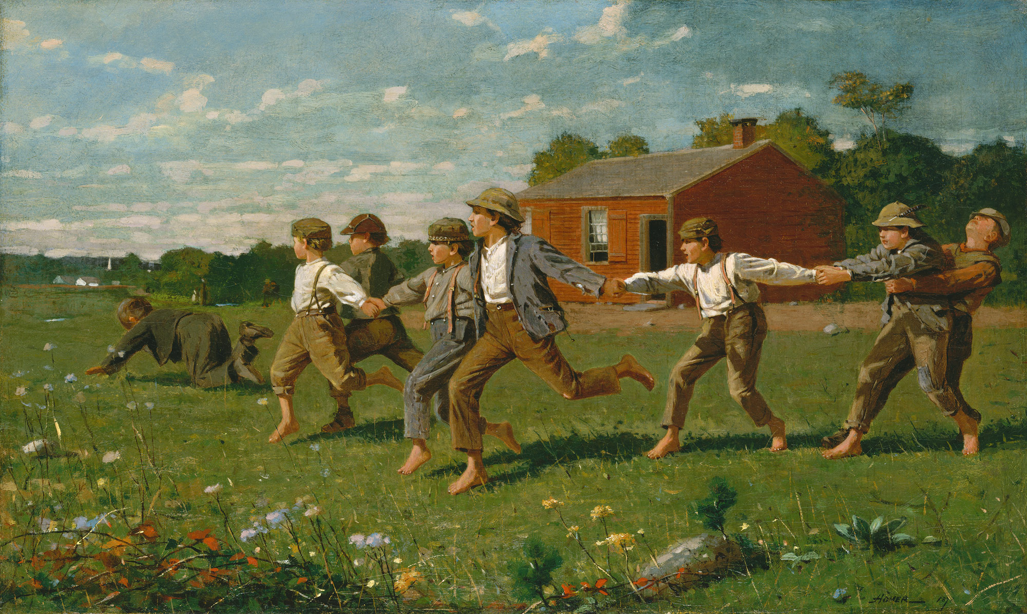
Snap the Whip, 1872 oil
http://www.metmuseum.org/toah/works-of-art/50.41
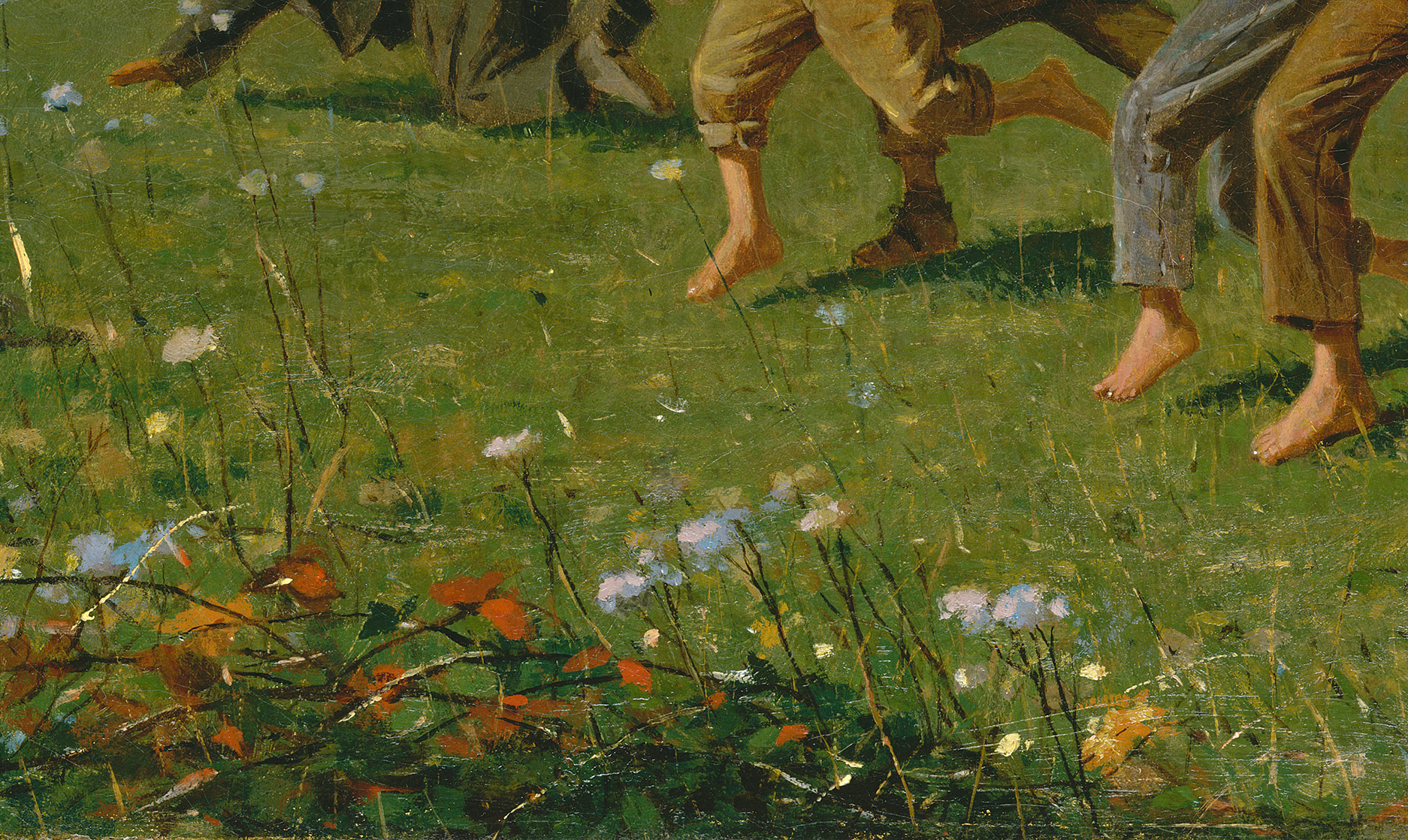
Again, even in oil Homer managed to portray happiness in his work. The rich browns and greens, work really well together and reflect off each other, creating harmony in his work. It really does show that Chevrual knew what he was doing whilst researching. I can see in this art tints, shades and tone used on the boys clothes which indicates the light from the sun. I really like how hes managed to show the grassy field here:
Simple lines and stippling creates the grass. He has used primary colours for the flowers on the green which compliments the other colours around that area.
Georges Seuart (1859-1891)
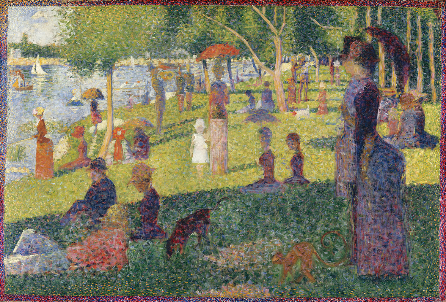
I remember studying Georges work when I was in school years ago. I loved this piece of work below:
Study for A Sunday on La Grande Jatte, 1884
http://www.metmuseum.org/toah/works-of-art/51.112.6
I always use to wonder when I was young, how many dots were there and admire all the colours involved. I also loved the was stippling technique used eg little green mixed dots to create one bold colored area.
His work is described as Neo-Impessionism, which is where separate touches of colour in different colour pigments eg light and dark greens resulted in a great brighter colours to the viewers. This was known as optical mixing. This technique George thought, showed shimmer of light on the canvas. In the words of the artist Paul Signac: "the separated elements will be reconstituted into brilliantly colored lights." The
separation of color through individual strokes of pigment came to be known as Divisionism, While the application of precise dots of paint came to be called Pointillism. quote from: http://www.metmuseum.org/toah/hd/seni/hd_seni.htm.
After looking at some artists, that were influenced by Chevreul's theory and research, I have come to realize that, Chevreul was a genius. Mastering the colour in this way, finding out complimentary and opposite colours, must of been a massive breakthrough for him and all this research, just to keep the customers happy. He has become important in today's life, every clothing, room in a house or advertising all influence by Chevreul's colour wheel. What am amazing achievement, I admire his passion. I cannot imagine what it was like before he created the colour wheel, to paint and struggle for a few hours trying to create the colour required. I feel knowing mixing of colours is important and will definitely help your work appeal to viewers and create a very complimentary painting to look at.

I got my white and black oil paint out to practice getting my tone correctly from white to black - After a few attempts I started to get a flow going correctly, I found my neutral colour and I then put my neutral grey, next to the black and next to the white. I realized that the black and white paint influenced the neutral grey I was observing. I noticed when next to the white the grey seems lighter and next to the black the neutral grey seems to go darker then when its in its own.

Next I painted a stretched piece of paper in the neutral grey for the next exercise.
separation of color through individual strokes of pigment came to be known as Divisionism, While the application of precise dots of paint came to be called Pointillism. quote from: http://www.metmuseum.org/toah/hd/seni/hd_seni.htm.
After looking at some artists, that were influenced by Chevreul's theory and research, I have come to realize that, Chevreul was a genius. Mastering the colour in this way, finding out complimentary and opposite colours, must of been a massive breakthrough for him and all this research, just to keep the customers happy. He has become important in today's life, every clothing, room in a house or advertising all influence by Chevreul's colour wheel. What am amazing achievement, I admire his passion. I cannot imagine what it was like before he created the colour wheel, to paint and struggle for a few hours trying to create the colour required. I feel knowing mixing of colours is important and will definitely help your work appeal to viewers and create a very complimentary painting to look at.
Exercise: Mixing Greys - Anachromatic Scale.
I firstly attempted to stretch the paper for the work coming ahead in the next few exercises.
I got my white and black oil paint out to practice getting my tone correctly from white to black - After a few attempts I started to get a flow going correctly, I found my neutral colour and I then put my neutral grey, next to the black and next to the white. I realized that the black and white paint influenced the neutral grey I was observing. I noticed when next to the white the grey seems lighter and next to the black the neutral grey seems to go darker then when its in its own.
Next I painted a stretched piece of paper in the neutral grey for the next exercise.
Exercise: Primary and Secondary Colour Mixing
I have just put all my yellows on a page to compare. I have done different experiments putting different yellows next to each other. I feel the Windsor Lemon is my brightest yellow. It seems more vibrant and bolder, it really stands out from the others. I discovered putting same colours next to each other that had different tones, it really helped to get a feel of which correct colour to use out of what you have that has no other colours mixed in - Yellow primary colour.

I then did the blue and red colours, Windsor Blue and Azo Red came out the best for my primary colours.

Next I blended two primary colours together at a time, such as yellow and blue, red to blue and yellow to red. The middle colours were Orange, Green and Violet. The secondary colours. When mixing Blue and Red, it does not find the violet colour it looks quite brown. So I then attempted with a couple different reds, to see if I could create it. I discovered that the Rose Red worked best and I could see my violet grades better, when adding more blue.
I also then did the same three blends, but added a little white in to give it more tonal value. I did the red to blue mix again, as I felt it didn't work out. I think I added in too much blue to soon. The second attempt came out much better. I noticed the middle colour of the red to blue blend, was a brow/grey colour instead of violet.

You can clearly see the difference from the first 3 with out white added. The colours stand out more and have a better bold vibrancy to them. The blue now looks like a primary blue and not a very dark blue as in the first blends I created.
Next thing to try was blending a Orange/Red to a Blue/green colour. I did this and then added a little white to the middle tone, this turned the colour grey know as a broken or Tertiary colour.

Lastly I blended orange and green together, it created a grayish flat green, which is again a broken/Tertiary colour.

I then did the blue and red colours, Windsor Blue and Azo Red came out the best for my primary colours.
Next I blended two primary colours together at a time, such as yellow and blue, red to blue and yellow to red. The middle colours were Orange, Green and Violet. The secondary colours. When mixing Blue and Red, it does not find the violet colour it looks quite brown. So I then attempted with a couple different reds, to see if I could create it. I discovered that the Rose Red worked best and I could see my violet grades better, when adding more blue.
I also then did the same three blends, but added a little white in to give it more tonal value. I did the red to blue mix again, as I felt it didn't work out. I think I added in too much blue to soon. The second attempt came out much better. I noticed the middle colour of the red to blue blend, was a brow/grey colour instead of violet.
You can clearly see the difference from the first 3 with out white added. The colours stand out more and have a better bold vibrancy to them. The blue now looks like a primary blue and not a very dark blue as in the first blends I created.
Broken or Tertiary Colours
Next thing to try was blending a Orange/Red to a Blue/green colour. I did this and then added a little white to the middle tone, this turned the colour grey know as a broken or Tertiary colour.
Lastly I blended orange and green together, it created a grayish flat green, which is again a broken/Tertiary colour.
Colour Wheel and Complimentary Colour Mixing
As you can see I created a colour wheel, it was my first attempt and I think it turned out rather well. I then looked at complimentary colours:
Yellow-Violet
Yelloworange-Violetblue
Orange-Blue
Orangered-Bluegreen
Red-Green
Redviolet-Greenyellow
Complimentary is exactly what the two opposite colours do to each other, they both flatter the other. eg the yellow and the violet, they work lovely together and create a harmony contact toward each other. They make the other colour more appealing to the eye, this happens with all the complimentary colours. I like the yelloworange and the violetblue duo, as they remind me of the sea and the sand, they have a rustic feel to them and they are very calming together,
I then mixed each of the pairs creating Tertiary Colours:
Yellow-Violet = Pinky colour
Yelloworange-Violetblue = Muddy Clay colour
Orange-Blue = Bluegreeney colour
Orangered-Bluegreen = Rich Brown
Red-Green = Brown
Redviolet-Greenyellow = Yellow Brown colour
All these colours to me,look a little muddy and dull. I guess that is where the name, broken colour comes from as they are relatively not a bold colour compared to primary and secondary colours.
Project Overall
This project has been an eye opener to start with the basics, I now realise that mixing colours is a science subject and you don't just mix and expect a colour that you want to appear. You have to practice mixing and understand the colour wheel. You have to also look and know a colours complimentary colour, to help with a painting. Knowing what colours work well with each other, makes it more appealing to the eye. I am excited to get started, but knowing the basics first is a good way to build confidence and knowledge about the rules and techniques of painting.
No comments:
Post a Comment