Exercise : Exploring contrasts
For this exercise, I used scrap bits of oil painting paper and stuck them in to my sketch book afterwards. I had to paint squares with one colour then paint another square around it and compare colours to each other.

The first task was to choose two colours that are close in spectrum, to see the contrasts. As mentioned in the exercise I can clearly see that both colours cancel each other out. The best example is the third one along (blue and blue-green above photo) I think having the blue around the blue-green makes the blue more visible in the blue green.


The final experiment was to include grey and to see what happens to the other colours surrounding them. I think the grey made both complementary colours stand out but I also think the grey has a somewhat cooling effect on the colours I used. The grey has a isolated feeling to it and stabilizes the vibrant colours making them muted,Toned down.
This experiment was a good eye opener, to be careful on what colours to use with each other and those to perhaps keep at a distance. I think its also shown that you really need to know your complementary colours, as they are the ones that help each other out. You can still make them lighter or darker by adding black and they will still complement each other. Finally the grey cools down the vibrancy of the colours and in a way gives them a quieter look. I think the main key to painting is to study and learn this to become a really good painter. Knowing your colours is the key starting step for any painting.
Impressionism was a style developed in France in 1870s. The Artist style was to concentrate on a fleeting visual impression produced by a scene and create reflected light by using unmixed primary colours and small strokes.
Post Impressionism was created in 1910. It was the same art style as Impressionism, the artists continued using vivid colours but they were more inclined to highlight geometric forms to create more of a expressive effect. The also seemed to use colours that were natural or erratic.
Neo Impressionists was created by a french critic Felix Feneon in 1886 to describe an Art movement created by Artist Georges Seurat. The art technique was using familiarized dots of mixed coloured paint, to a surface so that from a distance they blend together.
These types of Artists styles are created by using optical mixing and effects. To understand this I am going to investigate in to a couple of artist to see how this actually worked:
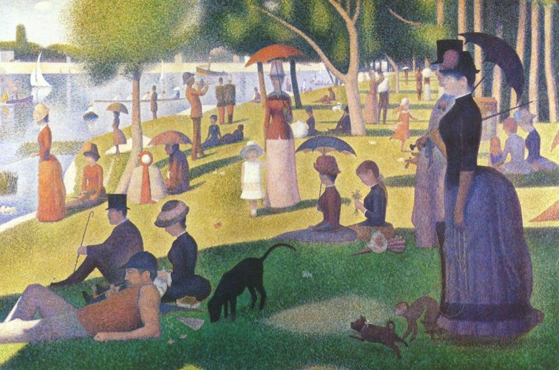 A Sunday Afternoon on the Island of La Grande Jatte
Georges Seurat

Woman by the Water Georges Seurat
http://www.pointillism-in-art.org/Women-By-The-Water.html
George Seurats art to me is really beautiful and clever. The way he infused dots of different colours to create paintings such as his masterpeice 'A Sunny Afternoon on the Island of La Grande Jatte'. Its very colourful and I remember my school art teacher when I was younger having a poster in the class room of this painting I use to really look and admire it. Seurat theories on colours were simple, that if two coloured dots overlapped it would create a third colour. This way meant that there was never a need to blend the colours together and that the colours remained vibrant as when they first came out of a paint tube.
Seurat used his colours to connect his theories of science and his emotions. He believed that he could use colour to evoke emotion and create tranquility in his art.

-1890.jpg)
Against the Enamel of Background Rhythmic with Beats and Angels, Tones and Tones and Colours, and a Portrait of Felix Feneon (1861-1944) 1890
I really like this painting its really bright and I like the use of the colours he has used, The back ground had swirly effects which makes the painting look as though it has great depth - A good optical illusion.

Most of Signacs work is based on the french coasts as he loved to paint water. I love the colours he has used here to create the sky. The atmosphere to me is at sun set, with the pink sky stating it will be a sunny day again tomorrow. The reflection of the sun, is on the boats sails and buildings in the background. I really like optical mixing, its made me see there's an even more fun way to paint.


I did some experiments in my sketch book for optical mixing to see what I could create:

As you can see I had fun with this, I really liked my experiment, with a dry brush in paint. It made the painted area look more lively and adding a violet created a sense of depth. I also really like my oil pastel mixing, by using orange painted background, going over it in yellow oil pastel, then using a tooth pick to scratch lines out to see the underneath colour. I thought this was really fun. At some point I want to try optical mixing in my work to see what I can create.
The first task was to choose two colours that are close in spectrum, to see the contrasts. As mentioned in the exercise I can clearly see that both colours cancel each other out. The best example is the third one along (blue and blue-green above photo) I think having the blue around the blue-green makes the blue more visible in the blue green.
Next I had to paint two complimentary colours together but I decided to do a few. I noticed that each of the complementary pairs helped each other to create stronger contrasts They really help each other to stand out and become more vibrant.
The final experiment was to include grey and to see what happens to the other colours surrounding them. I think the grey made both complementary colours stand out but I also think the grey has a somewhat cooling effect on the colours I used. The grey has a isolated feeling to it and stabilizes the vibrant colours making them muted,Toned down.
This experiment was a good eye opener, to be careful on what colours to use with each other and those to perhaps keep at a distance. I think its also shown that you really need to know your complementary colours, as they are the ones that help each other out. You can still make them lighter or darker by adding black and they will still complement each other. Finally the grey cools down the vibrancy of the colours and in a way gives them a quieter look. I think the main key to painting is to study and learn this to become a really good painter. Knowing your colours is the key starting step for any painting.
Research Impressionism, Post Impressionism and Neo Impressionism
Impressionism was a style developed in France in 1870s. The Artist style was to concentrate on a fleeting visual impression produced by a scene and create reflected light by using unmixed primary colours and small strokes.
Post Impressionism was created in 1910. It was the same art style as Impressionism, the artists continued using vivid colours but they were more inclined to highlight geometric forms to create more of a expressive effect. The also seemed to use colours that were natural or erratic.
Neo Impressionists was created by a french critic Felix Feneon in 1886 to describe an Art movement created by Artist Georges Seurat. The art technique was using familiarized dots of mixed coloured paint, to a surface so that from a distance they blend together.
These types of Artists styles are created by using optical mixing and effects. To understand this I am going to investigate in to a couple of artist to see how this actually worked:
Georges Seurat
Georges Seurat
http://www.artble.com/artists/georges_seurat
Woman by the Water Georges Seurat
http://www.pointillism-in-art.org/Women-By-The-Water.html
George Seurats art to me is really beautiful and clever. The way he infused dots of different colours to create paintings such as his masterpeice 'A Sunny Afternoon on the Island of La Grande Jatte'. Its very colourful and I remember my school art teacher when I was younger having a poster in the class room of this painting I use to really look and admire it. Seurat theories on colours were simple, that if two coloured dots overlapped it would create a third colour. This way meant that there was never a need to blend the colours together and that the colours remained vibrant as when they first came out of a paint tube.
Seurat used his colours to connect his theories of science and his emotions. He believed that he could use colour to evoke emotion and create tranquility in his art.
Close up of 'A Sunday Afternoon on the Island of La Grande Jatte'
http://jennabrand.com/2013/03/26/modern-art-lessons-futurism/
In the ' A Sunday Afternoon on the Island of La Grande Jatte' I can see how he has used pointillism on a giant scale. Looking close you can see the dots he made, but looking from a distance those colours do merge together to create blends. I really like how he portrayed the reflection in the lake using this technique it works really well and shows movement of the water. I would really like to attempt this kind of style at some point in my art work.
Signac was influence by Georges Seurat. He met him in 1884 and became a supporter of his friend and a friend. He used the same theories and techniques of optical mixing in his work.
Paul Signac
Signac was influence by Georges Seurat. He met him in 1884 and became a supporter of his friend and a friend. He used the same theories and techniques of optical mixing in his work.
Against the Enamel of Background Rhythmic with Beats and Angels, Tones and Tones and Colours, and a Portrait of Felix Feneon (1861-1944) 1890
I really like this painting its really bright and I like the use of the colours he has used, The back ground had swirly effects which makes the painting look as though it has great depth - A good optical illusion.
View of Constantinople, 1907
www.paul-signac.org
OP- Art : Bridget Riley
Op-Art is using optical illusions in art that deceives the eye, such as making you see something moving but its not,or an image appearing differently to what is actually there.
Bridget Riley is classed as the mother of Op-art. She also had studied work of Georges Seurat, such as her painting she did below:
Pink landscape – Bridget Riley 1960 – Oil on Canvas 101.5×101.5
http://www.op-art.co.uk/bridget-riley/
You can see here (above), in her painting that she attempted to use Seurat's Style. I t works well and you can see the blends to show hills in the landscape.
Bridget Riley
Movement in Squares, 1961
Tempera on Hardboard, 481/2x473/4 in.
|
http://www.bittleston.com/artists/bridget_riley/
Riley is fascinated with creating optical illusions. She wanted to engage the view not only with the object but also with the process of observation.
"For me Nature is not landscape, but the dynamism of visual forces - an event rather than an appearance - these forces can only be tackled by treating color and form as ultimate identities, freeing them from all descriptive or functional roles." Bridget Riley. http://www.bittleston.com/artists/bridget_riley/
In the Image above, you can see how she portrays an optical illusion, By using squares then as they get in the middle she squashes the squares. creating an illusion of the image going inwards. it does really work when looking at it.
Bridget Riley
Arrest 1, 1965
Emulsion on Canvas, 70x681/4 in.
http://www.bittleston.com/artists/bridget_riley/
The way she has painted here creates a sense of 3D in her work. Some of the waves stand out infront of you. She has done this by makings the side waves lighter, forming an optical illusion of a 3D effect. I really like this one and its really clever of her. Its like a piece of cloth with its folds. I guess this helps introducing this to a painting to create the 3d effect in your work.
My practice with optical mixing with paint an other mediums.
As you can see I had fun with this, I really liked my experiment, with a dry brush in paint. It made the painted area look more lively and adding a violet created a sense of depth. I also really like my oil pastel mixing, by using orange painted background, going over it in yellow oil pastel, then using a tooth pick to scratch lines out to see the underneath colour. I thought this was really fun. At some point I want to try optical mixing in my work to see what I can create.
Exercise Still Life with complementary colours
For this exercise I wanted to use my two favorite complementary colours yellow and violet. They really appeal to me and give a soft subtle feel, when they are next to each other. I decided that I was going to use some shells, that I picked up off Bournemouth beach. They have lovely textures to them and swirly patterns flowing over there bodies. I firstly did a pen sketch of my shell,s to make sure I had chosen a good composition. I decided that as I really was interested in Georges Seurat's optical mixing, I wanted to attempt his technique in a painting, I decided to use lighter and darker tones of my two colours to get more of variety of colours to use as well as stippling them together to form an optical illusion.


It took me a few days to finish but its finally done. I am really happy with the results and the two colours really do work with each other. I have produced a soft gentle painting with just two colours. I used stippling technique to create the sand that they were on (from our sandpit in back garden) I am really happy with the effect that is created. There was lots of fine grains of sand there and I think it I portrayed it well. I also put a few pebbles around to enhance the shells in my painting. I decided at the end that maybe I could of done a better composition, or fill the painting out more with painting them bigger. I mixed the colours and eventually got a grayish tone. I did this to show two large rocks in the foreground. I again used stippling here. I think I should have put more detail on them as there in the foreground. Overall I enjoyed doing this painting, as I had a chance to experiment with complimentary colours and optical mixing effects.
For this exercise I decided to use a theme that would be fun for me to do. I decided on a underwater theme while using colours such as pinks and lilacs to create a kind of mermaids treasure scene. I practice this first in my sketch book and It worked out well. I decided I would just attempt this like I did with my flowers to see what I create.


Looking at my final painting I really get a feel of treasure and the colours I used are very girly, which makes it look more a mermaid theme. I like how I portrayed the light coming through the water, in the background. The shells in my painting look sparkly and magical like some rare treasure. I added some sea weed and some swirly orange plant to look as though the treasure is hidden in the sea. I think I did ok with this painting, but I think it does not look like the objects in real life. I have put my own twist on it and it works as I made it look how I wanted. I feel it may not appeal to every one but its just a go for me to see how I create scenes and moods in my paintings.
These two painting have helped me to think about optical mixing and moods/themes of paintings that I am trying to portray. Its also learnt me to use limited colours in a painting as it still creates an impressive look. I feel the Evoke a mood painting, helps you to be very expressive. I like the complimentary colour painting the best out of the two as it was a new technique to me and I really found it interesting, just using two colours and experiment mixing them to create different shades.
It took me a few days to finish but its finally done. I am really happy with the results and the two colours really do work with each other. I have produced a soft gentle painting with just two colours. I used stippling technique to create the sand that they were on (from our sandpit in back garden) I am really happy with the effect that is created. There was lots of fine grains of sand there and I think it I portrayed it well. I also put a few pebbles around to enhance the shells in my painting. I decided at the end that maybe I could of done a better composition, or fill the painting out more with painting them bigger. I mixed the colours and eventually got a grayish tone. I did this to show two large rocks in the foreground. I again used stippling here. I think I should have put more detail on them as there in the foreground. Overall I enjoyed doing this painting, as I had a chance to experiment with complimentary colours and optical mixing effects.
Exercise Still Life with Colour Used to Evoke a Mood
For this exercise I decided to use a theme that would be fun for me to do. I decided on a underwater theme while using colours such as pinks and lilacs to create a kind of mermaids treasure scene. I practice this first in my sketch book and It worked out well. I decided I would just attempt this like I did with my flowers to see what I create.
Looking at my final painting I really get a feel of treasure and the colours I used are very girly, which makes it look more a mermaid theme. I like how I portrayed the light coming through the water, in the background. The shells in my painting look sparkly and magical like some rare treasure. I added some sea weed and some swirly orange plant to look as though the treasure is hidden in the sea. I think I did ok with this painting, but I think it does not look like the objects in real life. I have put my own twist on it and it works as I made it look how I wanted. I feel it may not appeal to every one but its just a go for me to see how I create scenes and moods in my paintings.
Overall
These two painting have helped me to think about optical mixing and moods/themes of paintings that I am trying to portray. Its also learnt me to use limited colours in a painting as it still creates an impressive look. I feel the Evoke a mood painting, helps you to be very expressive. I like the complimentary colour painting the best out of the two as it was a new technique to me and I really found it interesting, just using two colours and experiment mixing them to create different shades.