Thursday 11 September 2014

ASS1 - Final

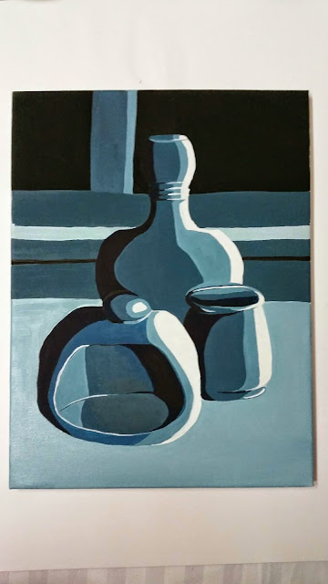
      For this assignment, I decided to go to a second hand store, to get some inspiration. I found four Items, that I thought went well together to paint. I sketched out a few compositions in my sketch book and realized, that it looked better with just 3 items as I felt I was trying to squash too much together in the drawing and it looked more better with less to look at.

I found a good composition with the three objects and then tested line, tone and colour in my sketch book


As you can see its just a basic composition to get me started for this course.

I am undecided weather to use acrylics or oil paint as of the time it takes to dry. I am going to use acrylics to do this Assignment. 


I panted the base background, I know its a different colour to the colour sketch in sketch book, but I wanted to make it a more vibrant painting. 

Now its dry I am going to add the table base on and try to attempt the jugs.


I attempted the jugs and felt it was not going as planned. The paint kept drying and now I didn't like what I had done with the background, it just seemed so bland.

I had a few days away from it and decided I was going to attempt it in oil paints, over the now dry acrylic attempt. 

I first painted the yellow jug, which turned out well. I liked the tone I created on it and the highlights with white paint.


I then added in the blue jug, which had a little pattern on. I think I got this jug quite correctly draw apart from the rim of the lid is a bit wonky.

I decided to do the background the correct colour, red which went dark behind the objects. I had fun applying this and I love the way its enhanced the focus on to the objects more, Chiaroscuro style.  

I painted the middle jug, this was quite a challenge, as the colour of the jug changed halfway through, but I managed it really well. I like how I implied the reflective light areas on this jug.


Once finished, I did the table base again the correct colour as I was seeing and introduced the shadows of the object.


Overall on Assignment 1

The outcome I feel, was really good for a first real painting. I could of been a bit neater with the rim on the blue jug and the base of the yellow vase, it was also a bit wonky. I like the colours, they work lovely together. I think I got the shadow on the table well and I even put a light area on the table, where the light was bouncing off. The dark background helps show off the rich colours of the objects and helps make a vibrant painting. Now just have to wait for it to dry.

Overall 

I have really enjoyed this first assignment learning the basics. Different tools, negative space, gradients and Chiaroscuro. They were all eye openers for me and really interesting to see what you can create thinking out side the box. who'd have thought, you could paint with oil pastels! 

I still have improvements to do, but keen to start my second assignment to improve my self and keep moving forward with practice. I feel I have learnt quite a bit already. 

Sunday 7 September 2014

ASS1 - Project 3 - Working on different coloured grounds

Exercise - Tone on a light ground 


For this exercise I had to paint a small still life showing the tones across the objects. I did this using Acrylic paint. I first did some sketches in my sketch book of different arrangements. I decided on the one below as it was simple and the light was in a good angle on the objects. I think the final out come came out rather well. I perhaps did spend a bit longer then I should of done on this piece of work but I was having fun with the painting. I like the atmosphere I created with the blues as though the objects were in a haunted house with a touch of light shimmering on them. 

I think I have clearly shown the tones on the objects and also in the back ground. 


Research Chiaroscuro Effects


I understand Chiaroscuro to be a painting of strong contrasts of light and dark.  Using this effect creates volume to a painting, a 3D effect if you like. It is also used in films and photos to create dramatic effects. I had a look at some Artists work to help me understand this more and see how different artists use this technique:


candlelit studies of Rembrandt:

I thought I would write about Rembrandt first, as hes is one of my favorite artist from when studying Drawing 1 last year. 


     Self Portrait 1669 National Gallery, London 
Refrence: http://www.nationalgallery.org.uk/paintings/rembrandt-self-portrait-at-the-age-of-63

For me, Rembrandt is a great storyteller in his work. He somehow reveals inner secrets and inner thoughts, of people sitting for him. The self portrait above: He has used light and dark in his art, the Chiaroscuro Technique, to emphasis the dark shadows around the figure, as a contrast to the lightness in the face and hand. It shows to me, very little mid tone. most of the image is dark or light. By introducing the dark shadows, it pulls focus to his face. There is much more detail with brush work to the face, then there is in the rest of his painting. By limiting this detail he is creating an area of focus, he is showing where he wants the audience to look.

 I asked my self, why is he doing this? what is he achieving with this technique? 

I think, he's using these areas of light exposure (highlighting hand and face, in this example) in a really dramatic way, for storytelling in his art. Hes making us wonder about what the character is or may not be thinking about. I've noticed in other art work of Rembrandt, as well as this one, that he mostly hides one side of a persons face, or even there eyes in the shadow, as though hes hiding something, a secret that he is keeping and does not want to tell the audience. This way our attention is on this thoughts of the time of the painting, this is the effect of this technique, Chiaroscuro. Using light to enhance half his face, I think metaphorically we are only seeing half the man he was, he's hiding something from the audience. I feel like I'm being made to ask, what is he hiding behind the shadows and what is he thinking. I feel this is the reason Rembrandt painted his work this way. He was forcing the audience to consider what he was thinking and the story behind the subject or himself. When using the Chiaroscuro technique, it allows us to reveal to the audience: the nature of the subject, there mood and sometimes I guess, there attitudes. I feel Rembrandt was so great at this technique. He always was interested n peoples own life stories and troubles, which then as you can see influenced his art work. 

other artists using the Chiaroscuro Technique:

Tintoretto: 

Self Portrait - Jacopo Tintoretto (Robusti) - www.jacopotintoretto.org
Self portrait -Jacopo Tintoretto
Refrence: http://www.jacopotintoretto.org/Self-Portrait.html

The Temptation of Adam and Eve - Jacopo Tintoretto (Robusti) - www.jacopotintoretto.org

The temptation of Adam and Eve - Tintoretto
Refrence: http://www.jacopotintoretto.org/The-Temptation-of-Adam-and-Eve.html


Now I have explained it with Rembrandt's work, I can see clearly here with these two paintings, the same technique, in each art work showing highlights to direct the audience, to certain areas to focus on. In The Temptation on Adam and Eve : I can notify the story being told here and the light is highlighting Adam and Eve and also the poison apple, which tells you the well know story of the Garden of Eve.

Caravaggio:
St John the Baptist Youth with Ram - Caravaggio - www.caravaggio-foundation.org


St John the Baptist Youth with Ram
Refrence: http://www.caravaggio-foundation.org/St-John-the-Baptist-Youth-with-Ram.html


Sick Bacchus c. 1593 - Caravaggio - www.caravaggio-foundation.org

Sick Bacchus 1593 - Caravaggio 
Refrence: http://www.caravaggio-foundation.org/Sick-Bacchus-c.-1593.html

Caravaggio used Chiaroscuro a lot in his work. He created a more dramatic scenes then normal Chiaroscuro, a term knows as Tenebrism. It created very violent contrasts of light and dark and made the dark areas a more powerful feature in the image. The technique was made to develop a spotlight effect to artwork.


Rubens:

Bacchus 1638-40 - Rubens
Rerence: http://www.ibiblio.org/wm/paint/auth/rubens/bacchus.jpg


Self-Portrait 1628 - Rubens
http://www.ibiblio.org/wm/paint/auth/rubens/

Looking at Rubens work, I feel more of a richer tone to his art. He still has the light and dark contrasts but with a bit of warmth and richness to his paintings then previous artists I have looked at. Again the technique gives volume and in a way a feeling of grabbing out to the painting as though there going to step out of it. 

Joseph Wright of Derby:


An Experiment on a Bird in the air pump. - Joseph Wright of Derby - 1768

Referance: http://www.nationalgallery.org.uk/paintings/joseph-wright-of-derby-an-experiment-on-a-bird-in-the-air-pump


I really Like this painting, it has a great candle effect. Its works really well with the glow from the light of a candle reflecting off subjects reviling in the darkness a story to be told. The light is emphasizing two upset looking little girls and there family comforting them and some talking between each other thinking of ideas to make the situation better. I think the light works amazingly in this painting and he is a new artist I have not come across yet. I will be defiantly looking at his work further, in the future, to help inspire me with my own use of Chiaroscuro Techniques. 


Exercise: Tonal study on a dark ground

Now I have looked at effects that other artist have done using Chiaroscuro Technique, I am going to try a quick one of my own, just to see how I get on working with a dark ground. I have chosen some grapes to paint to see if the effect turn out well. I am using oils and I am going to paint the black background in acrylic so it dries quicker.


I have now painted the darkest colours of the grapes and need to wait till it dries a bit, so I can continue painting. I found that the light paint keeps merging together to much and I cannot seem to create a lighter tone to show the light of the grapes.


Once it dried a bit more, I added on the lighter areas. I feel it turned out ok. The dark could of been more violent in this art work, to give more of a dramatic image. I don't think its the best I could of done, but I will practice again and again, to Improve my self with this technique. I think this time round I added on to much lighter paint as I was trying to get the right colour of the grapes yet it kind of defeated the attempt to do the Chiaroscuro Technique.