Tuesday 29 September 2015

ASS4 - Project 5 Working from Drawings and Photographs

Exercise  - Painting from a Working Drawing

    For this exercise I have to find an area I know, such as within my home and make three drawings: 

A Linear Study
A Tonal Study
A Colour Study

From these three drawings paint what you have learned from that to see how well you capture the area.
Sketching


    This is a part of my new jungle theme living room. This area is one of my favourite parts with the palm tree between two chairs. I only want to show in my painting one chair and the brown table area so the furthest chair I am going to miss out and put a corner wall there to finish of my area better. I will now attempt the three drawings and report back here.


     I have now drawn the area and I think my three drawing represent the area well. I feel I have enough detail here to be able to go away and paint the scene. 


     I have pinned them on to my notice board in my art room and I am going to begin painting.

Painting


     As you can see above I have added my first part of my painting which is the back wall. I have also added shadow from the palm tree, which will be in front of it in my next layer. I came to realise after looking at a familiar area and drawing it three times, it was easy to quick sketch it out on my canvas as I was use to looking at the area and using my memory also to make sure I can get the area as how I interpret it.


    After a few more attempts I finished the painting, For the second layer I painted in the basic shapes of the objects such as the chair and table and the palm tree. For my 3rd layer I added the detail on top of each object. I feel like this came out well. I think my table and palm tree came out well but I thing I should have spent more time on painting the pattern on the chair as it look a little flat.

Overall

    Overall for this painting, I felt that my sketches helped me capture the area well. There was enough information there to use to create the scene in a painting. Perhaps I could of looked at doing some paint tests in my sketch book to practice, capturing the correct textures as I didn't do the pattern correctly on the chair. 

   I do think that being away from the area I was painting, helped me used my memory to interpret the area into a painting of how I see it. When we live in an area and see day to day items our memory just quickly captures it and does not always capture all the details. When it comes to painting that area, it is not as detailed as the real thing but it is an artists own interpretation of that area through there own eyes and memory. With the help of pre sketching, looking at tones and colours, it helps to give the artist more information on the area chosen to create more of a reliable painting of that area.

  In my opinion, I enjoyed painting this area. I think I have captured it well and have the correct proportions. The only critique thing is the texture of the chair and its pattern. I had totally forgotten what it looked like. I feel to overcome this next time is to test some textures in my sketchbook first, with paint to capture it as good as I can.  I think painting this way is fun to do and you can be more expressive, but I feel that if you want to capture its true form, you need to be looking at the area and have it in front of you to capture the smaller details better. 

Exercise - Squaring Up

In this exercise I have to use a grid on a drawing to show how to enlarge a drawing to create a bigger painting. I was in Chester the other week and took this photo of two cottage houses. 


Sketching

I have decided to just concentrated on the yellow cottage and have cropped the image. 


I am now going to sketch it out and add some colour using watercolours.


As you can see above I have finished my quick sketch. I have now put a grid on it and will attempt to put this on canvas.

     This is my grid on the canvas, I made sure I had the right shaped canvas to apply it to, so my drawing will become bigger but with the same proportions. I am now ready to paint.


Painting


   I have now finished for the night and I have got some of the basic shapes in and painted some of the bottom layers. I will have to wait for the black to dry a bit before adding the next part.


    I have now done another layer and added brick texture to the cottage and started on the window and door. I have also started on my wall climbing bush area. I am happy with this area so far. I like the shadow I have added from the bush on to the cottage it gives a good depth effect. I will continue this tomorrow.


    I have now done some more basic layers and shall wait a while for it to dry a bit. I have noticed today from the photo to my sketch and painting that I have made an error. The plants in pots are too far away from the wall of the cottage, then in the photo. I didn't square up correctly here. I am not too sure how I did this. I am going to continue with it anyway, with what I have done and comment later on. 


    I have finally finished my painting and I am pleased with it. The colours work well together. I used a lot of the yellow throughout this painting, even mixing it with greens and blues. It has that Naive feel to it and I have used my building up layers technique to show my own style. The depth looks well on the climbing bush and I do like the shadows on the house to give it a stand out effect. 

Overall

    I feel that this painting has been a learning curve, which I am going to try and improve on in my next painting using the grid better. I did make a mistake that the plants were not in there right spot. I did carry on with this error and It still looks good. If viewers looked at it I think they would not question it, unless they compared it to the place/photograph. I will attempt to get more of an accurate drawing/painting in the next assignment. 

Exercise - Working Form A Photo


I have had a look at some photos and have chosen this lovely sunset scene with two Polar bears.


    I think this is a relaxing photo and will be interesting to paint. I want to interpret it to show polar bears in there natural world and showing them enjoying the last bit of the evening sunlight. This images when I look at it gives me a sense of warms with the sunset and the fur of the polar bears even though they are sitting on snow. I am going to make my painting look warm with the rich sunset but also add hints of blue to the bears fur to show the coldness. I think adding more texture and more detail to the fur, will help them become good features in my painting. Firstly I am going to put a grid on the photo to mark it up and then do a sketch in watercolour in my sketch book

Sketching


    After putting a grid on the photo, I decided to do a quick practice in my sketch book using oil pastels. The oil pastels were good to create the sunset but were not ideal for wanting to add texture. The best way I could was to use my nails to scratch at the surface. It didn't come out very well in my opinion, but I am hoping my painting will come out a lot better using oil paints.

Painting

I have now got my board and put the grid on to it. I was starting an old painting on here but will paint over it and use the board in the exercise.


      By looking at the photo, I need to see what I need to paint first. I feel I need to start with the sun set as you can see around the bears fur that there is highlights of the sun. I will do this as a base layer and work on top of it. 

  
  As you can see this is what I have done tonight. I have done the sunset and I have started to add the bears in. I really like the sunset effect in the background and I feel I have merged the colours together well. 

    I will have to stop to wait for it to dry a little as the orange is smearing in to my polar bears fur, making it change the colour I want to use. I shall reattempt again in a few days. 


     Its been 3 days since I last reported and today I began to paint again. I had so much fun with it that I finished it and forgot to take some more step photos. For me my photograph above of my painting does not do it justice. I am really excited about how this has turned out and I think it is one of my favourite paintings I have done.

     I like how I have captured the warmness of the suns last light and how it is shining on the bears fur. I used the blue, like I said I was going to as it worked out wonderfully. The blue adds texture to my bears and gives good detail, that fits in with the sunlight. The glow around the bears has worked out well, showing there silhouettes in the sunset. The ground with the snow I have created, gives that gentle texture with lots of humps and bumps. I added light areas on the snow too, to show the light. 


Overall

     I feel I have created a good painting, with a good effect of the sunset. I have achieved blowing up the photograph, using the grid and painting in my own style to show what I grasped from the scene.
    I feel my paintings is different from the photograph as I have added more light and textures. I wanted to express more of the warmth in my painting. I chose to paint my scene in this way, as I was attracted to the sunset in the photograph. It influenced me to express my love of sunsets and wildlife. I found it to be a good exercise to paint from a photograph as you can grasp what is there. I do think though you can tell from my painting that I painted it from an photo and not from being there. I think painting from photos can make your painting look flat if not enough research is done first. Perhaps observing a real sunset and A real polar bear would of helped improve the depth of the scene? I do however really like my painting and I cannot fault it apart from the depth, It may look a little flat. I do think this is one of my better paintings as my techniques of blending are now working well.


Thursday 24 September 2015

ASS4 - Project 4 Painting Outside

Research Point


The Golden Mean 

The Golden Mean is a way of measurement used for many years by artists, architects and others to observe landscapes and buildings around us. This mathematical ratio commonly found in nature—the ratio of 1 to 1.618.


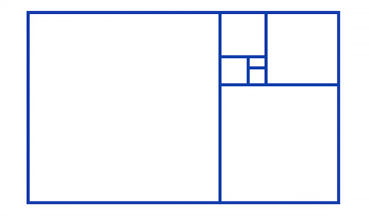
   The golden ratio is depicted as a single large rectangle formed by a square and another rectangle. What’s unique about this is that you can repeat the sequence infinitely and perfectly within each section see image below:.
golden rectangle ratio
Used in art, the golden ratio is the most mysterious of all compositional strategies used. By creating images based on this rectangle our art will be more likely to appeal to the viewer, the mysterious this is that no one knows why
Artists throughout history, like Botticelli and Leonardo daVinci, have used the golden rectangle, or variations of it, as the basis for their compositions.
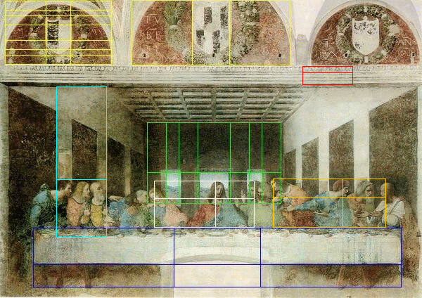
 Da Vinci The Last Supper, with golden sections highlighted.
http://www.goldennumber.net/art-composition-design/

Golden rectangles are still the most visually pleasing rectangles known, and although they’re based on a mathematical ratio, they are not that hard to understand how to use them.


For my own reference below from http://www.goldennumber.net/art-composition-design/
----------------------------------------------------------------------------------------------------------------------------------

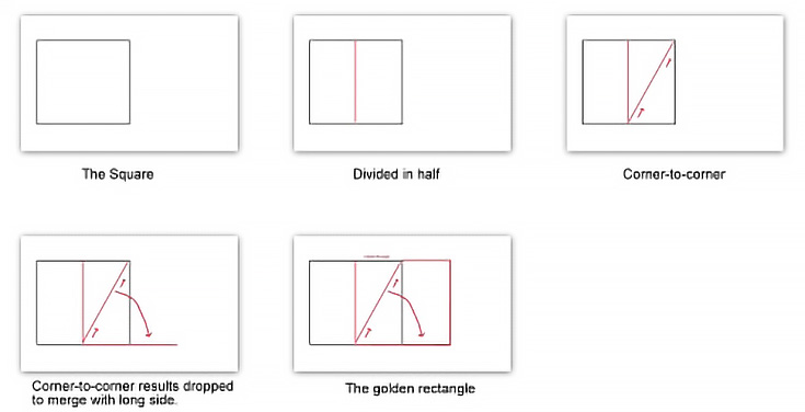
How to make a rectangle based on the golden ratio

If you want to use a golden rectangle in your own compositions, here’s how you can make that happen without any special tools or mathematical formulas.
1. Begin with a square, which will be the length of the short side of the rectangle.
2. Then draw a line that divides it in half (forming two rectangles).
3. Draw a line going from corner to opposing corner of one of those halves.
golden rectangle make
4. Rotate the top point of that diagonal line downward until it extends your square.
5. Finish off the rectangle using that diagonal length as a guide for the long side of your golden rectangle. It’s that simple.

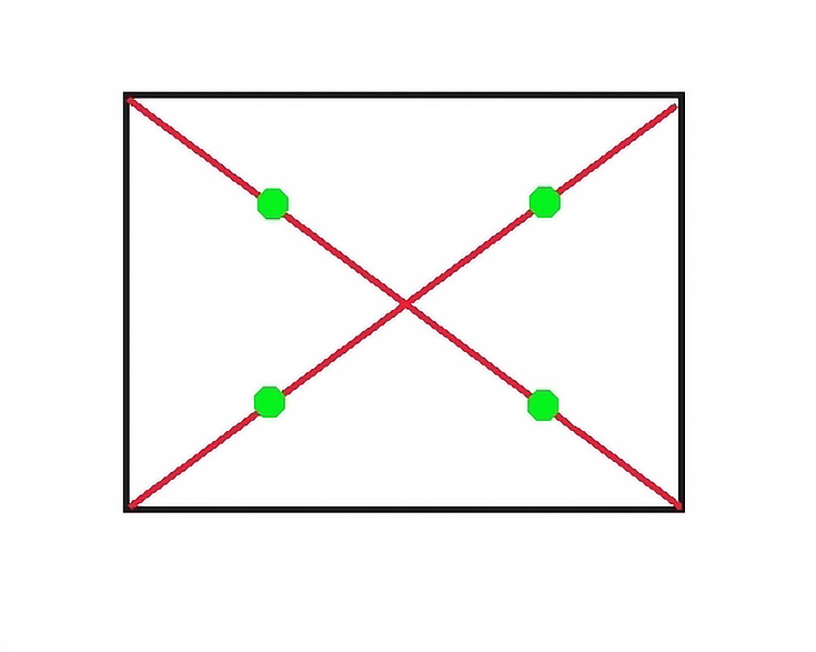
Visual points of interest inside a golden rectangle

Any square or rectangle (but especially those based on the golden ratio) contain areas inside it that appeal to us visually as well. Here’s how you find those points:
1. Draw a straight from each bottom corner to its opposite top corner on either side. They will cross in the exact center of the format.
2. From the center to each corner, locate the midway point to each opposing corner.
rectangle eyes
These points—represented by the green dots in the diagram above—are called the “eyes of the rectangle.”

-----------------------------------------------------------------------------------------------


By looking at this information I can see that if a maintained a ratio of small elements to larger elements that was the same as the ratio of larger elements to the whole, the end result will be more pleasing to the eye. Another way to create images more pleasing to the eye is using the 'Rule of Thirds'.

Rule of thirds

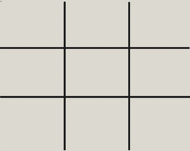
The rule of thirds compromises of using as grid such as below:

rule of thirds diagram

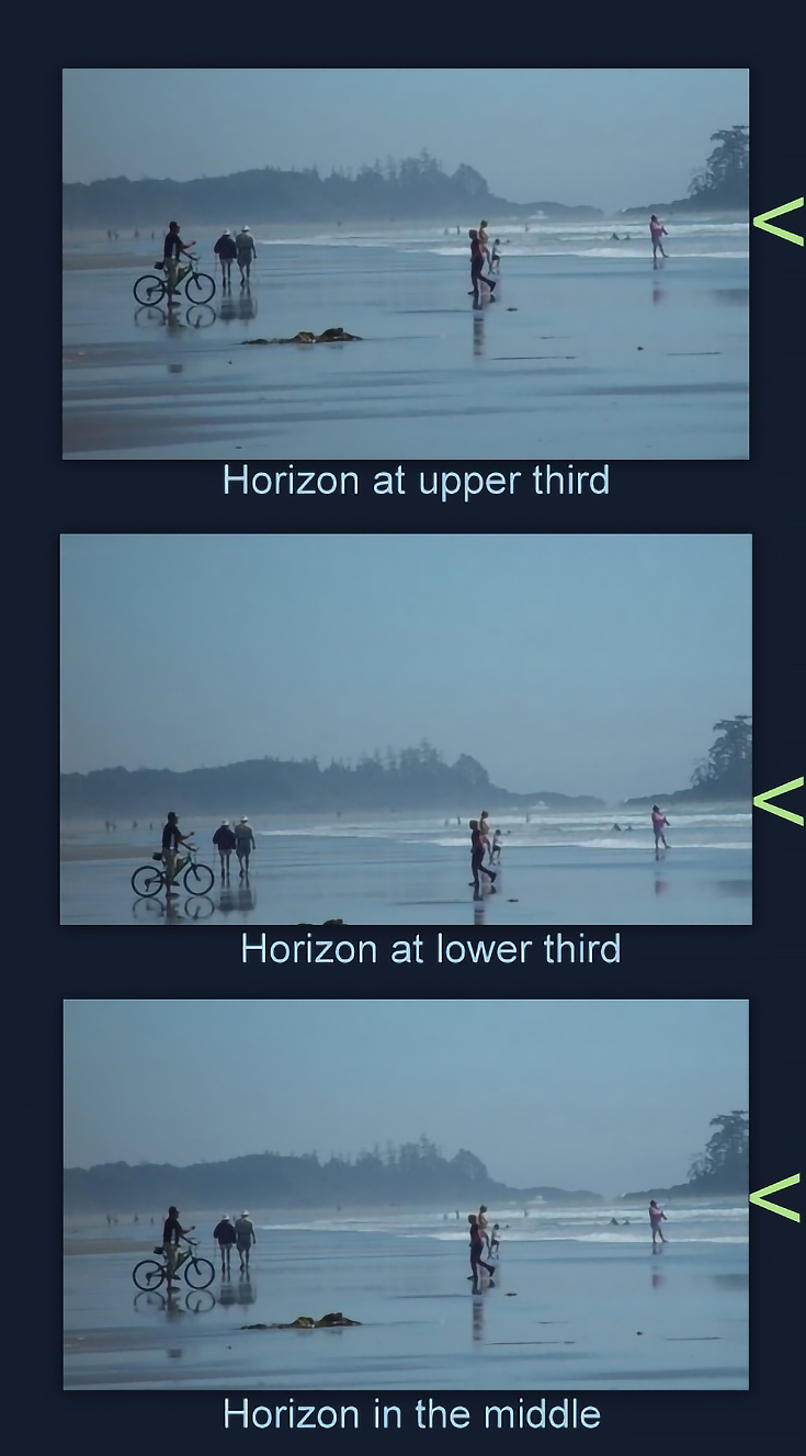
     When you look at this grid you can see there are three squares across and three squares up which give the name the rule of thirds. When drawing the grid the 4 points which cross over are key power points which work in a painting to create a better composition. See below for a good example that I found:


http://emptyeasel.com/2009/02/03/the-rule-of-thirds-why-it-works-and-how-to-use-it-in-your-art/
horizons

    I can notice by looking at this that paintings 1 and 2 have more appeal to me then the bottom one with the landscape horizon in the middle. The other two give the painting more lift to the composition making it different and more appealing to the eye. The top two are more appealing as the artists has put them on the higher and lower levels of the Third Rule grid to achieve a more appealing view. 

By researching this I am excited to test these out in my paintings. I am looking forward to finding ways to use this in my sketches and when observing landscapes.

Artist I have found using these two principles

I have had a look on the internet and I have looked at some paintings below which I think the Golden and the Rule of thirds has come in to place:

The Golden Rule


The Golden Rule was used extensively by Leonardo Da Vinci


The last Supper 
http://www.goldennumber.net/art-composition-design/
Da Vinci Last Supper showing golden ratio or phi proportions

Below Da Vinci “The Annuciation” the golden rule is used on the lines of the brick wall which are of the same proportion. 

http://www.goldennumber.net/art-composition-design/
da-vinci-the-annunciation-divine-proportion

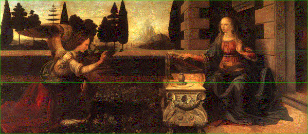
Even the smaller details such as on the table, have been positioned to follow the golden rule:

Michelangelo also used the Golden rule:

“The Creation of Adam” on the ceiling of the Sistene Chapel
http://www.goldennumber.net/art-composition-design/
Golden ratio composition in Michelangelo's Creation of Adam

The finger of God touches the finger of Adam precisely at the golden ratio point of the width and height of the area that contains them both creating a good composition to look up at.

Rule Of Thirds

The rule of thirds to me, is more understandable and I can see how well it works. I looked at a few Naive paintings below which I can see that the rule of thirds has been used to make there paintings have a better composition.

Rebecca Campbell
3 Chickens Equals 1 Turkey
http://www.redraggallery.co.uk/artist-rebecca-campbell.asp?gId=21
 Rebecca CAMPBELL - 3 Chickens Equals 1 Turkey
  This Painting above has used the rule of thirds by the artist placing the rope on one of the two invisible lines across the page, to create focus on the main area in her painting.  Also the rooster on the right is in the area of a power view point of the rule of thirds. 


Art by Paul Robinson
Flora Waits with Anticipation
http://www.redraggallery.co.uk/showInventory.asp?iId=13731&title=Flora%20Waits%20with%20Anticipation&artist=Paul%20ROBINSON
Paul ROBINSON - Flora Waits with Anticipation

In this painting, the rule of thirds is used here which makes the red phone box and Big Ben the main focal points. 


Vivienne LUXTON 
Celebrating a new Recipe
http://www.redraggallery.co.uk/showInventory.asp?iId=13599&title=Celebrating%20a%20new%20Recipe&artist=Vivienne%20LUXTON
Vivienne LUXTON - Celebrating a new Recipe

     This artist has used the rule of thirds to focus on the two happy chefs. The rule of thirds power areas hit both of there faces in the centre of the painting.

      By looking at these examples, I can clearly see how much of an importance it is to get a good composition. By using the golden rule or the Rule of Thirds, they both create an extremely powerful composition.

Exercise - Painting a landscape Outside


   For this painting  I have read the Oca folder in how to prepare for painting outdoors, I have my easel which folds up in to a carry case, which also holds my tools such as paint brushes, Brushes sponges etc. I have decided to use an artist board. I really enjoy using them I have found them to be more easier moving them around then a piece of paper or a canvas which can sometimes be awkward to carry around. The art boards are slim and easy to just take any where. I have an apron, which I will be putting over my coat to keep things clean. I have got a glass that I shall put my turps in when it comes to painting and lots of toilet roll to absorb any turps off brushes or mistakes.  I have got my tools to research the area such as water colour paints and pencils to sketch out the area I find and  create a few different angled sketches.

11/08/15 First of all I need to decide on an area I would like to paint. I need some where local so I don't have to travel far and I can go there a few times if need be. I am going to go out for a walk and see what I find, Taking my sketch book with me and some tools just in case I'm lucky to find a really interesting area.

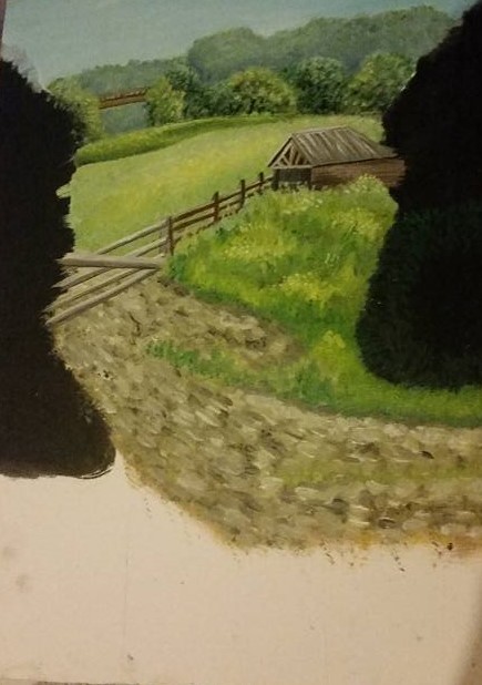
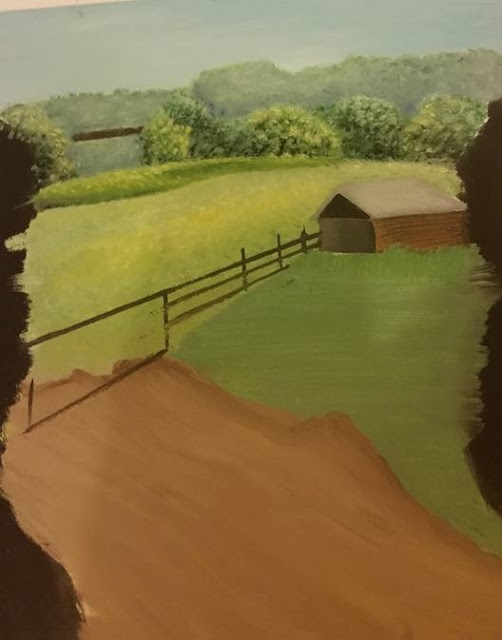
    I am now writing on my blog from my mobile phone. I think I have found a place to draw, Its an interesting country side area, Part of a farm. I am on a grassy slope looking in to the area. What's really interesting is that there is a old barn to the right of the area and I think could make a good focal point. Also in front of me there is a sign post. I am going to take a photo of my area to show here.


    This area is a great idea for a painting as it is not flat and there are interesting parts to my view. by looking at the photo I can see there is a lot of sky and the horizon line is in the middle. To make this more interesting and to use the rule of thirds I am going to crop the image and get rid of some of the sky hopefully this will bring my horizon upwards and then I will know when looking out to the view what areas I am putting in to my painting. 


    As you can see after cropping the image the area has become even more interesting. To capture the view I intend with less sky and more land I think it is best for me to get lower down to the ground so I am now sitting on the small hill that I was standing on looking in to the farm area. 

   Sitting here now looking at the view the key features I instantly notice are the Barn on the right in the middle ground on a hill and the sign post on the left which is in the foreground (on the hill I am sitting on). What also interested me in this area is the way the light of the sun reflects on the field in the background, it creates some what of a luminance on the grass where I can see which makes the grass seem to have a yellow tone to it. There is a bridge in the background through the trees. I can see cars going across it. There is two fences in this area which divides up the land scape which creates a good effect to the composition. Lastly there are bushes either side of my view which frame the area nicely. The Mood and atmosphere of the area to me is a very pleasant sunny day with the general mood of happiness with surrounding nature. The atmosphere is of a general countryside. 

  Where I am sitting is a quiet area with a country road behind me which is a good area to help me concentrate and to avoid the passers by. 

   Looking at the area I have decided to split the drawing in to three areas the background the middle ground and the foreground. By looking at those areas at a whole then individually I think it will help me to get more of a detailed painting. I have decided I don't want too much sky as there is enough interesting things to look at on the ground. The land moves up in height so it creates a interesting composition. I have decided I think having a vertical view of the landscape will look better then a horizontal landscape. This is because the area/view I want to capture is narrow and putting in on a landscape view it will ruin the composition I want to capture. I know this is a risk but I feel it is going to work out well I want to trust my theory of the way the bushes frame the narrow view I have. 

  For this painting I am going to use the rule of thirds. I think this will work out really well as the barn is not on a equal level being in the top right area. If I was to draw this area I can see that the barn would be hitting one of the rule of thirds power areas and the sign post is hitting the bottom left power point which make this view a great opportunity to use this rule to create a dramatic composition.  I have got my photo below with the rule of thirds grid on just to show how it is going to work. 

   I am now going to sketch a few angles to get to know the area better and where the correct level of the horizon is going to be. I will look at contrasting tonal areas and paint samples of colours that I can see in the view to use with in the paintings I shall be doing at a later point. I feel the landscape has linear and Aerial qualities. Linear because of the depth in the view due to the fences splitting up the areas and Ariel view due to the trees far out in the background becoming blue due to the atmosphere. I am now going to start and will report back once home. 


     I am now home and now looking at what I have done in my sketch book . I am very happy with the outcome. I have used the rule of thirds and I feel it is a great composition to use. My sketches were from left and right angles to get to know the area better. I still feel straight on angle sitting down in the best. I painted in water colour in my sketch book the final view I want to paint. I have put details of the objects on my pre drawings as the viewers may not totally understand my quick sketches. I have looked at what colours are best to use. I found my sap green to be of use for the bushes mixed in with different colours: Black to add deep depth in bushes/trees. Whites and yellow to add light and tone. for the ground dirt pathways in my view grey and earth colours will be great for this. My colour choices are below. I aim to keep them restricted and creating a variety by mixing them with other colours:

White, Black, Sap Green, Yellow, Marine Blue and burnt umber.

      I arrived there at 3pm and during being there for the last hour and half the light shifted to the right. I want to capture the light how I saw it, when I first arrived where it was reflecting on the field in the background. To help keep the same light, I will refer to the photos I took and also when I begin my painting, I will return to the area about the same time to capture it. It has been a sunny day today and I do want to go out again tomorrow to start painting. Hopefully the weather will be the same.

12/08/15 I have come home today from work and its dull and starting to rain, so I shall try again tomorrow. The is no point in going out today as the atmosphere of the scene wont be the same plus Ill get wet and my painting will get wet too. 

13/08/2015 Today the weather is a lot better I am really excited to get started. I have packed my things I need together and I am now ready to set off. 

   I have now arrived here at 2.45pm hoping to see the light in the same area for a bit longer. I have set my easel up and my blank bored ready to start the first steps towards painting.  Whilst checking my sketches and looking at the area again I want to point out that the area still looks the same and I am lucky enough to have the same light there again too. I have drawn my rule of thirds grid on my board and now have just finished sketching the basic areas out. I am now going to start the painting its 3pm. I am going to start with painting in the sky and the trees in the background. Hopefully I will do the field too. 

I am now back home and this is what I painted:


    Obviously its not finished. I think I will have to make 2 more trips. I have managed to put the sky in with the background detail of the trees. I was lucky enough to have put in the field that is in the background too. I have used yellow with the sap green to capture the light on the field as discussed previously and I think I have painted that area well. I like the trees in the background I added a little black to add depth to them and it gives a realistic effect. The bridge in the background is there also. I will be adding texture on to this once dry.  I have also done two black areas either side of the painting which is for the trees/bushes, which frame my scene. I have done them black and once they are dry I will put a green foliage texture on. The black underneath will then create depth in those objects. I have also just added in some of the basic lines where other things will be going in my painting such as the fence, the barn and the hill and the tractor path. I think for my first trip I have managed to do quite a bit. I shall now wait until its dry to go out again and do some more. 

15/8/2015  I have today been out again and this is what my painting looks like now:


       Today was not as warm and sunny so I had to wrap up a bit. Whilst I was out there it began to rain so could not stay out long. I managed to add the detail on the barn, the bridge in the background, the fence, the hill where the barn is and the tractor path. I like the texture I have got on the grass where the barn in and the way I applied the paint to the dirt track of the tractor path. I did this by using a flat brush and using various greys with yellows and applying dabs of paint to where I saw was necessary, I think it creates a good rough texture to the ground. The hill of grass was interesting to create. With all the colours of the different type of grass together I had to look closely to attain the same colours I could I my painting using my limited pallet. I did this by using my sap green with yellow, grey and white. I am going to attempt again tomorrow to see if I can get back out there.

16/08/2015  I am now back out here its 2.40pm still keeping to around the same time frame. Its a better day today, its back warm and sunny again. I am going to carry on with my painting now and report back here later.

Here is my painting of what I did today:


    I managed to finish the trees and bushes either side of my view and place in the fence that is in the foreground. I also did the basic first layer in my foreground on the grassy areas and the hill I am sitting upon. I find the bushes and trees fun to do. I particularly liked the tree on the top right hand side I did small brown strokes for branches then got a small brush to apply small dabs to look like leaves. I used different tones of sap green and for the lightest area of the tree I added white. I did this technique to the other 3 trees/bushes surrounding the painting. The bush at the lower left, weaves through the fence and is over grown, so the fence disappears with-in the bush. I have just applied the basic shape and texture of this bush and will improve it on my next attempt. I think I will only need one more go at this landscape to finish it off. 

18/08/2015 I have been out today with my paining and I have finished my land scape:


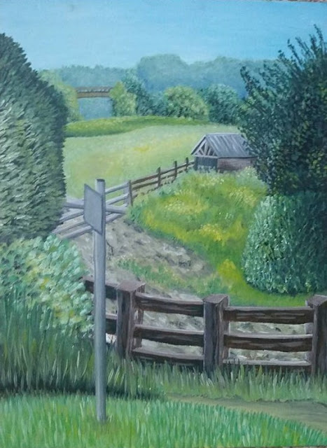
I worked out that overall it took me about 4.1/2 hours to paint from start to finish, which I don't think is bad. I finished my painting today, by adding the detail to my foreground which was the fence, the grassy border below it, the pathway, the grassy bush on the left, the hill I am sitting on and the Signpost in front of me. Looking at my painting now, I can still confirm it was a good idea to take a risk and do my landscape vertical. Using The Rule of Thirds, helped my painting come together as a insightful composition of the area I was looking at. My technique of how I created textures gives really good detail to my painting. Looking at the painting gives you a sense of depth and a far out view into the distance. I kept to the colours and my ideas and it has paid off. To critique me work however, I think the barn looks too small, or I may have done the middle fence to big, creating a sense of incorrect proportion on these two objects. I think other then that I am happy with what I have achieved and it was a good experience for me. 

500 words on the Experience and what I have learned from it:

     Before starting this exercise I thought to myself that this would be an easy fun task, to just go outside and paint. Whilst I did have fun, I came to realise there are many things to consider, even before starting a painting as well as during painting. One of the key factors for me was the weather and the time of day in which I painted, to keep my painting with the same atmosphere when I first observed it. I now understand it is difficult in getting the same light and mood of an area as the landscape and weather is constantly changing. I did however take photos which I referred to and I went to the area around at the same time every day, to make sure to capture the suns light in the right place as it was. Taking a chance and going out is another thing I learnt. On one of the days I took a chance and it did rain and I had to quickly hurry home to protect my painting. It was a good experience and I have not been put off doing it again. 
      I think choosing your area is also important to help portray what you want the views to see, such as a story or an atmosphere you like and want to share it with the viewers. I have learnt that you have to work around nature, to get the painting you desire. If there’s a day without the correct weather, then you just have to wait for the next day. Painting outside was eye opener, it made me feel at one with the landscape I was looking at and I had fun capturing the sights and the correct colours of the area. I have learnt to look more in-depth at landscapes to capture what is important to you with in that area. 
        The main features were placed in my landscape with the help of the ‘The Rule of Thirds’. It really made my composition come together. Deciding on the composition was a good exploration of different views. Sitting down in the end was the best way to capture more of the land and less sky. It showed me to move about more and you are bound to find a view that you are happy with. 
     I also learnt that pre-sketching the area at a few different angles made me get to know that area better and helped me in-case I had missed anything important out, which could have been useful. 
      Finally painting outside helps you grasp tones and contrast better of true natural colours. I was able to look and practice, till I was happy with my colours I had created. 
      Overall the experience was a challenge, yet I had fun with it and I have learned there is more to painting outside then just painting. There is a lot you have to think about and a process which helps you, to create your best interpretation of the landscape area chosen.

ASS4 - Project 3 Expressive Landscape


Research

       Surrealists dream like landscapes are one of the types of paintings I enjoy looking at. I think you can actually see so much imagination and ideas from artists around the world. Some landscapes are ideas of peoples views of other world, places they create in there minds.

     I am going to look at a few paintings by various artists. In my next painting the project is to create a mood and atmosphere. I am going to be looking and thinking about my own ideas and what fascinating landscape I can create using my own imagination.


Salvador Dali


To look at him you automatically think of him as a bit of an eccentric. This is one artist I do remember studying whilst as school. I even remember having a go at painting a scene involving melting clocks in a lands scape. I remember being really chuffed with it and proud as my teacher liked my work. 


'La persistencia de la memoria' (The Persistence of Memory)

http://www.moma.org/collection/works/79018


       I think this has to be one of his most iconic pieces of his art work. His theme here is time and decay in this land scape. His use of colour are vibrant and the scene stands out in front of you. His ideas with the melting clocks shows his great imagination here. The atmosphere here is showing time rules over every thing even the land.


The Three Sphinxes of Bikini (Les tres esfinxs de Bikini ) 1947

https://www.salvador-dali.org/cataleg_raonat/resized_imatge.php?obra=629&imatge=1


      I was just searching on the Internet and came across this land scape scene. I really like this one. Its simple but when you look at it you realise that Dali used his imagination to show that trees look like the back of peoples heads with there hair as the leaves. I like the colours used here, the head in the foreground really stands out at me. With simple use of complimenting colours together, I think this is a really good example of a unreal world Idea.

Sleep 1929,

http://www.jackygallery.com/index.php?main_page=product_info&cPath=4_30&products_id=420


   Dali in his work created creatures with tall legs and on stilts. This painting was one of Dalis dream world visions. He has regarded sleep as a monster supported by crutches This is quite a fun painting with an interesting idea. Really to me sleep cant be a monster because he is always asleep, he even needs aid of the crutches so he is not a monster, but to me more of a friend that provides us with rest. I really do like his idea here and again you can really see that Dali had a wide imagination.

Max Ernst


     I have had a look at his work and his idea behind it and to me I don't really appreciate his work. its not my taste of art at all:

EUROPA NACH DEM REGEN (Europe after the rain)
http://thewanderlife.com/sedona-arizona-imagined-landscapes/


      Don't get me wrong, he was really good with his imagination. He had been involved with war and these traumatic events in his life, were the meaning behind his imagination in his art. It pushed him to create works of ugly landscapes, which to me look as though it is parts of landscape that has been rained on by acid, the areas are rotting away. There are even dead war human bodies that are forming the land scape in this scene. Perhaps this is what he wanted to show, what its like to of seen and been in war to imagine the most ugliest and gruesome scenes he witnessed. his paintings were to captivate his inner mental view of what he had been through.

Giorgio de Chirico


Piazza d’Italia circa 1956. 
http://timkanebooks.com/2014/07/08/de-chirico-and-his-fantastic-landscapes/


    This painting is exactly what I picture a dream scape to look like. On the surface it looks simple and straightforward, but then I start to wonder. What is that train doing in the background? Who are those two people talking? it surrounds mystery. I like the way the shadows in his work are extra long, creating am idea that the land in this scene is like a flat dessert.  The colours used are simple yet work well together making each object noticeable and stand out. 


 Mystery and Melancholy of a Street 1914. 

http://timkanebooks.com/2014/07/08/de-chirico-and-his-fantastic-landscapes/


   This is one of de Chirico’s most famous paintings. I notice the shadows of two figures just out of view. That creates an unsettling image for me as my mind desperately wonders who or what they are, are they danger for the young girl outside playing? His use of shadow is a good idea as it makes you wonder what story is hidden with in his paintings. 


Dragan Mikhailovich 

 http://vsemart.com/serbian-naive-painting/


       I wanted to try and find some paintings that I can relate to with a Naive style. I discovered this artist and was immediately drawn in to his ideas. The paintings are beautiful landscapes with a lot of detail. I think the one above with the giant pumpkin on the sea is a very imaginative idea. There is a whole little town based upon the pumpkin. 


     This painting above, also of Dragan Mikhailovich fascinated me too. I like how he created a path that starts form the ground world, which then travels to a town in the winter sky. The colours of naive art are typically bright and I do think this is my taste in art. I am really attracted to the naive way by the colours and the way the paint is applied to the painting. There are lots of textures created. 

      Now I have looked at some dream worlds, I am going to look at ways that artists show emotion in there landscapes:


Paul Nash, The Mule Track (1918)

http://spartacus-educational.com/ARTnash.htm


Like Max Ernst, Paul Nash was also a painter of war. His work appeals to me a lot more then Ernst's. I think this is because I can see the emotion in Paul Nashs art. I feel I can under stand it better and it is more of how I would picture a war scene. There are blasts form bombs, fire and just utter destruction of buildings in the landscape. Nash wanted to share with others what war was like. He wanted to be a messenger for all the army to give non fighters an insight to what they were dealing with. His work produced terrible and fearful images which is the emotion he was trying to make the viewer feel. 


Graham Sutherland

Western Hills

1938 / 1941


'Western Hills' I feel is a great example of showing atmosphere in a painting. Sutherland did not paint outdoors but instead painted the suggestive forms of his beloved Welsh landscape from memory. The vibrant colours and textures of this painting create a richly atmospheric scene. I like the rich oranges and yellow it creates a scene of a sunset or sunrise with the suns glow over the hills.

Emil Nolde 

watercolours of Emil Nolde (1867-1956)

http://www.artpane.com/Books/B1032.htm 


 These paintings are among the most beautiful and important works of the 20th century. Emil Nolde created lots of these types of paintings. In this painting above I can sense the nearness of the sea. In the background I can see hills, with what looks like rooftops far away. In the foreground the sea is creeping towards the land. The reds create a really emotional atmosphere. I get a sense of rage from the natural areas, the sky and the sea, but beyond this there is the blue sky and the blue hills which gives me a feeling of calm over in the distance. Emils images are powerful and vibrant. 

I read on Art Plane website: 'Sea and sky are experienced as fateful forces of nature. The setting sun transforms the sky into a glowing sea of colour as twilight gradually envelopes the earth. The sky becomes the stage for cosmic events, for the struggle between light and darkness.' I think this comment really justifies Emils type of work showing the power of nature. 


Colored Sky above the Marais, watercolor on paper, c.1940,


   Nolde is equally interested in lesser dramas. He is attracted to the nuances produced by the light on a rainy day, with its gradation of colours from blue to green with added yellow and red. But above all he is excited by the full strong colours and the dramatic happenings of nature.

Gustav Klimt

Church In Cassone

http://www.klimtgallery.org/Church-In-Cassone.html


     I like Gustav's work, he inputs a lot of texture with in his paintings. I admire this scene with the tall trees and the white buildings. The different colours of greens compliment the white buildings and creates a vibrant painting with a lot of interested textures, The use of textures helps the painting to become more interesting and creates an effect that you could agree and feel the textures to their true form.


http://www.fridakahlo.org/the-wounded-deer.jsp

The Wounded Deer, 1946 by Frida Kahlo


     As mentioned in previous projects, I do enjoy looking at Frida's art. Its really interesting and every painting of hers I have looked at so far, makes me question the meaning beyond the painting. Such as this one, with her head on a deer that has arrows in its body. Was she feeling hunted? trapped maybe? from her injuries she had in her accident when she was younger? I think the arrows are symbolising her pain she is feeling. The background is the forest with dead trees and broken branches, which implies perhaps the feeling of fear and desperation. Far away is a stormy, lightning sky which also seem to me as a bad meaning in the painting.

     I researched further in to this painting. The true meaning behind it is that, in 1946 Frida Kahlo had an operation on her spine in New York. She was hoping this surgery would free her from the severe back pain but it failed. This painting expressed her disappointment towards the operation. After she went back to Mexico, she suffered both the physical pain and emotional depression. In this painting she depicted herself as a young stag with her own head crowned with antlers. This young stag is pierced by arrows and bleeding. At the lower-left corner, the artist wrote down the word "Carma", which means "destiny" or "fate". Just like her other self-portraits, in this painting Frida expressed the sadness that she cannot change her own fate. Frida used her pet deer "Granizo" as the model when she painted this portrait. She had many pets which she used as her surrogate children and deer is her favourite kind. This painting has multiple interpretations from different people. Some said it expressed her frustration over the botched surgery. Others said it portrays her incapability to control her own destiny. And some people said it has sexual implication and expressed her struggles in different relationships.

Research Conclusion

      After looking at all these different types of ideas, I now get an understanding of how to input a mood and an atmosphere in to a landscape painting. I like the fact that colour of nature can deeply affect your scene, the meanings behind dream worlds and events that have happened. I now want to use some of this research to create my own in the next exercise. 


Exercise - Creating Mood and Atmosphere


Ideas

    For this project I need to create Mood and atmosphere in a painting. I have had some thought to what I want to do and decided on creating my own dream world. I have had a few ideas such as: a landscape from a insects view and a landscape which is created by using peoples faces as mountains. Although these sounded as interesting, I really liked the idea of creating a food land. I want to use food objects to create a landscape which is fun and all you can eat. I want to create a sweet atmosphere and the mood will be hunger. I am firstly going to sketch some ideas out and see how I get on.

Sketches


    Whilst sketching I decided that a land of desserts would be fun to create. It will be bright and bold. I have drawn out a few basic ideas. I like the idea I have created with a giant doughnut in the centre, in the distance. It reminds me of a rainbow in the real world. I also like the idea of trees being lolly-pops or canes with candy floss on. I want to include sweets such as cakes, chocolate eggs, marsh mellows and toppings such as icing and sprinkles. I think also to create depth, I want to include a river of chocolate starting from the background to the foreground. I am now going to do a quick painting in my sketch book to test out the types of colours I think would help to create a sugar/sweet landscape. 


    After doing my quick paining test, I have decided that pastels colours create a sense of sugar such as pinks whipped with yellows and blues. Whites are good for Icing which will help my doughnut stand out from the background. I think my landscape scene will be a good example of a mood and atmosphere, with a mood of hunger and the atmosphere of the landscape being a sweet/sugary scene. I am happy with my idea and now I am going to begin painting.
Painting


      I have now began painting. I have started to paint in the basic shape areas of my landscape. I am still playing around with the colours at this point, deciding what tones to use in the background compared to the foreground. I still think the colours seem dull then how I want them to look. I am going to wait for it to dry and try and improve this on my next go at it.


     Now its dried I am going to again paint and see if I can get my colour looking better this time. I am hoping to get a bright and bold landscape. I feel that I need to pick up the  tones in my scene. 


I have now gave it another go and it looks a lot better. I created brighter colours by adding more colour and less white to the mixing of colours to create a more vibrant ground in the landscape. I think it is looking well. I was trying to put some swirls in the chocolate river but I am not too keen on it. I am going to paint over it and treat the chocolate river as though its water. Next layer I will be adding detail and forming my dessert scene to look delicious.


   After two more times painting I have finished my landscape I am pleased with it. I think I have created a scene that shows a mood and atmosphere well. I like the way the chocolate river adds depth to my landscape. I think my idea of a dessert land works well and by using my imagination, I have created my scene from my head what I think a dessert world would look like. There are a few things which I could of improved on looking at it now its dry, which is to of added more detail to the ground and the river. On the river I put white speckles of paint, to try and show the sugar in the chocolate sparkling but it just looks to me as though its not finished and I could have done better here. The other thing I have to mention is the marshmallow hill on the left in the foreground. To me I used the wrong colours and should of just painted it to look like a proper marshmallow. It now just looks like a hill which is covered in sugar. 


Overall

Overall, I think I have shown I understand Mood and atmosphere with my research, my ideas and my painting. I found it fun to do and letting some of my imagination out on the canvas was a good experience for me too. As I am a keen illustrator I like the fact that I could use my imagination for this task. I think I am beginning to understand to paint a good painting you need to think of what you want to portrait to the viewers and then how your going to do it. This can be decided my use of colours, mood, atmosphere, meaning/story. They are all needed to create good art.