Research on Self portraits through the ages
Self portraits today, are done by using technology such as photography. We now have mobile phones which we take 'selfies' on which gives an instant self portrait. Its sad to say but I feel that self portraits are becoming a lost art and looking more so in the future. They are still around, but are not as important as they were back a century or so. The main reason is that, a self portrait in art can take weeks, months or years to complete. Observing yourself and painting/drawing in everything that you see, particularly key features that make up yourself takes time. In the past there was not such things as cameras, so people would go to artists to paint portraits of them. In today's world, its just by the click of a button and it takes your pose in that second of your life. I have looked around for some great self portraits and I have found my 6 self portraits that I feel are the best. They all have key features to what I think creates a great self portrait: personality, good composition, colours style and techniques.
Albrecht Dürer self portrait 1500
http://www.openculture.com/2013/07/the_genius_of_albrecht_durer_revealed_in_four_self-portraits.html
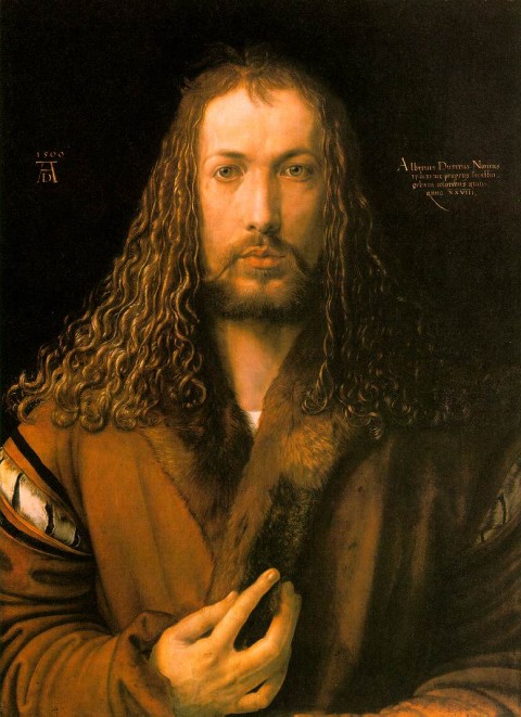
I could not resist this portrait of Durer. He is one of my favourite artists. I really admire is work and his techniques, especially is etching drawings. This portrait was painted when he was 29 years old, one of the last he did before he passed away. In his portrait above, I get a sense of him being a friendly and relaxing man to be around. He has twinkles in his eyes and the portrait gives me a sense of gentleness. He looks a bit like Jesus from the bible, with his curly hair and his brown robes, which is kind of what I pictured Jesus to look like, in my head. Its as though he has painted himself as a saint in a way, a good person. His hand gesture, gives a warm attitude to his self-portrait, his touch to his fur on his coat has a 'you can trust me' feel to it. His face area seems to me quite a long face, but I cannot comment that as a criticism, as I haven't actually seen him in real life. The colours used are very minimal, browns, skin and black colours give this self portrait a sense of warmth and work really well together.
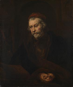
Rembrant self portrait with Circles 1665
http://blog.courtauld.ac.uk/researchforum/rembrandt-the-late-works-national-gallery/

I came across this painting a few months ago, whilst watching a BBC documentary about Rembrandt. I learnt that looking closely at this painting it looks unfinished. His face area looks as tough that is the only part that has been finished. He started painting this in 1665 and must of still painted it till his death in 1669. In the middle you can see he is holding paint brushes, but there not finished. Its as though some one disturbed him, whilst painting and he just did two big brush strokes, to show where the paint brushes were going to be and the angle which they are at. Usually in Rembrandt self portraits, and there was a quite a lot of them. He usually painted himself with elegant robes and gold chains. This one is different, as he is here with out non of those. It as though in this painting, he was trying to portray something internally in him. He was not caring what people thought of him. It is as tough he was trying to show an internal state of emotion. The main mystery of this work, is the two circles in the background. Some people think its a map to something. One of the main ideas is that during this time an artist called Giotto was being talked about. He was known as a artist who could draw a circle freehand, with one line. The theory is that Rembrandt drew two circles to show he could do it twice and was far more superior then Giotto was. For me this painting is too dark and the colours are murky, but it makes a good painting due to the mystery behind it and how different it is compared to his other self portraits. I feel having a hidden object or area in your painting makes it more appealing to the viewers. Humans are very curious and search for answers, for things that they can see.
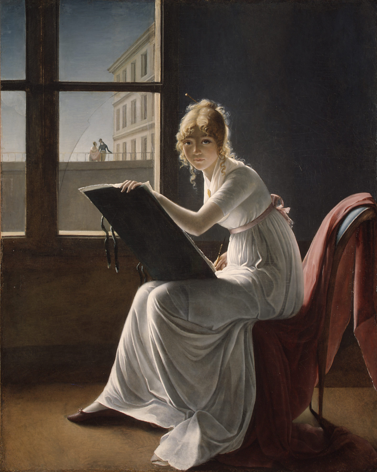
Young Woman Drawing, 1801
Marie–Denise Villers (French, 1774–1821)
http://www.metmuseum.org/toah/works-of-art/17.120.204
VINCENT VAN GOGH
“Self-portrait with bandaged ear”
http://www.courtauld.ac.uk/gallery/collections/paintings/imppostimp/vangogh/selfportrait/index.shtml
January 1889 - oil on canvas, 60-49 cm., London, Courtald Institute Galleries

Van Gogh painted him self quite a lot. There are many portraits you can see in today's art galleries. I picked this one because of the story about his ear and the way he has portrayed himself. He has used simple colours such as green and yellows to form this Art. His usual technique, with small visible strokes (especially on his coat) are visible. His expression is dispirited and still. It's as though he is questioning himself about being an artist. In the background on the left, you can see a blank canvas, as though he still want to paint, There is also a Japan piece of artwork you can see on the wall, I think maybe this was a place that he admired and when he looked at that art he could momentarily escape normal life. The Ear that you can see is bandage up here, is a well known story and it point out his struggle with a serious Mental illness which included, psychotic episodes and delusions. His painting was directly motivated by a psychotic attack, during which Van Gogh chased and threatened fellow artist Gauguin with a knife. Immediately following this episode, Van Gogh returned home, cut his ear off, and offered it to a prostitute as a gift. I am not a fan of this portrait, but I am very fond of his expression in the portrait and the technique of how he applies his paint.I like the way he Portrays his feelings of what he did and how he tried to level it out by cutting his ear off. I can see that it is important to have expression in a self portrait, to get across to the viewers how you are feeling and what your thoughts are at the time of painting.
FRIDA KAHLO
'Self Portrait with Thorn Necklace and Hummingbird' 1940 (oil on canvas)http://www.artyfactory.com/art_appreciation/portraits/frida_kahlo.htm

Kahlo for me has to be my favourite self portrait artist. Her self portraits are vibrant and tell stories of her pain and suffering. Kahlo in her 18th year, was in a traffic accident involving a bus. This was a very bad accident which made her bed bound for a year while fractures were healing on her spine. From then she had really bad health problems in her life. looking on a dedicated web site : http://www.fridakahlo.com/ I found a quote: Kahlo suggested, "I paint myself because I am so often alone and because I am the subject I know best." She also stated, "I was born a bitch. I was born a painter'. This to me shows she learnt to look at herself very well and knew exactly how she wanted to portray herself to the viewer. She wanted to portray how it feels to be her. I really love the portrait above, the greens are vibrant and there are some little symbolic animals in the background which I will come round to discussing. Kahlo has centred herself in the portrait and around her neck there's chocking thorn branches, which symbolise also the pain of her divorce from Diego at the time. There is also a dead hummingbird, which its wings are parallel with Kahlo's eyebrows. The dead hummingbird in mexico, is used as a charm to bring good luck. In the background on the right we can see a cat which to me looks mighty interested in that humming bird. Black cats are know for myths of death and bad luck. On the left there is a monkey which was her pet, a gift from Deigo. The monkey symbolises the devil. The butterflies represent the resurrection. The leaves in the background finish the painting off well, with there vibrant colours they contrast well with her orange skin.
Frida Kahlo
The Broken Column 1944
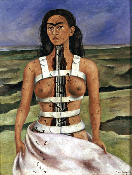
I also wanted to include this portrait, which is really expressive to her wounds she got in the bus accident. Her expression is strong, like a warrior, she's showing that nothing will slow her down. She looks brave and has accepted what happened to her. The nails and the metal spine look really painful and hard to look at, but looking at her poise and face you get a sense that she is a lot stronger and powerful the people think. Again, I feel using life stories and past experiences and inputting them in to your self portrait, really makes the viewer see who you really are, what life issues you have been through and belief in yourself.
Andrew Salgado
I was struggling to find a self portrait artist in this day and age. I asked a fellow friend of mine, who she could think of (shes a fashion designer) She mentioned the name Andrew Salgado, I had a look at his work and was amazed. It has a real modern feel to it and is a really good example of today's modern art. He is popular and one to watch in UK and America today.
'20 Years old' 2014
http://www.beerscontemporary.com/artists/salgado

Andrew creates his personal voice by painting his portraits but also uses mixed media, that forms a collage over all theme to his self portraits. This is very modern, he has combined oil paint with other materials and media to create something completely different. He has a strong personal voice, you look at his work and know that it is he, who created it. I like the colours he uses and all the messy marks he has created, which forms a well structured image of himself. By looking up close he has painted squares with oil paint to also create a part of a collage. His strokes flow opposite directions in squares next to each other. I want to look at another painting:
'The Temple'
http://www.beerscontemporary.com/artists/salgado

This other self
portrait is done with more colour then the last. The decorative wallpaper in
the background, really makes you focus on his face. As you can see, if you look
closes he has again got the same oil squares with his brush strokes going different
ways. This forms texture to his work. Everywhere you look in his self
portraits, there is an interested space, not one area is the same. Every
section and brush stroke is different, creating a really interested painting to
observe as a viewer. I am going to keep an eye on him, to see what else he
produces in the future. So by looking at Andrews work I have come to discover
about how important it is to include your own personal touch, to try and create
something that the viewer has not seen before.
Overview
I have come to
realize that maybe perhaps, everyone should attempt to paint themselves at
least once or twice in there lives. It gives you a great chance to actually
look at yourself as a person and it also shows what you think people see when
they look at you. You may point out a wrinkle, or an area of yourself which you
don't like, which you feel people notice, or you may decide not to add certain
bit that you don't like, every one is different. I think its a real shame that
technology has taken over this type of art. By painting yourself, its so much
more personal and interesting. This to me is better then a photo, as at is a
different way that people can look at you. I am really excited to start mine, I
have some ideas already.
Exercise: Painting My own portrait.
After
looking at these Portraits, I feel really inspired to start my own. There's two
artist from what I researched, that I found to be very interesting and found
there work appealing. I really like Kahlos portraits, I know they are sad, but
I like the fact she has included objects with meanings in to her portraits, to
tell a story and one tale of her personal struggle with her health. I didn't
really like Goghs portraits that I looked at, however I really do like his
painting technique. The use of optical mixes and the visible direction of paint
he has presented on the painting.
By looking at these
I want to practice, to try and push my personal voice out. I have decided I
would like to paint a portrait of me being happy. I want to also include
personal objects and meanings into my portrait to show why I am so happy. The
things that make me most happy and that are of importance are:
Being in love, just got engaged
Daydreaming
love of sunflowers
love of the countryside and nature
Passion for art
Family and friends
My obsession with all things Disney
Travel
I want to include
these in my portrait with me smiling in the middle because I am surrounded by
everything I love and care for. Its similar to Kahol's idea with objects with
meanings, except mine is to show happiness.
The next thing I
want to also include is a technique. I really like Van Goghs way of painting,
So I want to have a go at this in my portrait. I think I may do all the
surrounded Items using this techniques then my face area a little more subtle
so it stands out of the painting. I want it to show my happiness glowing as
that's what my portrait will be about. Hopefully by mixing Goghs technique and
introducing a subtle area to the painting, I will be trying to fish out my
personal voice. I just want to keep trying different Ideas to decided on which
I am most comfortable with and its unique to me.
Preparation
Firstly I am
going to sketch out my face a few times in my sketchbook to get use to my
proportions on my face.

I have now just
done a few sketches of myself and I feel my last sketch is more of a replica to
my face. I thought drawing myself would be easy, but I actually struggled with
this. I discovered that you look at yourself differently when applying make up
etc, compared to actually observing your self and drawing what you see. I asked
my fiance which sketch looks most like me and he said the last one did too. In
this sketch I have tilted my head to the side to get a good angle. I have
managed to get my eyes correct and my nose, it all looks proportioned
correctly.
I have come to
realize why not many artists paint themselves smiling. I was posed for a while
and my grin started to hurt my face a bit. I am going to persevere to show me
being happy though, as I feel this is what I want to portray to the
viewers.
As you know I
have been really inspired with Kahlo's portraits, where she includes objects
and animals into her work. So with the idea list above, of things that are
important to me and bring me happiness, I have decided what I am going to do to
show those in my portrait:
Being in love, just got engaged - My engagement ring and
clouds raining hearts
Daydreaming - Clouds as when I daydream I am always looking
at the sky
love of sunflowers - A giant sunflower
love of the countryside and nature - Fields, maybe a field
of poppies, as I really think they're beautiful. A few trees perhaps and birds
flying
Passion for art - Me painting on a canvass
Family and friends - Chinese symbols of friends and family.
I really like Chinese traditions and their spiritual ways so would be nice to
fit this in.
My obsession with all things Disney - I am wearing a blue jumper, so I thought
maybe I could put Mickeys head shape on it as though its knitted within the
jumper.
Travel - In the background on the fields that are going to
be behind me, I could place some suitcases or even sunglasses.
Now I have my idea
I am now going to sketch some compositions of my idea to see what is the best
layout in my painting.

As you can see, I
have done three layouts. My first sketch that I did, I included all my objects,
but I came to realize there was too much going on. I wanted it more simplified.
The second sketch I did, I felt was too little and not enough objects in there
to portray the meaning of happiness to the viewer. My third attempt came out as
I hoped it would. its simple yet it shows what I wanted to put across. I have
took out the suitcases the birds and the sunglasses. I decided to put a scroll
up on a post with the Chinese symbols on to make it look more important. I
think my overall look will be a good attempt at my own portrait, as well as
experimenting with ideas and techniques to bring out my personal voice.
Painting
Now I have got my
canvass ready and my paints set out, I am going to begin to paint. I have
decided I don't need to paint the whole canvas a background colour, as its all
different. There's only 1/4 on the painting of sky at the top, the furthest
background area. I have decided to draw with my paint, on the canvas, to get
everything correctly proportioned and then I can see where to go next.

I have now done the basic paint sketch and can see where
everything it going to go. I can see that my body is not properly proportioned,
so I need to mess about with this till I am happy with it and my head looks a
little flat so I heed to heighten my hair on my head to get more of my
forehead. Everything seems to sit well on the canvas so far. I will report back
once I have done a bit more.

I have now spent
two evenings on my painting. My facial area I found really fun to do. I think I
got my face correctly proportioned and I have captured my smile very well. I
always wear eyeliner, so that's why my eyes look like a black line, on the
under of the eyes. I had to look closely of where the light was bouncing off my
face and where there are shadows, such as my cheekbones and my smile lines. I
got a good matching skin tone and used a hint of red, yellow, black and white
to create the tonal effects that you see on my face. I have got more of the
background done now too. The clouds need more depth, so I need to apply some
grey areas at bottom of clouds to also show its raining (but with hearts). I
have painted in a field of poppies using optical mixing technique, green with
black and red dots on top to get the perception of poppies. The sunflower, I
think needs to be worked on a bit more. The middle of the flower just isn't
what I wanted, so may paint black and brush marks outwards to the petals. My body
is still not correct. I look like I have a shorter neck then I do. I need to
work on this a bit more. I have painted the scroll in on the post which is
looking well. I wanted the scroll to look old so I had an idea and got a tea
bag. I tried to wipe that on to the area but I just could not get the correct
effect, so I have just painted over that. I wish I had took a photo, but I was panicking a bit, that I had wrecked that area of the portrait. I have seemed to
have got it back on track. I need to wait for it to dry now and will carry on
with it tomorrow.

Its been a few days now, I have changed the middle of the sunflower which looks better and added my chair, canvas and my jumper. With the sunflower, hills and jumper you can see, I have attempted to included optical mixing areas and the way in which Gogh applies his paint. This is more noticeable on my jumper, which the direction on the paint is clearly visible going around my arm. I am really happy with the effect it has made and I have included mickey mouses head on the woolly jumper. I have used different tones of blue to create tone and depth.


Well I have now finished my Portrait it, took me a further 2 evenings to finish. Overall I am really happy with it. I stand out of the painting with a glowing subtle smiling face compared to the rest of the painting. I put shadow on the right side of my head to create a sense of depth and to push me to stand out even more. I brightened up my sunflower, by mixing in brighter yellow and orange, I added more detail such as detail of my ring, the hearts, Chinese symbols and adding a white curved line on my easel, to show there is paper there that I am painting on. My last finishing touch was my paint brush, which I think it set the painting off well.

I really like my attempt of my painting, If I had to seriously criticized it, I would have to say the eyes need improving, there needs to be tone on the paint brush and the sun flower petals could be done with more work to show more detail.
Apart from these things, I feel like I have achieved what I wanted. I know not all the background was in Gogh style, but I felts some areas, may look too much and needed some more subtle areas to even out the painting. I think I did well at testing out the techniques of Gogh showing the flow of paint and expressing myself through optical mixes. My whole paintings meaning is happiness and I have portrayed it well here. I think Kahlo would approve, its simple yet there's a lot in to show my happiness.
Some areas to a few people I have shown it to say are unfinished such as the hair and the tone on the paint brush. I didn't want to do any more, as I guess in a way looking at it now its already finished. In fact I like it a bit undone it resembles my daydreaming moments.
Exercise: Head and shoulder portrait
For this project I want to be daring by doing a close up of my friend Matt's face. I want to try and create a quirky composition, that's different and has personality to it. I want to attempt to use a limited pallet to help toward experimenting for my personal style.
I have decided for this portrait I have put Matt in a dark room with a spotlight, to make a dramatic portrait. I recently watched a film called Sin City, I loved the effect they used to create dramatic scenes such as below. I want to try and attempt this in my portrait painting of Matt.
Evening 1
Matt is here with me now, I have giving him a hat to wear as a prop, to help fit in with my scene that I want to create and also I asked him to wear a loose white shirt. I am going to begin sketching him out, to see what pose I can decide on.


I have created 3 sketches and out of them I prefer the second sketch. It was the hardest pose to capture. I think by using this difficult pose it’s more of a challenge to capture it then the others when painting. I have him posed with the spotlight to the right. This has put half of his face in to darkness creating that ‘Dramatic’ Scene I wanted. The hat is great and helps finish the sketch off. The other two sketches I did were good poses, but I found them easier to draw then the one I have chosen. I then attempted to do the portrait again in charcoal. I feel confident in attempting this now as a painting.

Evening 2
Today I am going to start my painting. I have pre-done the background using a dark red, it creates a murderous background to convey my dramatic scene.
Firstly I have drawn with paint, the outlines of Matt's face. His posture is to the left of my canvas, to help show the light reflecting off his face better. I have now got the outlines in and I am now going to start with putting a based down for the light and dark areas of my painting, so I can see what I am looking at better.
Evening 3
It’s been a day, and now its dry I really want to get started on the fun bit, by using a limited pallet and inputting his features in as well as tone created from the spotlight.
I have experimented with the colours. Looking at Matt's skin, I can see the spectrum colour is orange. I have added white to get the correct light value of the skin. I still felt something was missing, so I added a hint of blue, complimentary colour of orange. This now looks a lot better. It adds depth to the colour. To create the shadows, I will add more blue to the main skin colour. The most darkest areas I will add a little violet and black to create more depth. I have decided on using white, black, Orange, blue and Violet as my pallet for this painting.

I have just finish painting for tonight, I am really happy with my chosen colours I have done the neck area and his hand. The violet and blue really help to contrast with the skin to create the shadows. I have had fun mixing them together on the canvas to blend the light and dark areas together. I how have to wait until dry before I carry on.
Day 4
Today is sunday which is my best day for my art. I am hoping I get this painting finished today and looking how I want it. As I have not looked at it for a few days, I can see some areas, where I feel are incorrect. His chin looks too big and his nose and mouth is too squashed together. I think I need to move his mouth down further from his nose, I can see its too high up which is creating a bigger chin. That is something I need to amend today.

After a few hours, I have finished my painting. I am happy how it has came out. I still think the chin looks a bit too big, but overall Its a good effort I feel. I have created a dramatic scene with my friend which is what I wanted to achieve, with my spotlight effect. The shadow effects look well on my painting and I especially like the neck area. I really think I got that area spot on and I had fun blending the colours. I found the hand to be the most difficulty to paint, with all its wrinkles in the skin. There was a lot of different tones in this part, due to how the light was hitting the hand. I felt this was a challenge. I don't think I have got it perfect. I feel I may have used a few wrong tones in certain areas and maybe should of looked more at the hand. The shadow on Matt's face is really dramatic and it was really hard to show the eye and the triangular lit up area in the the shadow.
I asked Matt what he thought about the painting and he was happy with it. He pointed out his eye looks a bit wonky, which I already knew about but overall he said it look like him and I captured his good side.
I really enjoyed using a limited pallet. I may use the limited pallet again for my next painting, maybe even with less paints but also try a different technique on how to apply the paint, in which I have been lacking in experimenting. As I have not got a personal voice, I need to experiment a lot with technique and ways to use colours to find it. I need to concentrate now on this.
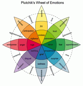
Research Point
For this part in the assignment work, I have to now look at
moods and atmospheres created in artist portraits. This is to get an understanding that a portrait is just not about painting
a person, it's also about conveying a mood or an atmosphere to the
viewer. Maybe this will help me observe ways of applying paint also.
Picasso
In 1901 to 1904, Picasso created paintings know as the Blue Period:
In 1901 to 1904, Picasso created paintings know as the Blue Period:
The old guitarist 1903 http://www.pablopicasso.org/old-guitarist.jsp

In the painting above, I can instantly see that the colour blue enhances the mood this painting. He painted these blue paintings in a time of depression, after losing a great friend, who was also an artist -Carles Casagemas. In The old guitarist, you get a real sense of sorrow and sadness, not just by the portrait of the man, but the colour blue. The use of the colour makes this painting even more pronounced to show the mood and atmosphere of how he was feeling after losing his friend. As the saying goes: He was feeling Blue.
Some more of his portraits of this period below:
Pablo Picasso, Femme aux Bras Croisés (Woman with Folded Arms), 1901–02 http://en.wikipedia.org/wiki/Picasso%27s_Blue_Period#/media/File:Pablo_Picasso,_19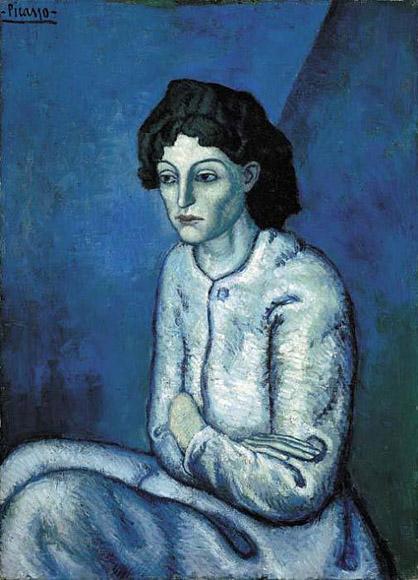
Picasso, 1901–02, Le bock (Portrait de Jaime Sabartes), The Glass of Beer (Portrait of the Poet Sabartes), oil on canvas, 82 x 66 cm,Pushkin Museum, Moscow

Pablo Picasso, 1902–03, Femme assise (Melancholy Woman), oil on canvas, 100 x 69.2 cm, Detroit Institute of Arts, Michigan
By looking at his work I can see that even using certain colours, can make your art more powerful, showing mood and atmosphere to the viewer. Picasso's 'Blue Period' really fascinates me, because he has used minimal lines and colour in his paintings. They create such a dramatic effect to convey the message of sadness and despair to the viewer.
I then pondered about what other colours are used to create different moods and atmospheres in paintings. I came across this web site which was a good read - http://www.finearttips.com/2009/08/use-the-hidden-meaning-of-color-in-your-art/
This website has good information in regards to what colours to use to different emotions and atmospheres. I got the diagram below from the website, as I thought is was pretty useful:
These mood and atmosphere colours really help influence what you are painting in a portrait or a story.
The German (and Austrian Expressionists) used colour and subject matter to attain reactions from the viewers such as shock. After the war they felt they needed to show the horrors of what had happened which shocked and provoke reactions from viewers, The used bold colours and strong lines to convey simple images yet but using the correct colours created scenes that just showed the horrors that had happened during the war.


![Otto Dix. Wounded Man (Autumn 1916, Bapaume) [Verwundeter (Herbst 1916, Bapaume)] from The War (Der Krieg). (1924)](http://www.moma.org/collection_images/resized/459/w500h420/CRI_116459.jpg)


I then pondered about what other colours are used to create different moods and atmospheres in paintings. I came across this web site which was a good read - http://www.finearttips.com/2009/08/use-the-hidden-meaning-of-color-in-your-art/
This website has good information in regards to what colours to use to different emotions and atmospheres. I got the diagram below from the website, as I thought is was pretty useful:
These mood and atmosphere colours really help influence what you are painting in a portrait or a story.
Van Gogh


His early works that I have looked at are below:
Peasant Woman at the Spinning Wheel
February-March 1885, Nuenen
http://www.wga.hu/art/g/gogh_van/02/nuenen16.jpg
Peasant Woman by the Fireplace
March-April 1885, Nuenen
http://www.wga.hu/art/g/gogh_van/02/nuenen17.jpg
Peasant and Peasant Woman Planting Potatoes
April 1885, Nuenen
http://www.wga.hu/art/g/gogh_van/02/nuenen18.jpg
They show people sowing seeds, working, basic labour such as cooking and sewing. These paintings are images of poor people. I can see instantly how the colours he has used to create an atmosphere of what it was like to be poor. He used dark colours, black, browns which made his paintings more dynamic to show the darkness, dirtiness and the way poor people were portrayed as. In each painting, you can see that van Gogh has used simple lines, He was concentrating more on the poor subject then looking at the details. He wanted to show how he saw the poor and he was spot on to how I would view them. Looking at the paintings it makes you feel sorry for them living in those conditions and having to work hard to get little money. The reason Gogh wanted to paint this subject is because of how he felt. He was poor and he was relying on his brothers money to support him. At this time due to Gogh being poor he might of only been able to afford a few colours, hence why all the colours in the paintings are similar, all earth colours. I guess these were the cheapest colours to buy back then, or he just re-used his muddy leftover colours. His pallet looks like it made him work in a particular style that shows contrast of light and dark in his work.
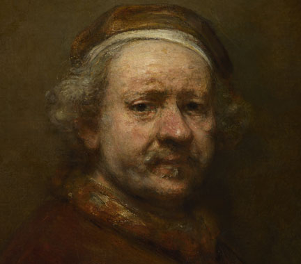
Rembrandt
Detail from Rembrandt, Self Portrait at the Age of 63, 1669
http://www.nationalgallery.org.uk/artists/rembrandt
Rembrandt's portraits paintings are one of the most significant styles of portrait paintings from the past. He captures the
atmosphere very well and the moods of people. Back in those days there was not much lighting as today. They used candles and this shows in his paintings of dark backgrounds and use of light upon his models and himself. You can notice in the peoples eyes of their life issues and sorrows, I don't think I have seen a portrait of rembrandt's looking happy they all look like they have pasts, stories to tell
and sorrow.
He creates atmosphere and
moods with limited pallets using dark reds, blacks and skin tones. Using light upon models faces to capture their emotions in the darkness. Due to the lightness in his paintings strong
contrasts are made which really capture his figures.
To me its fascinating, how well he captures personalities and there moods in a portrait. It makes them look more real and as though they could just step out of the paintings that they are in. The darkness of the paintings also creates depth which I presume creates that sense of volume which helps them to look real.
In contrast to this, the work of the Fauves and German Expressionists created mood and personality by distortion of colour or form in their portraits:
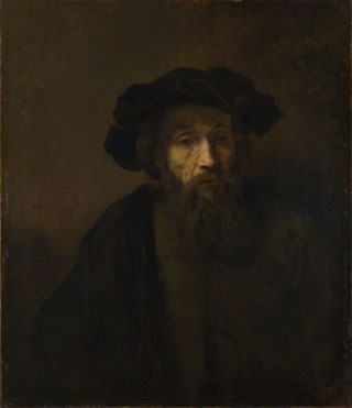
A Bearded Man in a Cap
late 1650s, Rembrandt
http://www.nationalgallery.org.uk/paintings/rembrandt-a-bearded-man-in-a-cap
An Elderly Man as Saint Paul
probably 1659, Rembrandt
http://www.nationalgallery.org.uk/paintings/rembrandt-an-elderly-man-as-saint-paul
To me its fascinating, how well he captures personalities and there moods in a portrait. It makes them look more real and as though they could just step out of the paintings that they are in. The darkness of the paintings also creates depth which I presume creates that sense of volume which helps them to look real.
In contrast to this, the work of the Fauves and German Expressionists created mood and personality by distortion of colour or form in their portraits:
Fauve Paintings and German Expressionists
The German (and Austrian Expressionists) used colour and subject matter to attain reactions from the viewers such as shock. After the war they felt they needed to show the horrors of what had happened which shocked and provoke reactions from viewers, The used bold colours and strong lines to convey simple images yet but using the correct colours created scenes that just showed the horrors that had happened during the war.
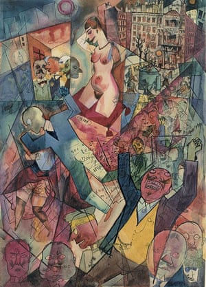
Erich Heckel, Portrait of a Man, 1919, Woodcut, 46.2 x 32.4cm
https://www.moma.org/learn/moma_learning/erich-heckel-portrait-of-a-man-mannerbildnis-1919
This woodcut portrait by Eric was done after the war. The colours used give me a an indications that war was happening: Dirty earth colours and orange in the background, represents to me the bangs and booms of the gunfire and bombs. This mans face expression looks concerned I get a sense that he is wondering what is going to happen next: Is there going to be another war? His face shows his cautious and wants to hear that everything is going to now be at peace. I don't like the colours used together, but I don't think I am supposed to, given the message in the painting.
Other German horror paintings I found:
Other German horror paintings I found:
Self portrait by the German Expressionist painter Max Beckmann
http://online.wsj.com/ww1/expressionism
Portrait of turmoil … George Grosz's Down with Liebknecht, 1918.
Courtesy Richard Nagy gallery Richard Nagy gallery/PR
http://www.theguardian.com/artanddesign/jonathanjonesblog/2013/oct/03/george-grosz-first-world-war-art-jonathan-jones
Otto Dix
Wounded Man (Autumn 1916, Bapaume)from The War
(1924)
http://www.moma.org/collection_ge/object.php?object_id=87725&curated=1
From the paintings I could find I can see theres concern, horror and a sense of nightmarish quality with in these paintings. The last one painted by Otto Dix really makes me want to look away. The wounded soldier has a horror/shocked expression, its that bad that you can sense his pain. I know there is not much colour in this painting, but I wanted to add this as I feel the expression is just how I would think horror is portrayed.
Fauvism
Henri Matisse
In his paintings I sense a different style I have not come across before. Here below is a portrait of his wife.He used a very expressive style with his application of paint and the bright colours he used. The colours he used as you can see contrast to how his wife looked which was quite stern.
Henri Matisse, Woman with a hat, 1905, oil on canvas, 80.7 x 59.7 cm
http://www.metmuseum.org/exhibitions/listings/2012/steins-collect/images
]
Henri Matisse (French, 1869–1954) Self-Portrait, 1906 Oil on canvas; 21 5/8 x 18 1/8 in. (55 x 46 cm)
http://www.metmuseum.org/exhibitions/listings/2012/steins-collect/images
This painting above is one of his self portraits to me the colours hes used, especially the green on his face, makes him look as though he is feeling sick. Again a stern expression with bright colours used compared to Rembrandt's portraits, which are dark and soulful. Looking at just these two paintings of Matisse's from the colours I get a sense of sour, the colours give me a sense of bitterness and distasteful in the paintings. I guess this serves well with their gloomy unhappy expressions n their faces, He's also transferring their moods in to the colours hes uses, colours that are together unpleasant to the viewers eye.
Other Fauve paintings I came across:
Other Fauve paintings I came across:
André Derain (1880-1954)
Portrait of Matisse 1905
http://www.wikiart.org/en/andre-derain/portrait-of-matisse-1905
Henri Matisse Green stripe (Madame Matisse) 1905
oil on canvas 40.50 × 32.5 cm (Statens Museum for Kunst, Copenhagen)
http://www.artionado.com/Matisse/Matisse%20fauve%20works%205.html
Looking at the Fauve style I can see that they are simplified drawings, with use of very bright colours that look unblended most of the time. I can see that dark out lines are used and there is an show of emotion of the colours used. The people look still and no expression but with the added colours , it gives you a sense of what perhaps they are feeling behind there stern face expressions.
Exercise: Painting Mood and atmosphere
I have asked her to sit with her elbows on a table and her face in her hand. this position shows dramatic horror of a person realising what's happened.

I have just used charcoal to sketch her out and I think it looks well. I did my sketch of my mom enhancing her wrinkles on her head to create more of a frown and make her arms and hand stand out more, My moms hair is long also which is helpful as I can see that in a way of a blanket that she just wants to hide under.
I have now decided as there are more them one emotion in my painting I did a quick experiment with colours in my sketch book. I have decided to use red for anger blue for sorrow and mix the two together which will create frustration which is just what happens when the two emotions are combined in real life.

I have decided to just experiment this in my sketchbook with soft pastels to see if it portrays what I want and the blue and red colours dramatically enhance these emotions.
It didn't take me long to test this out and I am really happy with the results I asked 3 people just in my home and they all said the same thing. She looks sad and angry, which is great so the viewer does notice my meaning from my drawing.

I have now got my tools together to create this painting. I have my cardboard slices and my choices of colours on my palette with a pre primes sheet of oil paper.
I have very quickly sketched out the main lines of my drawing just so I can see where I am going with the paint. This should be a lot of fun with cardboard and messy which I am good at making.

I have firstly started using the cardboard to apply the paint for the background, I have used a blue and a white and applied them on to the surface of the painting. I have realised to apply the paint with cardboard you have to use more paint as you have to rub it on the the paper with the cardboard to get a good coverage. I can see it gives a great texture effect to the paint on the paper.

I have now filled in the dark area of her chest and started on the face. I am beginning to really enjoy this, its really free flowing and I am not feeling bothered about how neat it looks.
I have now finished the paintings and I got so much in to it that I forgot to keep writing on my blog. I have to say looking at my finished work I am really happy as the emotions I was trying to convey has come across well in my painting as you can clearly see she is upset, frustrated and angry all in one go.

There are some areas which I could improve but I wanted to leave it a bit unfinished to show my self. I feel the dare area in the middle of the chest could of been more tones and not just one colour. Her rights are looks fatter then her other arm. But I am nt too fussed about these as the main exercise is to show mood and emotion in a painting which I think have nailed it on the head. I have not concentrated on what my mom looks like too much. I have concentrated more on the emotion and atmosphere surrounding her, more like a statement. Also with this painting a have explored my colours that I have used and discovered how the work well together and apart to create my painting. They work really well and the bounce off each other just like the emotions of upset and anger do. They are really intertwined to their meanings in the painting.
Overall I have loved playing about with this effect with cardboard (and nails) I have come to realise that colours use is a really even more so now play an important part to a painting. Also the way in which you can see how the paint is applied. Eg scratches, or angry hard brush strokes, they in themselves show emotion which is another good way to show your emotion/meaning in a painting. I feel this is the freest I have been with any painting and I can see how more expressive it it without worrying what looks wrong or right on my work. If I had to do this painting again, I would of tried to use violet for the hair as that is using the blue and red together to only have it as a two colour painting. but other then that I cannot think of much else.
Exercise: Conveying a character
In this exercise, I need to show character of a person, a type of expression and portray that to the viewer. After doing some sketches I have decided to do the sketch below of a lady laughing. I want to portray enjoyment as my expression. Someone who is having a fun time. Enjoyment can required a few expressions but Laughing I feel is the best one to use. I have decided to use bright colours to show her happiness. I was thinking what I could to to emphasise laughter and after writing a few things down in my sketchbook, I thought of clowns/Circus, where you hear people laughing. By using colour, I want to express a clownish type of face, a figure of jester. Also to express enjoyment, I thought of celebrations and the use of confetti. I want to portray this somehow in my painting. I think splattering different colours of paint on my portrait will enhance my enjoyment expression.

Day 1

As you can see above I have started to paint my portrait. I am really enjoying this because I think I am getting better at being a bit more loose with the paint, you can see my blending strokes and I really like how it works on my paper. I think my idea of a type of clown face paint is working well and its really different to what I have seen on the internet. I have done her nose red for a typical clown face and I really like the way I have painted the inside of her mouth with blues and pinks.

I need to improve on the chin area I don't like it as one colour so I am thinking to mix some pastel colours to help me form the chins tone better.
Day 2
Today I continued my paintings and finished it quite quickly:

I love what I have created here and you get a sense of enjoyment within my painting. I am so chuffed with this and I like the style of how I applied the paint. I enjoyed blending the colours together and letting the marks show for a change. I feel like I am breaking my habit each time I do another painting.
I am really happy, as you can instantly see the emotion that I wanted to viewers to see in my painting. I like how I created tone to the skin with orange and yellows. I feel I could of improved on her left eye with more detail and the pink area above her nose. I just feel it does not sit entirely well, but its a learning curve to try and find other ways of combating that area. If I was to do that again I would of not done the stippling on the pink area and probably just added a more of a darker blend to it to make it show more volume.
What made the painting even more exciting and thrilling for me to do was the splashing of the bright colours on top of my finished portrait. I think it clearly sets the painting off well and does actually show the theme of celebration by looking like confetti. Some of the paint was quite runny and some big splodges fell on to my painting. I think these also give my painting personality and help for it to become something different ad unique.

My overall verdict on painting portraits:
This whole project has been really fun and an eye opener too. I have also seen improvement in my paintings skills to. I am feeling more confident and I have started to get a feel for painting and the enjoyment for it more.
I have come to realise that painting portraits is not just looking at a persons and paintings what you see. Its such more a bigger process: The emotion, The choice of colours, The message with in the portrait and The different styles in which there are to try out.
Out of all of my portraits, my favorite one and most successful one to do was the Conveying Character exercise. This was because of my style and Idea that I created and achieved. I had a lot of enjoyment painting this but also since the start of this project I feel I have come a long way with my painting skills. My second favorite was my self portrait, due to the messages hidden in my painting and also the way I see myself.
As for technical demands, I believe that where was a few I found new and hard. The main one was painting with cardboard, I really enjoyed that and it helped me to be looser with how I apply paint. I found using cardboard, that you were limited to the detail of areas such as face area :eyes/nose. The cardboard made me feel that I had to be really simple with the lines that I wanted to create. Another technical demand I had was choosing the right colors for emotions and areas of my paintings. Deciding on what colours made people look at them and think of an emotion is something that you have to understand for it to work well in your portraits.
I found the interpretive element of portrait painting to be quite hard. Getting people to look like them in your paintings, is a point of practise. I think I painted myself well, I asked people what their thoughts were when they looked at my painting and they said it really looks like me. Its an expression that they know me for doing. Matt was happy with his portrait apart from the wonky eye, but it is practice to get things more accurate. I think you don't have to be so accurate of a persons portrait when you are trying to express their emotion. In fact the details go out of the window and are overtaken by the types of colours you use and the ways you apply paint to a painting.
I am really happy how far I have come over this project of portrait paintings and I am keen to carry this confidence on to the next project, keeping in mind use of colors and techniques I have now learnt.