Firstly I did a few sketches, I really liked the composition of some red and yellow baubles, with some gold ribbon (sketch 2). The colours are very Christmas themed and they look really fun to paint. I did a line drawing in pen and ink to make sure I understand the objects well before I start to paint them.
Finally for my research I decided to have a go with colour of the objects. Using my favorite drawing medium, oil pastels in my sketch book. I felt this came out well. It was hard to show the ribbon as gold with its mesh texture, as my oil pastels were to thick. The only way I tried to do this, was to scratch crossover lines in the the oil pastels mark I had made.
The light is coming from the right so I need to make sure I get that correct on my paintings reflecting off the baubles. The main issue with my painting, I think is going to be the ribbon as in some areas you can see through it with the red baubles behind it so getting a transparency look may be a challenge, but I am ready to give it a go. Overall I am happy with my idea and and looking forward to start painting whilst trying to get in the Christmas spirit..
The light is coming from the right so I need to make sure I get that correct on my paintings reflecting off the baubles. The main issue with my painting, I think is going to be the ribbon as in some areas you can see through it with the red baubles behind it so getting a transparency look may be a challenge, but I am ready to give it a go. Overall I am happy with my idea and and looking forward to start painting whilst trying to get in the Christmas spirit..
Painting
Firstly I lightly sketched it out on my canvas so I could make sure i had picked the right size to to it on. I got it on there perfectly, now I am ready to paint.
First I decided on where to begin first. I used a transparent red just to lightly draw in with my paint the baubles in so I could get more of a feel. I decided it was best to start with the background and work my way to the objects nearest to me.


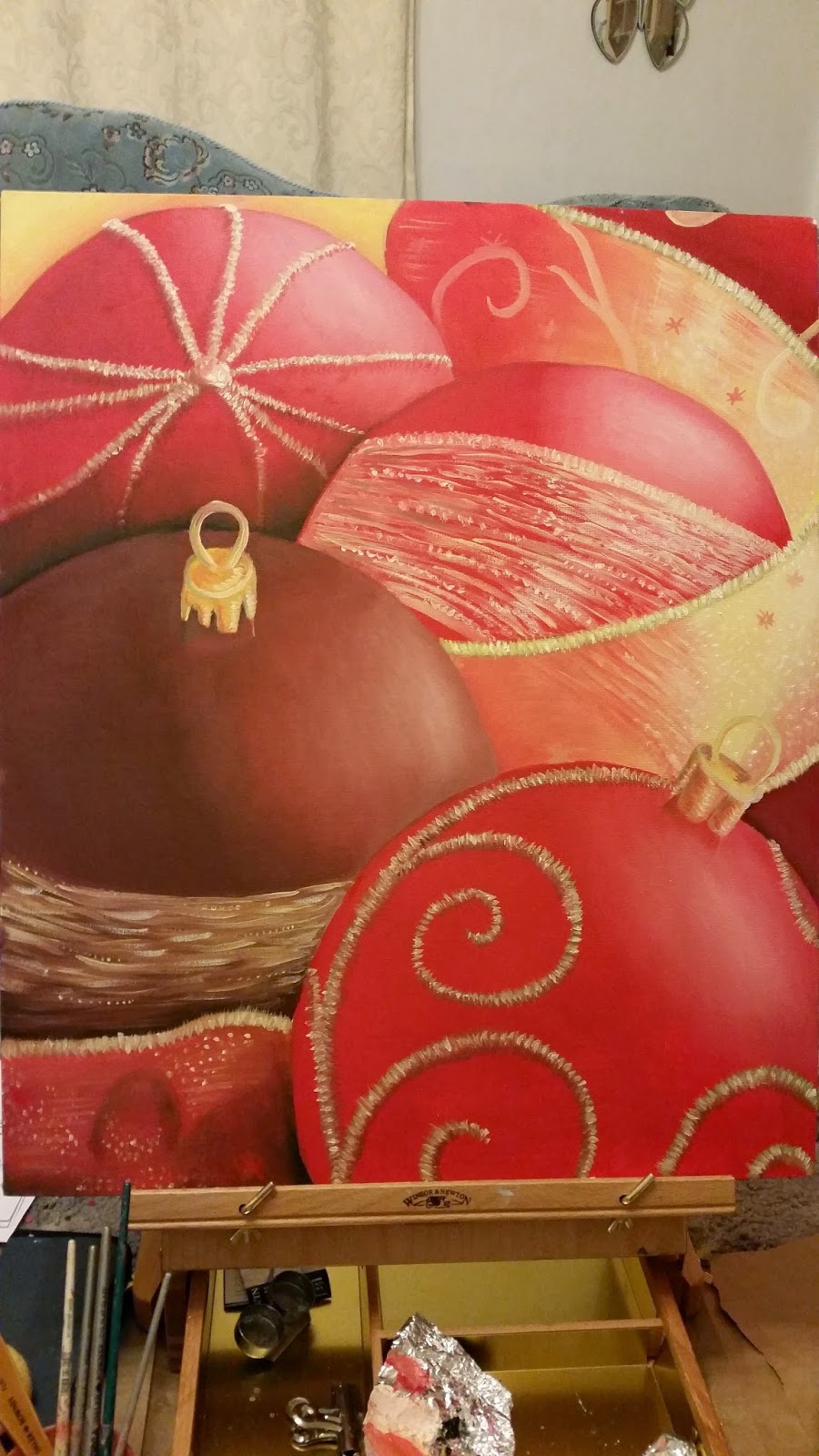
I started from the top of the canvas to put in the background first. I looked closely at the ribbon and noticed the colour was not gold as the dark areas. You could see more of the colour of bauble from the back coming through the ribbon. I showed this by looking at the colours to where I was painting and then brushed in some quick light horizontal and vertical lines to show some of the mesh texture. (below)

On the ribbon there is a gold tinsel boarder. For this I used a few yellows in a kind of optical mixing way to create a gold glittery tinsel effect which I think has worked out well. I used a dark yellow a normal yellow hue and a very white yellow. The dark yellow created depth, the hue yellow created colour and the white yellow created light. These mixed together I feel created a glitter effect which worked great to portray the tinsel areas in my painting. It also helped by applying the three colours in little streaks along the border of the ribbon. .

Next I concentrated on the two top left baubles . On the top left bauble, I put the tone on the bauble and then added the tinsel detail on top. Again using optical mixing technique of the yellows to create that glittery gold as with the boarder of the ribbon previously. Around the tinsel areas of the bauble, I added a darker red against it to give it depth from the bauble as does stick out off the actual bauble I was studying. (above)

The bauble below this was a darker red tone, I think this helped my composition a lot more as it broke up the scene to become more interesting. I first added the base colour tones with the light on the right hand side bouncing off. I then added the detail on which was gold strips on the bauble going horizontal. I did this with a few yellows just whisking horizontal brushstrokes and adding some stippling effect. I really like this little bit of detail I created, as it was fun to express what I was looking at.

Then I did the hoop of the bauble that you use to hang on the tree. This was gold so I tried to portray this by using a hint of orange too and adding the light on it it where I could see it was shinning.


I then did the bauble on the right hand side and the ribbon below it. The decoration on the bauble was gold tinsel going horizontal across the bauble, just like the darker coloured bauble. I painted the ribbon and did the same technique as previously described. I feel the decoration on the bauble I did not do correctly as it does not look symmetrical to the baubles shape. I think also the directions of my strokes of the gold ara are going in a awkward direction making it look more unsymmetrical.


I finally did the bottom bauble and the last piece of ribbon at the bottom right. I really like my final bauble I painted. I really like the brightness and the detail it has on it. The giant gold tinsel swirls were definitely one of my favorite parts of the painting to do and you can really see how well the optical mixing does a great tinsel effect. I really like the tree hanging hoop as well on the bauble. I think I put a lot of detail on it and finishes off the bauble really well. I lastly did the ribbon at the bottom. This I found was quite tricky as It had two dents in its body. I painted the tones and colours as I saw it. I think it ended up looking a little messy with the brush marks but I was really trying hard to portray what I was seeing.


Next I concentrated on the two top left baubles . On the top left bauble, I put the tone on the bauble and then added the tinsel detail on top. Again using optical mixing technique of the yellows to create that glittery gold as with the boarder of the ribbon previously. Around the tinsel areas of the bauble, I added a darker red against it to give it depth from the bauble as does stick out off the actual bauble I was studying. (above)
The bauble below this was a darker red tone, I think this helped my composition a lot more as it broke up the scene to become more interesting. I first added the base colour tones with the light on the right hand side bouncing off. I then added the detail on which was gold strips on the bauble going horizontal. I did this with a few yellows just whisking horizontal brushstrokes and adding some stippling effect. I really like this little bit of detail I created, as it was fun to express what I was looking at.
I then did the bauble on the right hand side and the ribbon below it. The decoration on the bauble was gold tinsel going horizontal across the bauble, just like the darker coloured bauble. I painted the ribbon and did the same technique as previously described. I feel the decoration on the bauble I did not do correctly as it does not look symmetrical to the baubles shape. I think also the directions of my strokes of the gold ara are going in a awkward direction making it look more unsymmetrical.
I finally did the bottom bauble and the last piece of ribbon at the bottom right. I really like my final bauble I painted. I really like the brightness and the detail it has on it. The giant gold tinsel swirls were definitely one of my favorite parts of the painting to do and you can really see how well the optical mixing does a great tinsel effect. I really like the tree hanging hoop as well on the bauble. I think I put a lot of detail on it and finishes off the bauble really well. I lastly did the ribbon at the bottom. This I found was quite tricky as It had two dents in its body. I painted the tones and colours as I saw it. I think it ended up looking a little messy with the brush marks but I was really trying hard to portray what I was seeing.
Overall
Overall I really enjoyed this painting. The yellows and the reds have a very vibrant contrast and help brighten each other up. I feel the darker bauble does definitely break the two colours up giving the painting more character. The christmas mood and theme I was trying to portray, works really well and you can instantly see what this painting is all about. The points where I think I could of improved on, was the ribbon at the bottom - perhaps I could of spent more time on the detail. Also the decoration on the bauble on the right where the detail looks a little unsymmetrical.
If I ever had to do this painting again I would add some green foliage of a christmas tree as it would work well with its complementary colour red. I think I can see a good improvement, compared to my assignment 1 final painting. My blending of tone has improved and my new sense of what colours to use together is now coming together.
The main things in this assignment that I have learnt are to get to know the colours and rules. Understand colour mixing and contrasts,optical mixing, perspectives. All of these contribute to create a good painting and I have learnt that by using these rules and techniques you can't go wrong. All I have to do is keep improving and start to understand what works for me to create my own voice. I do have to say, that I do like to do paintings with soft gentle colours. I think they are very relaxing to look at and appealing to the eye. I have really enjoyed this assignment and I feel like I have learnt a lot.
Merry Christmas!! :-)