Research Dutch Realist interior paintings
Whilst Searching for interior paintings on the internet I came to realize there was not much on there. I then realized that back then they were painting to tell stories, I found a domestic kind of genre in this era of people inside houses/buildings. This is where I got to see how Artists back then, created interiors in there paintings. As when researching previously on the use of colour project, the Dutch age was trying to capture photo/life like paintings really trying to show the scenes. This also applies to the backgrounds in this case the interiors. Also the artist in this era were trying to sell there paintings and it was popular of this time to have stories behind or with in the paintings, So I guess if they were painting empty rooms back then, they would not of earned much and people would of classed the paintings as boring and ordinary.
Johannes Vermeer
I realized at once whilst searching that Johannes is a well known painter of the Dutch age. He was famous for his Domestic Interior Genre paintings. His paintings focused on every day life scenes.He was very good at producing space and dimension in his art.
The Art Of Painting
http://www.artble.com/artists/johannes_vermeer/more_information/biography
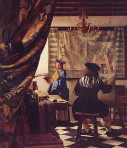
I really like this painting. Its a painting of him self painting. Showing the viewer how its done. The curtain is quite a popular trick, that he places in his work to give the viewer a sense of your not supposed to be there but yet your having a sneaky peek, to what is going on. Its a very private moment with the artist studying his model. The room has depth, which is created buy the artist inputting foreshortening to his work. The items are bigger the closer they are, giving a perspective view. The tiles on the floor give the viewer an optical illusion of depth, pushing the painting backwards and he has got all the furniture at the correct angles to give a sense of looking in to the painting. There is light coming from behind the curtain at the front on the painting. This is glowing on the artists subject, the background wall and partly on the floor. This produces a sense of width to the room. I like this painting as its quirky and I can imagine Johannes enjoying painting this, as its a subject he really enjoys... painting!
Pieter De Hooch
Another painter around this century was Pieter. He was really famous from the Dutch age. He was really interested in perspective and receding areas of rooms, then to input his views in to his work.
Courtyard of a House in Delft (1658) National Gallery, London
http://www.visual-arts-cork.com/old-masters/pieter-de-hooch.htm
 |
The Bedroom
http://upload.wikimedia.org/wikipedia/commons/thumb/a/a9/Pieter_de_Hooch_-_The_Bedroom_-_Google_Art_Project.jpg/698px-Pieter_de_Hooch_-_The_Bedroom_-_Google_Art_Project.jpg

I really like Pieters Interior paintings you really get a sense of depth and perspective in there compositions. I also like this art work that he created. It puts a smile on my face with the cute little girl. Its as though shes nagging her mother about something yet playing around with the door, a kind of nervous posture, as though shes asking a cheeky demand off her mother. Shes holding a ball, so i'm guessing shes asking to see if she can go out and play with her friends. In the background you can see out side, it looks like a lovely summers day. This to me is also hinting about the little girl, wanting to go and play as she does not want to be stuck indoors while its nice outside. The perspective of the interior has really had a lot of thought gone in to it. The angle of the room where we are in is at a left slant. The is a doorway near the middle of the painting, invites you to look through it with dark wooden beam boarder. You are then in another room which is dim but whats attracting you through that door is the light from outside. its shining brightly and to me its one of the main focal points of the painting. I really like looking at his paintings at they are really clear and they are fun to look at to create a story from.
Overall
Looking at both artists, I think they both used light to draw the viewers into the rooms or beyond the rooms to look through the painting creating depth and volume of space.It is very clever and it certainly does work. Also the angles use d,created depth with the help of the direction of the floor, doorways and furniture with in the rooms. Its all about concentrating on the angles and to imput something such as bright light to make the viewer get drawn further in to the painting.
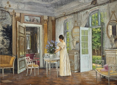
Other Interior Paintings
Arranging Summer Blooms, 1899
http://www.artistsandart.org/2014/04/Adolf-Heinrich-Claus-Hansen-interiors-in-painting.html
.jpg)
I had a look for some other artist that did interiors, there was not that many that caught my eye, but I ended up discovering an artist by the name of Adolf Heinrich Claus Hansen. From what I can see he painted a lot of interiors.
Arranging Summer Blooms, 1899
http://www.artistsandart.org/2014/04/Adolf-Heinrich-Claus-Hansen-interiors-in-painting.html
I really liked this painting of his (above). From looking at this you can tell its a corner of a room, by the way the has angled the doors and walls in the painting. The main feature is the woman arranging the flowers. I get a sense of elegance within his paintings and very feminin feel to his art. I discovered that your lines have to be at the correct angle and straight as you can make them to produce a clear composition in a room.
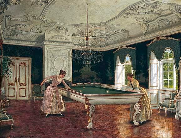
Women playing billiards, 1894-1895
http://www.artistsandart.org/2014/04/Adolf-Heinrich-Claus-Hansen-interiors-in-painting.html
.jpg)
In this elegant painting of his, you can see the way he has looked closely at the angle of the pool table. It is obviously the main feature of the painting, showing women relaxing playing pool. The pool table is wider at the front then at the back end, to give an optical illusion of length, it creates depth to the painting. The furniture in the background becomes smaller, then the objects in the foreground to also create depth and volume in the room. I really like his work, it looks very accurate and you get a clear perspective of the room. I will keep him in mind when I am creating my own interior painting.
Exercise: Quick sketches around the house
I did four sketches of my bedroom, as I spend most of my time in there relaxing. I actually impressed my self. I found it quite fun to find the eye level then work from the vanishing point to create perspective of my room.
On the first sketch I did I did it from the side of the bed looking at the window. I think this was not a good idea as it was quite limited and I could not see a lot of the room. I think I did alright with the perspective, apart from the little bedside table. I think that I got the angle slightly wrong here.
I really like this second sketch as its a great view of my room standing up in front of the bed. You can clearly see the perspective and I think the walls are at the right angles. I like how the bed becomes closer to you the nearer it gets to the foreground.
The third sketch I did was of me sitting on the bed, looking at the opposite side of my bedroom. I think this was more of a challenge, as I had the door open with a look in to the landing area. I do however feel there was too much to look at, with my other door to my wardrobe and my shelves in the left has side of the room. I think there's too much here to put in to a painting. I think the second sketch is more appealing to the eye then this one.
Finally the fourth sketch I did from standing on the landing, looking in to the bedroom. I really did not get the angle of the door correctly here. It was hard trying to draw it in a perspective way, as I was standing really close to it and the angle I was at was making me confused to the angle of the bottom of the door. The vertical line on the edge of the door, is really not straight at all. The rest of it looks of. but I think for a painting this will not work as its blocking some of the room and I want a clear view now.
I have decided I like to second sketch for the next exercise because:
- It shows more of the room, compared to sketch 1.
- There's not as much detail as in sketch three and I feel that this makes the painting too busy with nothing in particular to have as a focal point.
- I feel its better then sketch four as the door blocks most of the room.
Basics of Linear Perspective
Linear Perspective is a technique use to create Three-Dimensional images on a flat 2D ground. It is used to create depth and distances in art. It also helps us to see the size of an object and the placement in the image. By learning this technique it helps to enhance drawing skills and it is quite essential for an artist to use this technique.
Linear perspective is create by using line. Horizontal and vertical lines to create a 3D image. I have done an step by step example below.
As you can see by doing this it creates depth to your work and creates an area of space in the image. There are three basic elements needed for linear perspective they are:
Horizon line:
This line is always at eye level - regardless of where you are looking, this Line always falls at eye level eg: if you are looking down, your eye level remains at the height of your eyes, not down where you are looking.
Vanishing Point:
This is the point to which all lines which are parallel to the viewer, recede. All planes must be perpendicular or parallel to you in order for perspective to work correctly. If you are looking at the corner of an object that is not at a 90 degree angle to you this will create distortions.
Convergence Lines:
These are lines that converge at the vanishing point. These are any lines that are moving away from the viewer at an angle parallel to the direction that the viewer is looking. In the case of the highway that we mentioned above these lines would be the edges of the highway as they move away from you forward into the distance.
Pietro Perugino
fresco at the Sistine Chapel (1481–82)

Exercise : Simple Perspective in interior studies.

The worst attempt of perspective, I think are the two corner pieces of furniture either side of the room. It took me ages to get the table correct (one on the right), as I painted it with the back of the table higher then the front as first attempt. I had to paint over some parts of it and try again. Its not perfect now, but the table is a lot better then it was. I feel the colours work well too and I feel I got the bed really well done as the main feature. I kept my duvet on the bed, to show some one does live there. I painted it really simple so the perspective shows clearly. Over all I am happy with this attempt I feel the paining is a bit blotchy in some areas and could of been neater. It has really helped me to understand how to create perspective in a painting and how to look at a room to covert it on to a canvas.