Tuesday 2 December 2014

ASS2 - Final

         For my final assignment, as its near Christmas, I thought it would be fun to do a Christmas themes painting. I love Christmas decorations, so what better way to show this and paint them. I have chosen a small box of Brightly colored baubles and ribbons with a bit my Christmas tree.

         Firstly I did a few sketches, I really liked the composition of some red and yellow baubles, with some gold ribbon (sketch 2). The colours are very Christmas themed and they look really fun to paint. I did a line drawing in pen and ink to make sure I understand the objects well before I start to paint them.

          Finally for my research I decided to have a go with colour of the objects. Using my favorite drawing medium, oil pastels in my sketch book. I felt this came out well. It was hard to show the ribbon as gold with its mesh texture, as my oil pastels were to thick. The only way I tried to do this, was to scratch crossover lines in the the oil pastels mark I had made. 

       The light is coming from the right so I need to make sure I get that correct on my paintings reflecting off the baubles. The main issue with my painting, I think is going to be the ribbon as in some areas you can see through it with the red baubles behind it so getting a transparency look may be a challenge, but I am ready to give it a go. Overall I am happy with my idea and and looking forward to start painting whilst trying to get in the Christmas spirit..

Painting

       Firstly I lightly sketched it out on my canvas so I could make sure i had picked the right size to to it  on. I got it on there perfectly, now I am ready to paint.

      First I decided on where to begin first. I used a transparent red just to lightly draw in with my paint the baubles in so I could get more of a feel. I decided it was best to start with the background and work my way to the objects nearest to me.


   I started from the top of the canvas to put in the background first. I looked closely at the ribbon and noticed the colour was not gold as the dark areas. You could see more of the colour of  bauble from the back coming through the ribbon. I showed this by looking at the colours to where I was painting and then brushed in some quick light horizontal and vertical lines to show some of the mesh texture. (below)


       On the ribbon there is a gold tinsel boarder. For this I used a few yellows in a kind of optical mixing way to create a gold glittery tinsel effect which I think has worked out well. I used a dark yellow a normal yellow hue and a very white yellow. The dark yellow created depth, the hue yellow created colour and the white yellow created light. These mixed together I feel created a glitter effect which worked great to portray the tinsel areas in my painting. It also helped by applying the three colours in little streaks along the border of the ribbon. .


       Next I concentrated on the two top left baubles . On the top left bauble, I put the tone on the bauble and then added the tinsel detail on top. Again using optical mixing technique of the yellows to create that glittery gold as with the boarder of the ribbon previously. Around the tinsel areas of the bauble, I added a darker red against it to give it depth from the bauble as does stick out off the actual bauble I was studying. (above)


      The bauble below this was a darker red tone, I think this helped my composition a lot more as it broke up the scene to become more interesting. I first added the base colour tones with the light on the right hand side bouncing off. I then added the detail on which was gold strips on the bauble going horizontal. I did this with a few yellows just whisking horizontal brushstrokes and adding some stippling effect. I really like this little bit of detail I created, as it was fun to express what I was looking at.


     Then I did the hoop of the bauble that you use to hang on the tree. This was gold so I tried to portray this by using a hint of orange too and adding the light on it it where I could see it was shinning.


   I then did the bauble on the right hand side and the ribbon below it.  The decoration on the bauble was gold tinsel going horizontal across the bauble, just like the darker coloured bauble. I painted the ribbon and did the same technique as previously described. I feel the decoration on the bauble I did not do correctly as it does not look symmetrical to the baubles shape. I think also the directions of my strokes of the gold ara are going in a awkward direction making it look more unsymmetrical.


        I finally did the bottom bauble and the last piece of ribbon at the bottom right. I really like my final bauble I painted. I really like the brightness and the detail it has on it. The giant gold tinsel swirls were definitely one of my favorite parts of the painting to do and you can really see how well the optical mixing  does a great tinsel effect. I really like the tree hanging hoop as well on the bauble. I think I put a lot of detail on it and finishes off the bauble really well. I lastly did the ribbon at the bottom. This I found was quite tricky as It had two dents in its body. I painted the tones and colours as I saw it. I think it ended up looking a little messy with the brush marks but I was really trying hard to portray what I was seeing. 


Overall

    Overall I really enjoyed this painting. The yellows and the reds have a very vibrant contrast and help brighten each other up. I feel the darker bauble does definitely break the two colours up giving the painting more character. The christmas mood and theme I was trying to portray, works really well and you can instantly see what this painting is all about. The points where I think I could of improved on, was the ribbon at the bottom  - perhaps  I could of spent more time on the detail. Also the decoration on the bauble on the right where the detail looks a little unsymmetrical. 

    If I ever had to do this painting again I would add some green foliage of a christmas tree as it would work well with its complementary colour red. I think I can see a good improvement, compared to my assignment 1 final painting. My blending of tone has improved and my new sense of what colours to use together is now coming together.

     The main things in this assignment that I have learnt are to get to know the colours and rules. Understand colour mixing and contrasts,optical mixing, perspectives. All of these contribute to create a good painting and I have learnt that by using these rules and techniques you can't go wrong. All I have to do is keep improving and start to understand what works for me to create my own voice. I do have to say, that I do like to do paintings with soft gentle colours. I think they are very relaxing to look at and appealing to the eye. I have really enjoyed this assignment and I feel like I have learnt a lot.

Merry Christmas!! :-)
   

Tuesday 4 November 2014

ASS2 - Project 4 - Painting Interiors

Research Dutch Realist interior paintings


           Whilst Searching for interior paintings on the internet I came to realize there was not much on there. I then realized that back then they were painting to tell stories, I found a domestic kind of genre in this era of people inside houses/buildings. This is where I got to see how Artists back then, created interiors in there paintings. As when researching previously on the use of colour project, the Dutch age was trying to capture photo/life like paintings really trying to show the scenes. This also applies to the backgrounds in this case the interiors. Also the artist in this era were trying to sell there paintings and it was popular of this time to have stories behind or with in the paintings, So I guess if they were painting empty rooms back then, they would not of earned much and people would of classed the paintings as boring and ordinary.

         
Johannes Vermeer

               I realized at once whilst searching that Johannes is a well known painter of the Dutch age. He was famous for his Domestic Interior Genre paintings. His paintings focused on every day life scenes.He was very good at producing space and dimension in his art.


The Art Of Painting
http://www.artble.com/artists/johannes_vermeer/more_information/biography

            I really like this painting. Its a painting of him self painting. Showing the viewer how its done. The curtain is quite a popular trick, that he places in his work to give the viewer a sense of your not supposed to be there but yet your having a sneaky peek, to what is going on. Its a very private moment with the artist studying his model. The room has depth, which is created buy the artist inputting foreshortening to his work. The items are bigger the closer they are, giving a perspective view. The tiles on the floor give the viewer an optical illusion of depth, pushing the painting backwards and he has got all the furniture at the correct angles to give a sense of looking in to the painting. There is light coming from behind the curtain at the front on the painting. This is glowing on the artists subject, the background wall and partly on the floor. This produces a sense of width to the room. I like this painting as its quirky and I can imagine Johannes enjoying painting this, as its a subject he really enjoys... painting!


Pieter De Hooch

       Another painter around this century was Pieter. He was really famous from the Dutch age. He was really interested in perspective and receding areas of rooms, then to input his views in to his work.

Courtyard of a House in Delft (1658) National Gallery, London
http://www.visual-arts-cork.com/old-masters/pieter-de-hooch.htm


            I thought this painting showed  a great example of perspective, going straight through a room and beyond in to another courtyard. The way in which the Door ways are angled and the directional  flow of the pebbles on the ground all are important to help create depth and a 3D style to the painting. The light coming from the back courtyard is perfect, the way it fills the open room and creates luminosity on the floor is amazing. He has got a lot of detail in the painting to capture textures and again for typical Dutch painters, had people involved to tell a story. I get a sense that the story is about a maid taking her child out to a market and in the room is the madam, the owner of the home. She looks more poised and wearing more elegant clothing. Maybe what I am looking at is the back entrance for the servants, which is out of the way and hidden from public view. The Lady is at the front door waiting for some one, whilst the maid and her child move on unseen. Its quite a good painting to guess what is going on. This is what an artist wants you to do. They want you to figure out the story on there painting's.


The Bedroom
http://upload.wikimedia.org/wikipedia/commons/thumb/a/a9/Pieter_de_Hooch_-_The_Bedroom_-_Google_Art_Project.jpg/698px-Pieter_de_Hooch_-_The_Bedroom_-_Google_Art_Project.jpg


           I really like Pieters Interior paintings you really get a sense of depth and perspective in there compositions. I also like this art work that he created. It puts a smile on my face with the cute little girl. Its as though shes nagging her mother about something yet playing around with the door, a kind of nervous posture, as though shes asking a cheeky demand off her mother. Shes holding a ball, so i'm guessing shes asking to see if she can go out and play with her friends. In the background you can see out side, it looks like a lovely summers day. This to me is also hinting about the little girl, wanting to go and play as she does not want to be stuck indoors while its nice outside. The perspective of the interior has really had a lot of thought gone in to it. The angle of the room where we are in is at a left slant. The is a doorway near the middle of the painting, invites you  to look through it with dark wooden beam boarder. You are then in another room which is dim but whats attracting you through that door is the light from outside. its shining brightly and to me its one of the main focal points of the painting. I really like looking at his paintings at they are really clear and they are fun to look at to create a story from.


Overall

              Looking at both artists, I think they both used light to draw the viewers into the rooms or beyond the rooms to look through the painting creating depth and volume of space.It is very clever and it certainly does work. Also the angles  use d,created depth with the help of the direction of the floor, doorways and furniture with in the rooms. Its all about concentrating on the angles and to imput something such as bright light to make the viewer get drawn further in to the painting. 


Other Interior Paintings

           I had a look for some other artist that did interiors, there was not that many that caught my eye, but I ended up discovering an artist by the name of Adolf Heinrich Claus Hansen. From what I can see he painted a lot of interiors.

Arranging Summer Blooms, 1899
http://www.artistsandart.org/2014/04/Adolf-Heinrich-Claus-Hansen-interiors-in-painting.html


     I really liked this painting of his (above). From looking at this you can tell its a corner of a room, by the way the has angled the doors and walls in the painting. The main feature is the woman arranging the flowers. I get a sense of elegance within his paintings and very feminin feel to his art. I discovered that your lines have to be at the correct angle and straight as you can make them to produce a clear composition in a room. 


Women playing billiards, 1894-1895 
http://www.artistsandart.org/2014/04/Adolf-Heinrich-Claus-Hansen-interiors-in-painting.html


   In this elegant painting of his, you can see the way he has looked closely at the angle of the pool table. It is obviously the main feature of the painting, showing women relaxing playing pool. The pool table is wider at the front then at the back end, to give an optical illusion of length, it creates depth to the painting. The furniture in the background becomes smaller, then the objects in the foreground to also create depth and volume in the room. I really like his work, it looks very accurate and you get a clear perspective of the room. I will keep him in mind when I am creating my own interior painting. 


Exercise: Quick sketches around the house

     I did four sketches of my bedroom, as I spend most of my time in there relaxing. I actually impressed my self. I found it quite fun to find the eye level then work from the vanishing point to create perspective of my room. 

     On the first sketch I did I did it from the side of the bed looking at the window. I think this was not a good idea as it was quite limited and I could not see a lot of the room. I think I did alright with the perspective, apart from the little bedside table. I think that I got the angle slightly wrong here. 

     I really like this second sketch as its a great view of my room standing up in front of the bed. You can clearly see the perspective and I think the walls are at the right angles. I like how the bed becomes closer to you the nearer it gets to the foreground.

     The third sketch I did was of me sitting on the bed, looking at the opposite side of my bedroom. I think this was more of a challenge, as I had the door open with a look in to the landing area. I do however feel there was too much to look at, with my other door to my wardrobe and my shelves in the left has side of the room. I think there's too much here to put in to a painting. I think the second sketch is more appealing to the eye then this one.

      Finally the fourth sketch I did from standing on the landing, looking in to the bedroom. I  really did not get the angle of the door  correctly here. It was hard trying to draw it in a perspective way, as I was standing really close to it and the angle I was at was making me confused to the angle of the bottom of the door. The vertical line on the edge of the door, is really not straight at all. The rest of it looks of. but I think for a painting this will not work as its blocking some of the room and I want a clear view now.

I have decided I like to second sketch for the next exercise because:

  1. It shows more of the room, compared to sketch 1.
  2. There's not as much detail as in sketch three and I feel that this makes the painting too busy with nothing in particular to have as a focal point.
  3. I feel its better then sketch four as the door blocks most of the room.           
Basics of Linear Perspective

   Linear Perspective is a technique use to create Three-Dimensional images on a flat 2D ground. It is used to create depth and distances in art. It also helps us to see the size of an object and the placement in the image. By learning this technique it helps to enhance drawing skills and it is quite essential for an artist to use this technique. 

   Linear perspective is create by using line. Horizontal and vertical lines to create a 3D image. I have done an step by step example below.

   As you can see by doing this it creates depth to your work and creates an area of space in the image. There are three basic elements needed for linear perspective they are:

Horizon line:

This line is always at eye level - regardless of where you are looking, this Line always falls at eye level eg: if you are looking down, your eye level remains at the height of your eyes, not down where you are looking.

Vanishing Point:


This is the point to which all lines which are parallel to the viewer, recede. All planes must be perpendicular or parallel to you in order for perspective to work correctly. If you are looking at the corner of an object that is not at a 90 degree angle to you this will create distortions.

Convergence Lines:


These are lines that converge at the vanishing point. These are any lines that are moving away from the viewer at an angle parallel to the direction that the viewer is looking. In the case of the highway that we mentioned above these lines would be the edges of the highway as they move away from you forward into the distance.

Pietro Perugino

fresco at the Sistine Chapel (1481–82) 
http://www.wga.hu/html_m/p/perugino/sistina/ 

I found this painting, which I feel is a good example to show linear perspective. You can clearly see the horizon line, which is just above the middle of the page. The vanishing point is behind the building in the middle, straight through the front brown doors. The floor in this painting really shows the convergence lines, creating parallel angles towards the vanishing point. This creates a three dimensional view. I feel it really helps to have something in the foreground, such as with the people at the front, to have an idea of the size of the buildings in the back ground. By using this technique, it really helps in you art to gain depth or receding space in a drawing/painting.


Exercise : Simple Perspective in interior studies.


      For this I decided to use my second sketch I did, of my room. I felt it was simple but had enough in there to show my skills of perspective. I feel my line of my walls were quite straight and I was happy with my blinds coming towards the foreground. My room was quite messy, so to keep it simple I just put the main items that I wanted to show (mainly furniture). The colours I used were quite limited, I just used grey, yellow and brown colours with white and black to change shades. I think the most convincing areas of perspective in my work is the cupboard on the right bottom, the bed and the left wall.

       The worst attempt of perspective, I think are the two corner pieces of furniture either side of the room. It took me ages to get the table correct (one on the right), as I painted it with the back of the table higher then the front as first attempt. I had to paint over some parts of it and try again. Its not perfect now, but the table is a lot better then it was. I feel the colours work well too and I feel I got the bed really well done as the main feature. I kept my duvet on the bed, to show some one does live there. I painted it really simple so the perspective shows clearly. Over all I am happy with this attempt I feel the paining is a bit blotchy in some areas and could of been neater. It has really helped me to understand how to create perspective in a painting and how to look at a room to covert it on to a canvas.

Thursday 16 October 2014

ASS2 - Project 3 - Colour Relationships

Exercise : Exploring contrasts

      For this exercise, I used scrap bits of oil painting paper and stuck them in to my sketch book afterwards. I had to paint squares with one colour then paint another square around it and compare colours to each other.


      The first task was to choose two colours that are close in spectrum, to see the contrasts. As mentioned in the exercise I can clearly see that both colours cancel each other out. The best example is the third one along (blue and blue-green above photo)  I think having the blue around the blue-green makes the blue more visible in the blue green.


    Next I had to paint two complimentary colours together but I decided to do a few. I noticed that each of the complementary pairs helped each other to create stronger contrasts They really help each other to stand out and become more vibrant. 


     The final experiment was to include grey and to see what happens to the other colours surrounding them. I think the grey made both complementary colours stand out but I also think the grey has a somewhat cooling effect on the colours I used. The grey has a isolated feeling to it and stabilizes the vibrant colours making them muted,Toned down. 

    This experiment was a good eye opener, to be careful on what colours to use with each other and those to perhaps keep at a distance. I think its also shown that you really need to know your complementary colours, as they are the ones that help each other out. You can still make them lighter or darker by adding black and they will still complement each other. Finally the grey cools down the vibrancy of the colours and in a way gives them a quieter look. I think the main key to painting is to study and learn this to become a really good painter. Knowing your colours is the key starting step for any painting.


Research Impressionism, Post Impressionism and Neo Impressionism

     Impressionism was a style developed in France in 1870s. The Artist style was to concentrate on a fleeting visual impression produced by a scene and create reflected light by using unmixed primary colours and small strokes. 


        Post Impressionism was created in 1910. It was the same art style as Impressionism, the artists continued using vivid colours but they were more inclined to highlight geometric forms to create more of a expressive effect. The also seemed to use colours that were natural or erratic.


       Neo Impressionists was created by a french critic Felix Feneon in 1886 to describe an Art movement created by Artist Georges Seurat. The art technique was using familiarized dots of mixed coloured paint, to a surface so that from a distance they blend together. 


    These types of Artists styles are created by using optical mixing and effects. To understand this I am going to investigate in to a couple of artist to see how this actually worked:


Georges Seurat 


                          A Sunday Afternoon on the Island of La Grande Jatte 
                                                       Georges Seurat 
http://www.artble.com/artists/georges_seurat

Women By The Water - Georges Seurat - www.pointillism-in-art.org

                                       Woman by the Water Georges Seurat

                    http://www.pointillism-in-art.org/Women-By-The-Water.html

    George Seura
ts art to me is really beautiful and clever. The way he infused dots of different colours to create paintings such as his masterpeice  'A Sunny Afternoon on the Island of La Grande Jatte'. Its very colourful and I remember my school art teacher when I was younger having a poster in the class room of this painting I use to really look and admire it.  Seurat theories on colours were simple, that if two coloured dots overlapped it would create a third colour. This way meant that there was never a need to blend the colours together and that the colours remained vibrant as when they first came out of a paint tube.

     Seurat used his colours to connect his theories of science and his emotions. He believed that he could use colour to evoke emotion and create tranquility in his art. 


Close up of 'A Sunday Afternoon on the Island of La Grande Jatte'
http://jennabrand.com/2013/03/26/modern-art-lessons-futurism/


        In the  ' A Sunday Afternoon on the Island of La Grande Jatte' I can see how he has used pointillism on a giant scale. Looking close you can see the dots he made, but looking from a distance those colours do merge together to create blends. I really like how he portrayed the reflection in the lake using this technique it works really well and shows movement of the water. I would really like to attempt this kind of style at some point in my art work. 


Paul Signac

       Signac was influence by Georges Seurat. He met him in 1884 and became a supporter of his friend and a friend. He used the same theories and techniques of optical mixing in his work.

                     Against the Enamel of Background Rhythmic with Beats and Angels, Tones and Tones and Colours, and a Portrait of Felix Feneon (1861-1944) 1890 - Paul Signac - www.paul-signac.org

Against the Enamel of Background Rhythmic with Beats and Angels, Tones and Tones and                                   Colours, and a Portrait of Felix Feneon (1861-1944) 1890

      I really like this painting its really bright and I like the use of the colours he has used,  The back ground had swirly effects which makes the painting look as though it has great depth - A good optical illusion. 


View of Constantinople, 1907 - Paul Signac - www.paul-signac.org
View of Constantinople, 1907
www.paul-signac.org

     Most of Signacs work is based on the french coasts as he loved to paint water. I love the colours he has used here to create the sky. The atmosphere to me is at sun set, with the pink sky stating it will be a sunny day again tomorrow. The reflection of the sun, is on the boats sails and buildings in the background. I really like optical mixing, its made me see there's an even more fun way to paint. 


OP- Art : Bridget Riley

Op-Art is using optical illusions in art that deceives the eye, such as making you see something moving but its not,or an image appearing differently to what is actually there.

Bridget Riley is classed as the mother of Op-art. She also had studied work of Georges Seurat, such as her painting she did below:

Bridget Riley - Pink Landscape
Pink landscape – Bridget Riley 1960 – Oil on Canvas 101.5×101.5
http://www.op-art.co.uk/bridget-riley/

  You can see here (above), in her painting that she attempted to use Seurat's Style. I t works well and you can see the blends to show hills in the landscape.

Bridget Riley: Movement in Squares, 1961
                                                     Bridget Riley

                                                   Movement in Squares, 1961 

                                                       Tempera on Hardboard, 481/2x473/4 in.
   http://www.bittleston.com/artists/bridget_riley/

     Riley is fascinated with creating optical illusions. She wanted to engage the view not only with the object but also with the process of observation.  

"For me Nature is not landscape, but the dynamism of visual forces - an event rather than an appearance - these forces can only be tackled by treating color and form as ultimate identities, freeing them from all descriptive or functional roles." Bridget Riley. http://www.bittleston.com/artists/bridget_riley/

   In the Image above, you can see how she portrays an optical illusion, By using squares then  as they get in the middle she squashes the squares. creating an illusion of the image going inwards. it does really work when looking at it. 


                             Bridget Riley: Arrest 1, 1965
Bridget Riley

Arrest 1, 1965 

Emulsion on Canvas, 70x681/4 in.

http://www.bittleston.com/artists/bridget_riley/

              The way she has painted here creates a sense of 3D in her work. Some of the waves stand out infront of you. She has done this by makings the side waves lighter, forming an optical illusion of a 3D effect. I really like this one and its really clever of her. Its like a piece of cloth with its folds. I guess this helps introducing this to a painting to create the 3d effect in your work. 


My practice with optical mixing with paint an other mediums.

       I did some experiments in my sketch book for optical mixing to see what I could create:


       As you can see I had fun with this, I really liked my experiment, with a dry brush in paint. It made the painted area look more lively and adding a violet created a sense of depth. I also really like my oil pastel mixing, by using orange painted background, going over it in yellow oil pastel, then using a tooth pick to scratch lines out to see the underneath colour. I thought this was really fun. At some point I want to try optical mixing in my work to see what I can create.

Exercise Still Life with complementary colours

       For this exercise I wanted to use my two favorite complementary colours yellow and violet. They really appeal to me and give a soft subtle feel, when they are next to each other. I decided that I was going to use some shells, that I picked up off Bournemouth  beach. They have lovely textures to them and swirly patterns flowing over there bodies.         I firstly did a pen sketch of my shell,s to make sure I had chosen a good composition.   I decided that as I really was interested in Georges Seurat's optical mixing, I wanted to attempt his technique in a painting,  I decided to use lighter and darker tones of my two colours to get more of variety of colours to use as well as stippling them together to form an optical illusion.  


       It took me a few days to finish but its finally done. I am really happy with the results and the two colours really do work with each other. I have produced a soft gentle painting with just two colours. I used stippling technique to create the sand that they were on (from our sandpit in back garden) I am really happy with the effect that is created. There was lots of fine grains of sand there and I think it I portrayed it well. I also put a few pebbles around to enhance the shells in my painting. I decided at the end that maybe I could of done a better composition, or fill the painting out more with painting them bigger. I mixed the colours and eventually got a grayish tone. I did this to show two large rocks in the foreground. I again used stippling here. I think I should have put more detail on them as there in the foreground. Overall I enjoyed doing this painting, as I had a chance to experiment with complimentary colours and optical mixing effects. 


Exercise Still Life with Colour Used to Evoke a Mood

      For this exercise I decided to use a theme that would be fun for me to do. I decided on a underwater theme while using colours such as pinks and lilacs to create a kind of mermaids treasure scene. I practice this first in my sketch book and It worked out well. I decided I would just attempt this like I did with my flowers to see what I create.


       Looking at my final painting I really get a feel of treasure and the colours I used are very girly, which makes it look more a mermaid theme. I like how I portrayed the light coming through the water, in the background. The shells in my painting look sparkly and magical like some rare treasure. I added some sea weed and some swirly orange plant to look as though the treasure is hidden in the sea. I think I did ok with this painting, but I think it does not look like the objects in real life. I have put my own twist on it and it works as I made it look how I wanted. I feel it may not appeal to every one but its just a go for me to see how I create scenes and moods in my paintings. 


Overall 

       These two painting have helped me to think about optical mixing and moods/themes of paintings that I am trying to portray. Its also learnt me to use limited colours in a painting as it still creates an impressive look. I feel the Evoke a mood painting, helps you to be very expressive. I  like the complimentary colour painting the best out of the two as it was a new technique to me and I really found it interesting, just using two colours and experiment mixing them to create different shades. 


Wednesday 15 October 2014

ASS2 - Project 2 - Still Life

Research Point 

History of Still Life

         Still Life is a painting or drawing of a group of objects either man made, natural objects or mixed together. Objects from the very beginning of Still Life were things like flowers, fruit, other foods and dead animals. Now in Still Life Art we use any objects we can get our hands on from cups,candles ornaments to mobile phones. All new technology that was created in 19th and 20th centuries till present and also new nature objects that were discovered over the years inc wild flowers. 

         I am now going to go through the centuries to see how it began and how it has evolved over the years.


1600 - 1700 Golden Dutch Age -Baroqu and 1800

Serious still life began in the 1500 use for bible illustrations purposes, Such as the painting below :

Christ at Emmaaus by Caravaggio (1601)
http://www.nationalgallery.org.uk/cgi-bin/WebObjects.dll/CollectionPublisher.woa/wa/work?workNumber=NG172


       I noticed the still life arrangement on the table. There's bread,wine and cooked fowl. I think this is a good painting especially the people. but I think the natural objects look a bit dull, but then again back then it was only candle light they used not electricity.

    During this time, Artists painted in a very realistic style (photograph like). In 1700 Still Life became a proper form of art, especially in the Netherlands.Still Life paintings were not religious or important, but the were very popular.

Pieter Claesz, Still Life with Ham (between 1625-30)

http://www.kunstkopie.de/a/claesz-pieter.html&sfl=1&INCLUDE=LIST


              I really love this piece of art work, Claesz has done a grand job here , I like the way he has painted to goblets. They look real and the draped material works well. the whole painting compliments its self and the colours are very complimentary towards each other. You can tell he has put a lot of effort in to this. I do however feel that the meat (I think its meat) could of been improved as I don't think it looks as good as the rest of the painting.


Jan de Heem, Festoon of Fruit and Flowers (between 1635 and 1684)

http://www.essentialvermeer.com/dutch-painters/heem.html#.VEf_MSLF_bQ


        This painting is very vibrant, which I guess he was trying to show richness in this piece of art. I can see a hook and all the produce, flowers and food are being hanged from it, I like the little added touch of the butterflies, I am guessing they was not actually there at the time but a nice way to finish the painting off. The colours work well with each other, red, oranges and yellows, I can see some blue material being used also. it all works very well on a dark background enticing you to look at the hanging object's closely.


Vanitas Painting

                Also around this era Vanitas Paintings came in to the art world, Vanitas, is a name that refers to a passage of the bible in Revelations, which says 'Vanity of all vanities - all is vanity'  -  means that every person had pleasures in there life which they loved and made them feel wealthy and important, but really it mean't nothing because eventually you die. Its quite depressing but I guess its true and means really that we should not get so attached to our favorite things. Vanitas Paintings always had expensive and fancy objects such as goblets, musical instruments and Jewellery. Also in these painting you would find skulls and candles which were reminders of this era.

Harmen Steenwijck, Still Life: An Allegory of the Vanities of Human Life (1640)
http://www.artyfactory.com/art_appreciation/still_life/harmen_steenwyck.htm

'Still Life: An Allegory of the Vanities of Human Life', 1640

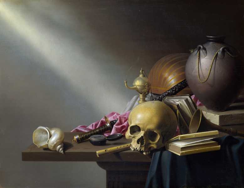
Skulls seemed to appear quite a lot in these paintings, which I consider to be a communication to the viewer of death. As though maybe this person had died and these were all there favorite belongings. I read on the link for this painting that the shell is classed to show a wealthy person as back then not many people would of had one. Back then it would of been like a collectors piece. The Silk purple cloth - This represents silk as the finest quality material and the colour purple was the most expensive dye. So in these Vanitas Paintings, I can see that each Item was put there on purpose to show wealth and the type of person they were eg books- a person who had great knowledge.

Adriaen van Utrecht, Vanitas Still Life with a Bouquet and a Skull  (1643)

http://www.ft.com/cms/s/2/4f2df0e8-3248-11e2-916a-00144feabdc0.html#axzz3Gu49vl34


          I like this painting you can defiantly feel the riches in this piece of work. I think it looks better then the painting above, the flowers seem to compliment the rest of the object on the table. I read on the link for the painting, that the flowers symbolize triumph in death. So this person may of be in a war, or died being a hero. I get the sense of a more elegant person in this work also, as though there more rich then the persons belongings in Utrechts painting. 


1700-1800

              Many painters were still continuing to paint still lifes in the 18th century. Two in particular were french artists called : Jean Siméon Chardin and Jean-Baptiste Oudry. They both enjoyed drawing dead animals for there still life work. Oudry was reowned for being an amazing animal painter of the 18th century. She was really good at hunting scenes and using dead game in her still life. Chardin introduced chiaroscuro, light and dark and reflections into his work.

Wild Duck With A Seville Oraange
Wild Duck With A Seville Oraange - Jean-Baptiste-Simeon Chardin - www.jean-baptiste-simeon-chardin.org

Hound with Gun and Dead Game 1740
Jean-Baptiste Oudry
http://www.artsunlight.com/artist-NO/N-O0001-Jean-Baptiste-Oudry/N-O0001-0001-hound-with-gun-and-dead-game.html


Hound with Gun and Dead Game - Jean-Baptiste Oudry

                I think both of these paintings are great, maybe I am a bit biased, as I love animals, though not dead ones. I do however, like how they have interpreted the animals on canvas using paint. they look really life like. I can see why Oudry was classed as a great animal painter. The work in the painting above is just amazing. The detail is so real and I just want to stroke the dog. Comparing this to the 1700, I guess in a way does still show the riches of the person/painter as they could to afford to go and hunt which was a pleasure back then and a hobby for the rich.


1800-1900

             Artists in the 19th century carried on painting still lifes, yet it all started to change. Impressionists and post impressionists art forms were introduced. Artist were now not concerned about making photo realistic paintings or Painting still lifes, to show value and possessions. They were more interested in experimenting with colour and how they applied there paint to canvases to create colourful artwork.


       An important master Paul Cézanne, was from this era. Some say He single-handedly raised still life to a respected art form in his time.


Cézanne

            Paul Cézanne painted a large number of still lifes. Looking at his work I can see he was amazing with experimenting with colours. He used warm colours such as reds and oranges against cool colours like greens and blues to make the objects stand out at you. I can see that he just didn't just paint objects one colour, he used a mixture such as the table and back grounds to make the paintings more alive. 


Cézanne, Pot of Flowers and Fruit (1888-1890)

http://www.johnlewis.com/the-courtauld-gallery-paul-cezanne-pot-of-primroses-and-fruit-1888-1890-print/p588007


Note the different colours in the table top and the wall behind.


Cézanne, Paul: Still Life with Ginger Jar, Sugar Bowl, and Oranges
http://www.moma.org/collection/object.php?object_id=78469
Cézanne, Paul: <em>Still Life with Ginger Jar, Sugar Bowl, and Oranges</em>


The colours of the blanket really work well in this painting and compliments the oranges, the warm colours in this painting. Again O ranges and greens work well in his work.

Van Gogh 

Sunflowers

http://www.dailymail.co.uk/news/article-2413253/Van-Goghs-sunflowers-He-painted-seven-versions-glorious-masterpiece.html


           This is another artist of this time the famous Van Gogh, He did this still life below of the sunflowers. This was quite a hot topic with van Gogh, he painted quite a few sunflower stil lifes. In 1987 one of his sunflower paintings sold for almost 40 million dollars. The use of colours are bright and such a happy feeling when looking at this painting. You can now see a difference from previous centuries -The brushstrokes, you can see then where as before applying paint was supposed to be invisible. Now the painting its self was the main focus. Artist now could paint any way they wanted, what worked for them as lond as the final result worked.


1900 - 2000

The Cubists


            Georges Braque and Pablo Picasso were the ones that claimed Cezanne was the 'Father of them all' These two invented a style of painting called 'Cubism'. The idea behind it was that they took Cezannes idea of not painting things in perspective and decided to show several points of view in one peice of work. This helped to create art which was more original and effective. Although as you can see with the examples below, it is some times difficult to see what the objects were in there paintings.  over the centuries now you can see we are near to abstract painting. The artist is not painting anything real at all, but just creating imaginative images that appeal to the eye with paint.


Clarinet and Bottle of Rum on a Mantelpiece (Clarinette et bouteille de rhum sur une cheminée)

by Georges Braque 1911

http://www.tate.org.uk/art/artworks/braque-clarinet-and-bottle-of-rum-on-a-mantelpiece-t02318
Clarinet and Bottle of Rum on a Mantelpiece (Clarinette et bouteille de rhum sur une cheminée)

Pablo Picasso Still-Life 1945
http://www.pablo-ruiz-picasso.net/work-140.php
Pablo Picasso. Still-Life. 1945 year


Pablo PicassoBowl of Fruit, Violin and Bottle 1914
http://www.tate.org.uk/art/artworks/picasso-bowl-of-fruit-violin-and-bottle-l01895

1900-2000
                          In the 20th Century art was now any ones game, being able to just paint in your own way and interpriate to the viewer how you see an object. Henri Matisse was a famous artist of this era - He went through 2 world wars and even though with all the bloodshed and the terrible things going on, he never once expressed this in his art. Painting in a way I guess was his way of escaping and having time to remember the good things such as his paintings. Matisse was one of the founders of Fauvism and a leader of 'Les Fauves', a group of artists who enjoyed painting pictures with bold colours. The colour in their paintings was not to describe their subject matter, but to express the artist's feelings about it. The use of colour inspired future generations of artists who ultimately explored colour as an abstract subject in its own right.
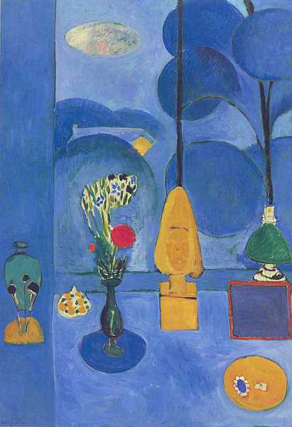
Henri Matisse

The Blue window 1912
http://www.artyfactory.com/art_appreciation/still_life/henri_matisse.htm
'The Blue Window', 1912 (oil on canvas)

 Henri Matisse - The egypt Curtain 1948
http://www.artyfactory.com/art_appreciation/still_life/henri_matisse.htm
'The Egyptian Curtain', 1948 (oil on canvas)

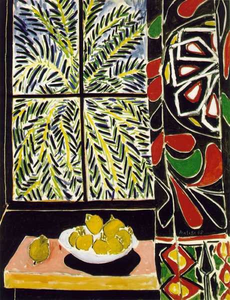
I can see in these two painting the great use of bold colour that he used - I think hes looked at the still life, took a few bold colours from it and used those to create the painting. I like the Blue window the best out of these two. I don't really like the colours used in the Egypt Curtain, the colours don't appeal to me.

2100 


We are only 14 years into this century and yet there are so many people still creating art. Artists have continued to paint still life pictures. I realize now after looking back at all the centuries that there is not right or wrong way of painting a still life. As long as you understand how to create accurate drawings, apply tone and colour you can create your own style and express your own way. You may even invent a new style, who knows, but its all about having fun, enjoying painting and expressing yourself!


Exercise - Drawing With Paint.


             I feel the outcome of my painting turned out well. After listening to my tutors advice and painting the picture lightly first, helped to see the composition and tone better. I like the different blues I used on the biscuit Tin and the cork made suitcase that they were placed on top of. I feel that this was a quirky composition and for an painting attempt its technique and colours worked out too. The things I felt that I could have done better on, is the biscuit tin. You can clearly see the reflective light on the little vase, but on the biscuit tin, it does not look as good as I had hoped. I was concentrating on the multi colours of blues and lost the light on the object. Another thing is the material I feel it looks like hills in a landscape and not the actual shape that was in front of me. I really need to keep practicing, looking more at what I see. I feel I have slightly improved here with the tone on the object compared to my final for assignment 1.


Exercise Still Life with flowers

        For this task I decided to use some flowers I already had in my home. I loved the colours and the way the flowers draped.
        I decided on a composition, which included a chair, table, material, a saucer and of course my flowers. I then practiced drawing the composition and the flowers in my sketch book.


I loved the colour contrasts I had in front of me, Violets and pinks with bright green leaves and a grey back ground which really made the composition look relaxing and appealing to the eye. The flowers are very delicate and I think the colours show this as they are soft and gentle shades.


          I then began to paint the background, working to the foreground of my still life. I had trouble getting the angle of the chair right and the shadow which was hitting the wall, as I had to use very straight lines whilst painting. It was a bit of a challenge but after playing around with the paint I feel I got the best accuracy I could in that particular area. There were a lot of leaves, so to fill in the gaps between each one I used a dark green (as they were dark areas) to create depth in to the painting. I think on the right hand side on the middle lot of leaves, I added too much dark green, where there should of actually been another leaf there. I was making sure I really looked at what I could see and I think I portrayed the leaves very well. I used a mixture of green colours on the leaves to create tone and texture. I loved painting the flowers and I just let my painting arm flow. I loved how I created what I saw, delicate flowers, which was what I wanted to show. Some were pink and some were violet. I looked closely at the pink and noticed there was a hint of yellow on them which I put in to my flowers on my painting and this made all the difference. I felt it showed a kind of optical mixing in my flowers creating a more detailed look of the light and dark areas on the blooms. I also did this on the violet flowers with a hint of blue and it worked out well too.


            When I finally finished the other objects in my painting I left it a few days to dry. I went and got it out of my studio area and just looked at it for a while. I am so chuffed at it. There is a few areas I could improve on such as the dark green areas and the table. I feel I needed to perhaps show more light that was coming from the right beaming off the table. I really like the outcome and it has a subtle and gentle feel to the whole painting. 

Exercise - Still Life with natural Objects

    For this exercise, I had already pre planned what I was going to do. I had decided on drawing some fruit and vegetables on my wooden table and chopping board. I also had a large rich wooden panel, which I thought would go great in the background. I started putting things together and was really happy with the composition I had done. I included a jug with tomato juice in, some bright coloured peppers and some mint plant. I felt the green of the mint plant really worked against its complimentary colour red (tomatoes) .


The brown colours on the wood panel and the chopping board, also complimented the whole scheme. I decided to put my objects to the left hand side of my painting, to show part of my wood panel, as I really likes the patterned texture on it. I tested it out in my sketch book and it looked great.


        I stared to paint it by putting in the wooden panel first. I really looked at the grains in the wood and the rich browns and yellows, I could see. I feel I did well with the grain of the wood, which flowed across the background. I then did the table top of my painting which was a light bark colour, the wood looked very rustic and old so I tried to portray this in to the painting.  I then started on the leaves, jug and the fruit. I really like how I captured the jugs form It shows all the bounces of light I could see. I think I made an error with the main orange, in the middle of the chopping board because it's come out a lot darker then it should be. I have not shown enough detail inside the fruit. I  think I need to really work carefully in some areas to grasp what I am looking at better. Once finished that area I moved on to the final few parts, chopping table, leaf in foreground and the chili's on the table. I really was impressed by how I showed the chili. I think I got the shine on them accurately and I love the bright colours I used. I feel that I could of put more detail on the leaves, by introducing more tone but I felt I wanted the fruit to stand out the most.


Overall I feel this was a good attempt at this still life. There are a few areas I would change or improve on but its another learning curve. From this painting I have started to learn how to put certain colours together to help produce an appealing painting. I have also learned about textures of wood and to observe the patterns that are within.

Overall

        I really enjoyed this task, to paint two different still life's.  My favorite one is the flower painting I did. I found this more appealing to me and I enjoy making subtle and easy on the eye contrasts. I feel that this is a type of style I would use to portray my own voice, as I enjoyed painting it so much. It is a very tranquil painting and I like that I didn't try too hard with this, I just let my self flow and go with what I was seeing. I think the problems you may have with drawing natural objects are the textures. Objects such as fruit and flower tend to die and rot. If your taking a while to paint and study the objects, they tend to change colour slightly or shape. I also think what's hard is showing juices of a fruit eg a orange in the painting. I think on both painting I made good and bad choices. On the fruit and vegetable one, I think had a good composition but I needed to improve on looking at the orange more and putting more tone on the leaves. In my flower painting, I think I did the correct composition . The flaws if I have to really criticize my work, is the saucer on the right of the table. It does not look perfectly round and maybe I should of spent some more time concentrating on that. My method of painting was to portray a gentle soft painting and I think I did well with this, by using soft colours with a grey back ground to make my flowers stand out. I have learned from both exercises that natural objects are for me, more enjoyable to paint and draw. I love the bright colours and all the textures each individual object has, compared to a man made objects, where it's mainly metals and pottery a etc, with little textures in my opinion. I  like the idea of mixing natural with man made objects though as I feel that helps with a painting to give it more of a character . I really enjoyed painting these and I am keen to explore painting more and what works for me.